Prisma Colored Pencil Representational Reflection Drawing
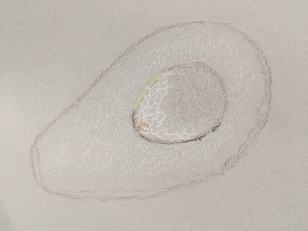
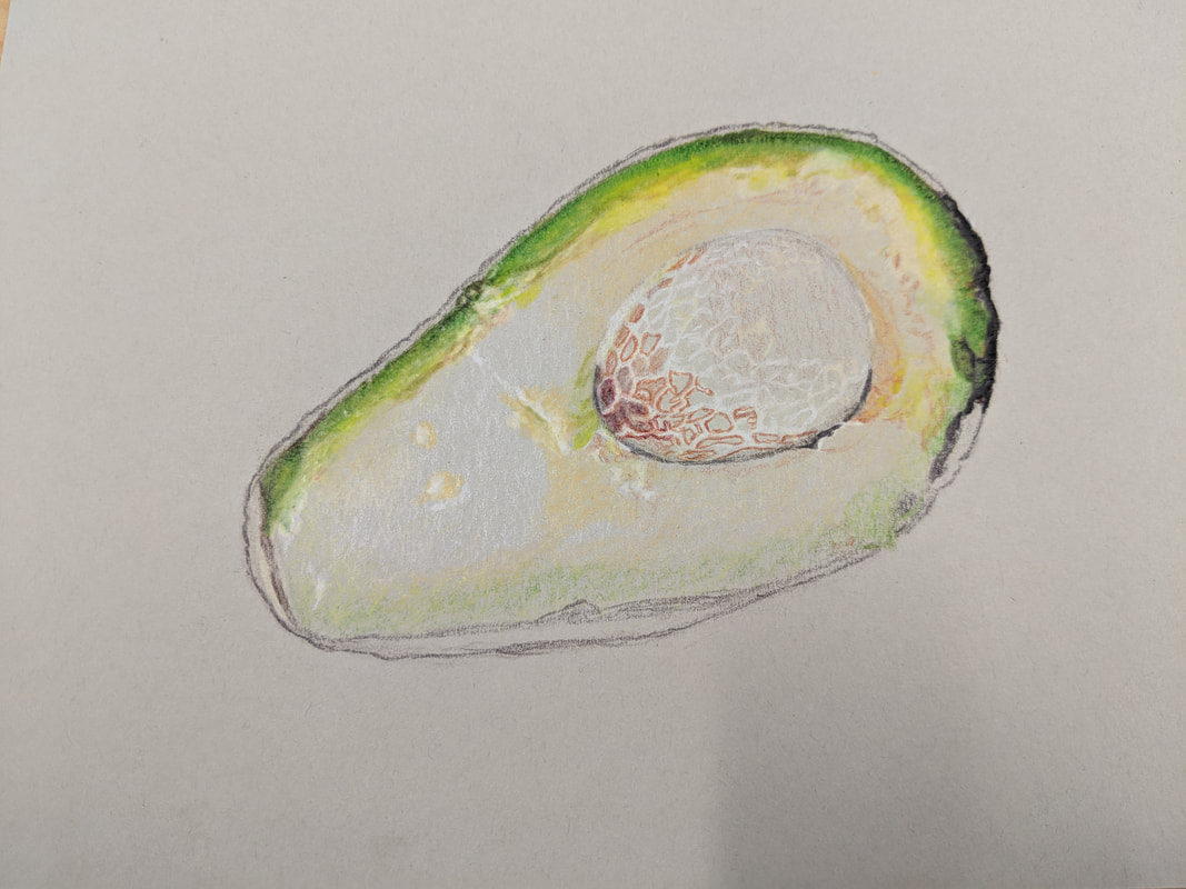
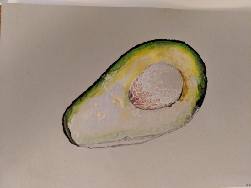
The three photos shown in the gallery above are in progress photos of the avocado drawing that I did in prisma colored pencils. As you can see, I started out by sketching the general shape of the entire avocado and the seed. Then, I put in white colored pencil to mark highlights and worked from light colors to dark colors until the entire avocado was finished.
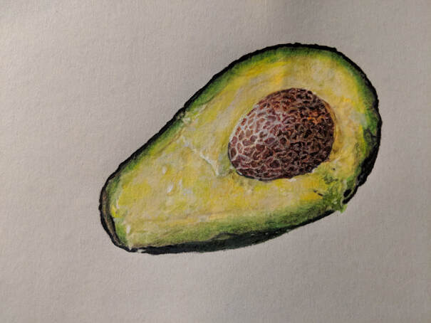
The above photo shows my completed drawing of an avocado. This drawing serves as a practice with prisma colored pencil so that I could refresh my memory of how to use prisma colors to create a successful piece. This drawing was a practice before I started my final representational reflection piece.
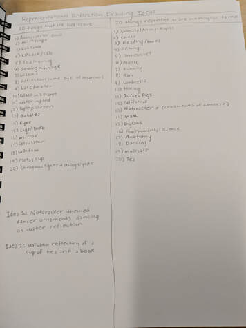
The above photo shows my list of 20 reflective surfaces and a list of 20 things that have some kind of representational meaning for me. My two final ideas are nutcracker themed dancer ornaments dancing on water, and a reflection of a book and a cup of tea in a window.
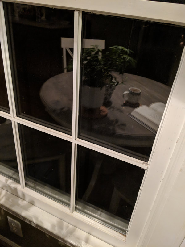
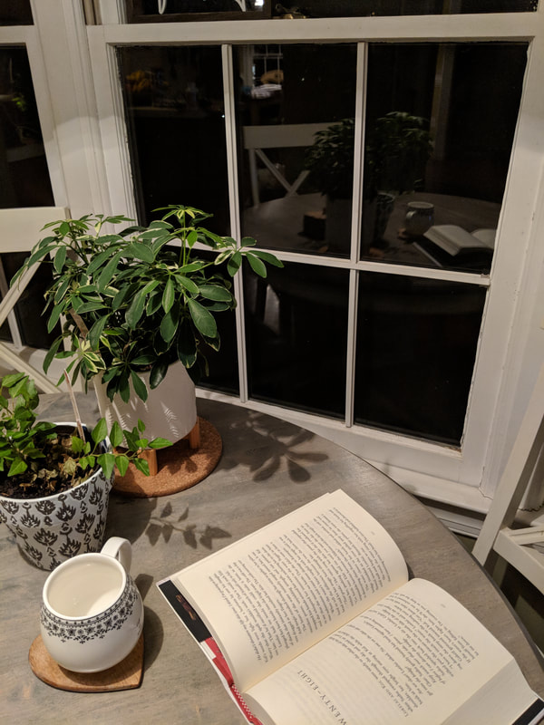
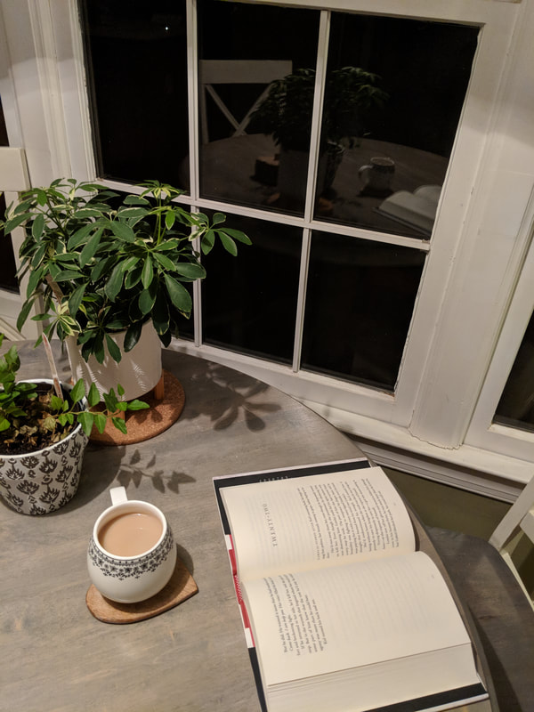
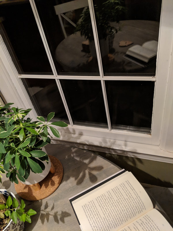
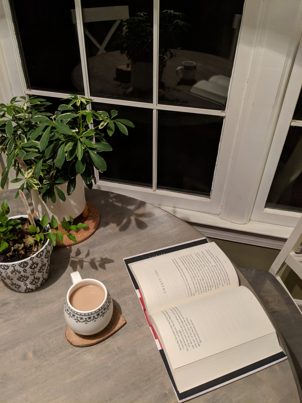
The five images above are the five compositional sketches/photos for one of my two ideas for my representational reflection drawing. They show window reflections of a cup of tea and an open book because my peaceful and stress relieving environment is being at home with tea and some kind of fantasy book.
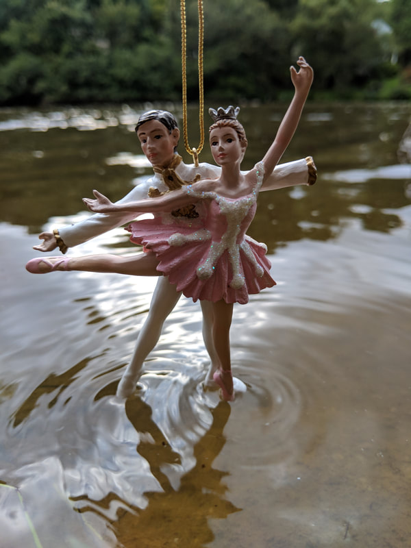
The five images above are the five compositional sketches/photos for my first idea for my representational reflection drawing. I chose the fifth image as my reference photo for the final project.
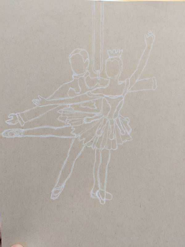
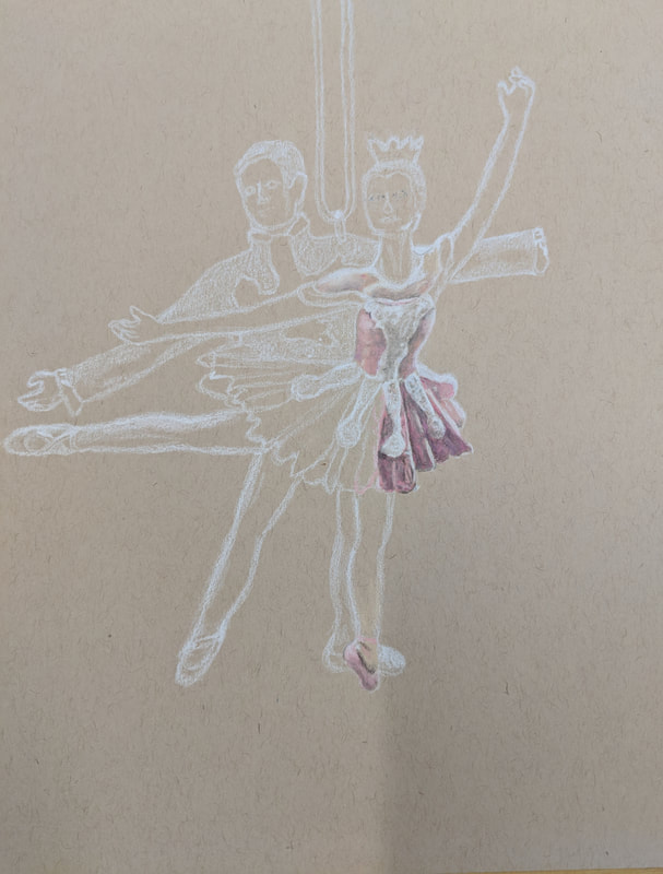
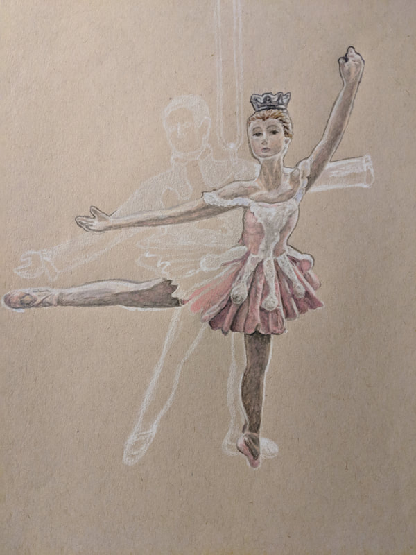
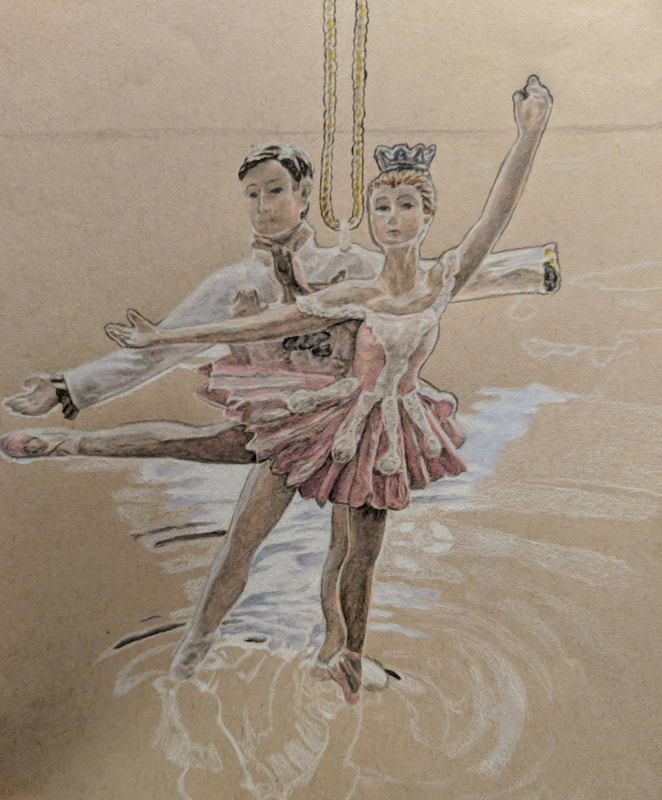
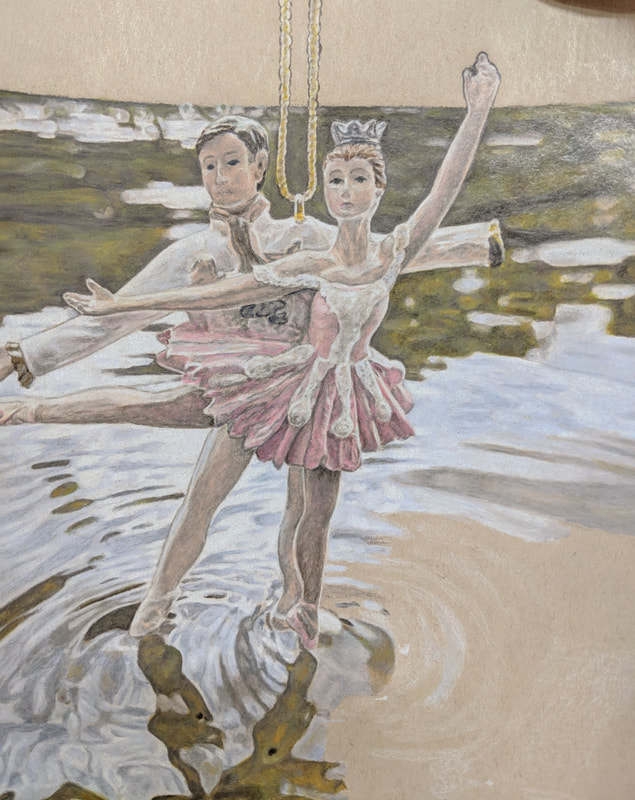
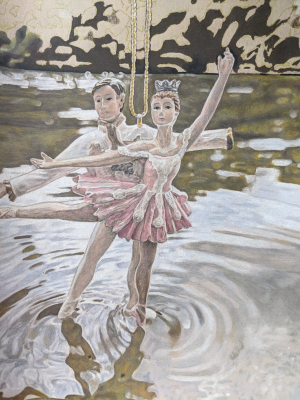
The above photos depict my reflections drawing piece in progress as I worked on it. The first photo shows my practice color sketch of the photo that I used for this piece. This practice sketch helped me determine the dimensions I would need to use to create realistic bodily proportions for the dancers. The second photo shows my process for starting all prisma color drawings. In this process, I start with white colored pencil or another light color and outline all the shapes and details of the photo. I then continued on to adding highlights and color as seen in the other in progress photos.
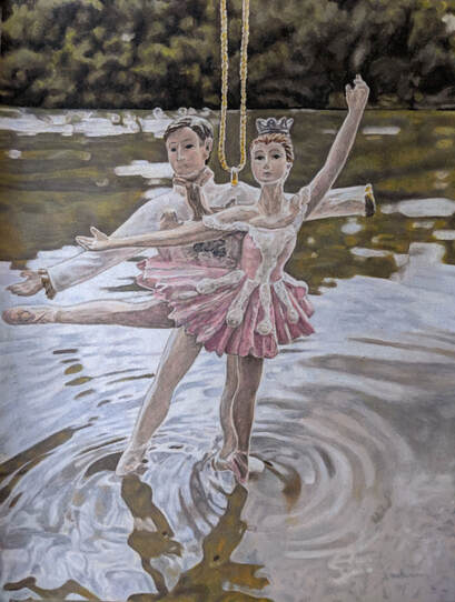
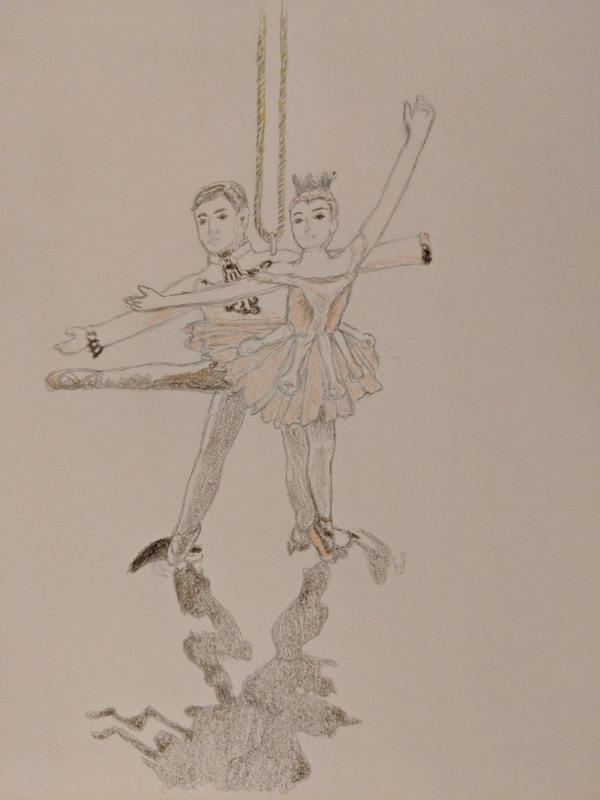
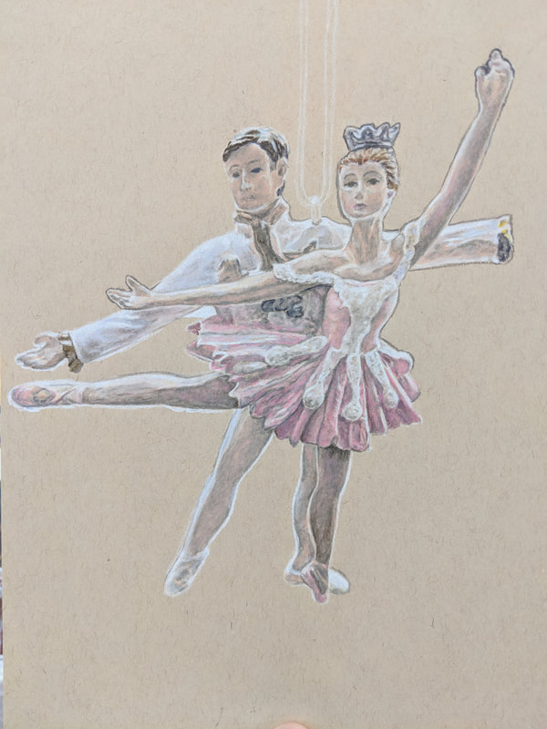
"Dancing on Water"
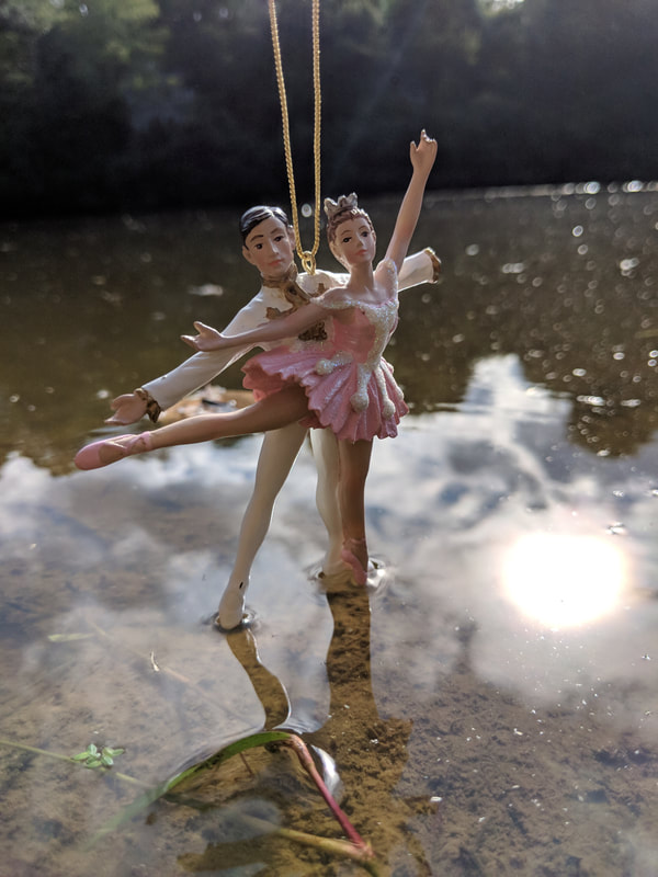
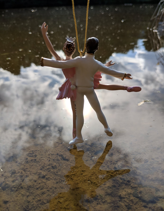
For my representational reflection drawing I chose to draw a Nutcracker themed Christmas ornament dancing on water. I chose this item to reflect myself because dancing was an activity that I participated in for a very large portion of my childhood from around the age of four to the age of eleven or twelve. I participated in Nutcracker performances twice in my dancing career, once as a Gingerbread and again as a little angel. This ornament has a special significance to me because all throughout the years of dancing I would buy a new Nutcracker ornament every year at Christmas time to hang on the tree. I have my own little collection of ballet dancer ornaments along with other Nutcracker themed items including a Nutcracker snow globe and six actual nutcrackers.
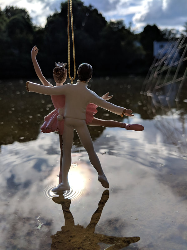
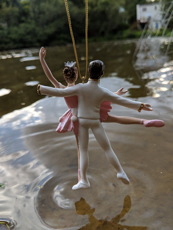
I took the photo for this drawing by holding the ornament over water and taking pictures while holding my phone upside down so that I got a photo of the ornament straight on without a downward angle. The body of water that the dancers are on is a lake that my grandparents house backs onto and I had to go sit next to their little wooden dock in the evening to get the photos.
To begin a prisma color pencil drawing, I always start by outlining the composition in white pencil before doing anything else. This works very well for me because I prefer to be very careful at getting proportions and dimensions right at the beginning of a drawing rather than noticing mistakes later on when color has been added. Therefore, I use the white pencil so that if needed, the color is light enough for me to erase. Once I was satisfied with the white outline of the ornament, I start adding more white pencil very lightly to lay out where the highlights of the drawing will need to be. Then, I slowly started adding color to the drawing. I started adding color to the woman's dress first, mostly because I was too nervous to start on the face. When drawing the woman's dress, I had to add a variety of colors that wouldn't seem necessary but help bring out the brights and the shadows of the dress. Once I had finished the dress, I started moving on to the skin tones. I also had to use a variety of colors in the skin tone to try to make it realistic, this included a large amount of the same colors that I used in the dress. I repeated these patterns when adding color to the man, I just used a few different colors. I also incorporated some shades of blue into the man's outfit. When I finished the ornament, I finally moved on to working on the background. When creating the background, I carefully outlined the details of the water and reflections in white pencil and then added highlights and then more color from there.
I am very happy with the outcome of this piece because I feel I accomplished my goals of creating accurate dimensions and through the process of drawing, I did not lose any of the beauty that the scene possesses. I am also very happy with the way that the faces of the dancers came out because I was afraid that the little details of the face would not come out right, but in the end they came out well. The one thing that I hope to improve upon the most, however, is the amount of time it takes me to complete these projects. I am very very very slow at drawing, especially with prisma colors, because I am a perfectionist, but I hope to be able to slowly become better at completing these pieces in a shorter time period while maintaining the attention to detail that I already have.
Acrylic Paint Self-Portrait
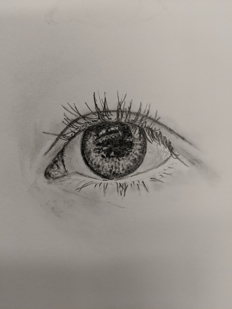
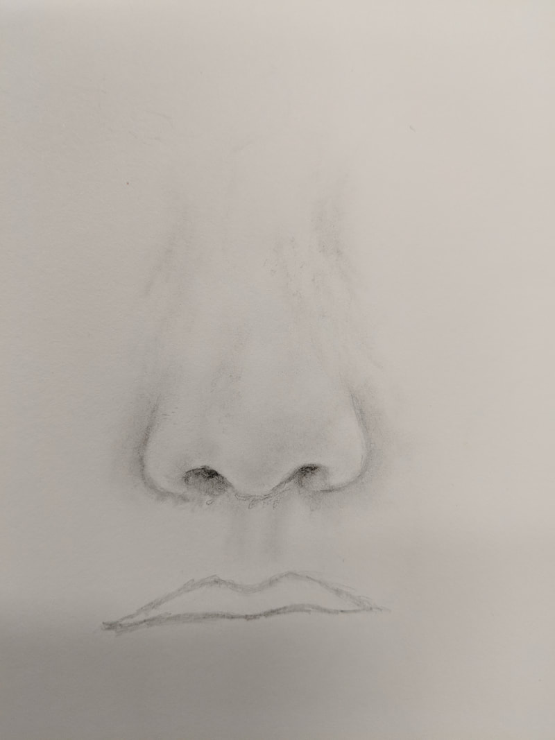
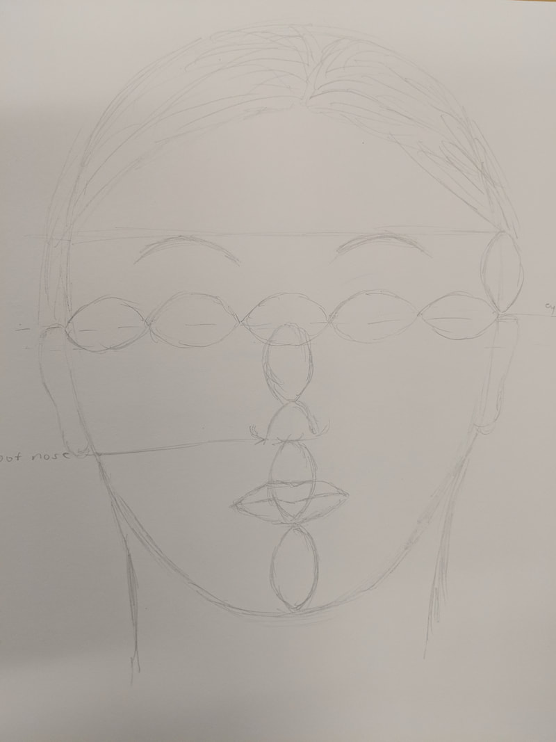
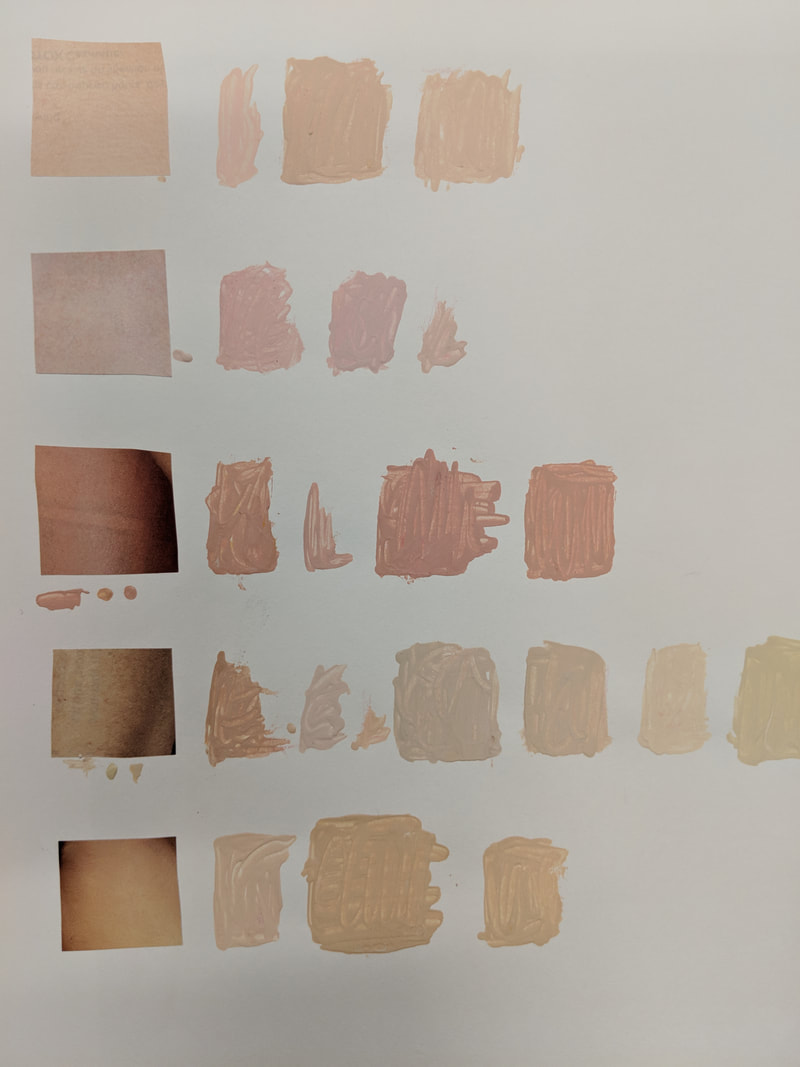
The first photo above shows a graphite drawing of my eye that I did to practice drawing facial features before I went on to sketching myself on the canvas for the painting. The second photo also is a practice drawing of facial features because I did a drawing of my nose. The third picture is a drawing of the layout and proportions of the face so that I could get a feel for where all the facial features lie on the face and how far away they all are from each other. The final picture shows clippings from a magazine of different skin tones, which I tried to match by blending the primary colors of acrylic paint.
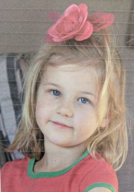
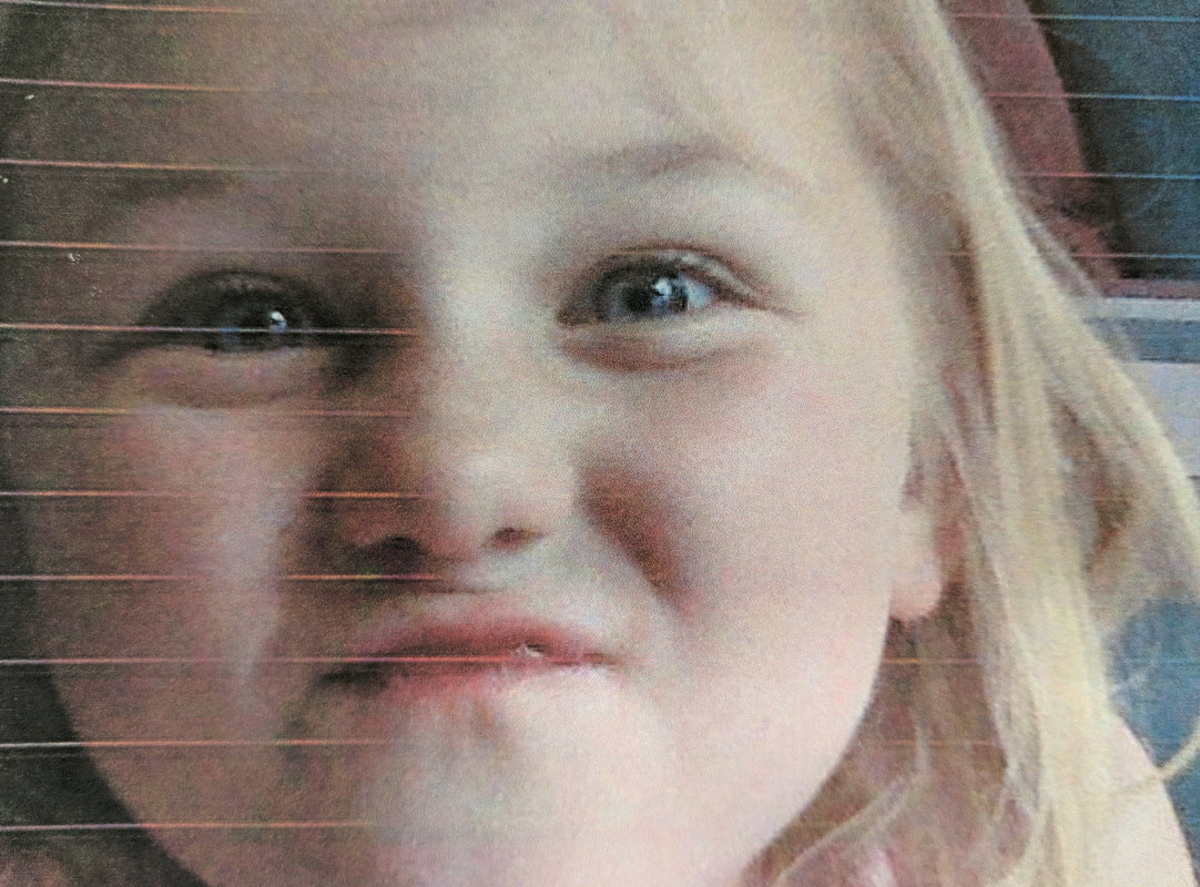
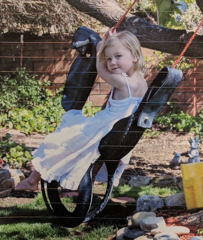
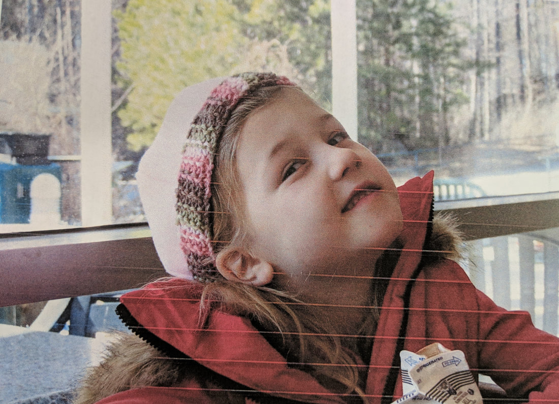
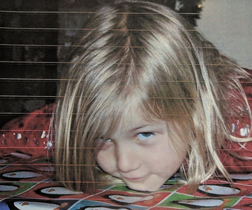
The five photos above are the reference photos that I chose between for the photo of myself to use for my self-portrait. I used all photos of myself from when I was younger. I chose the first photo above to use when painting my self-portrait.
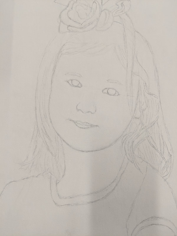
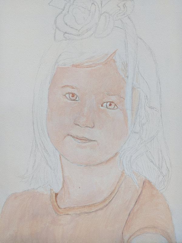
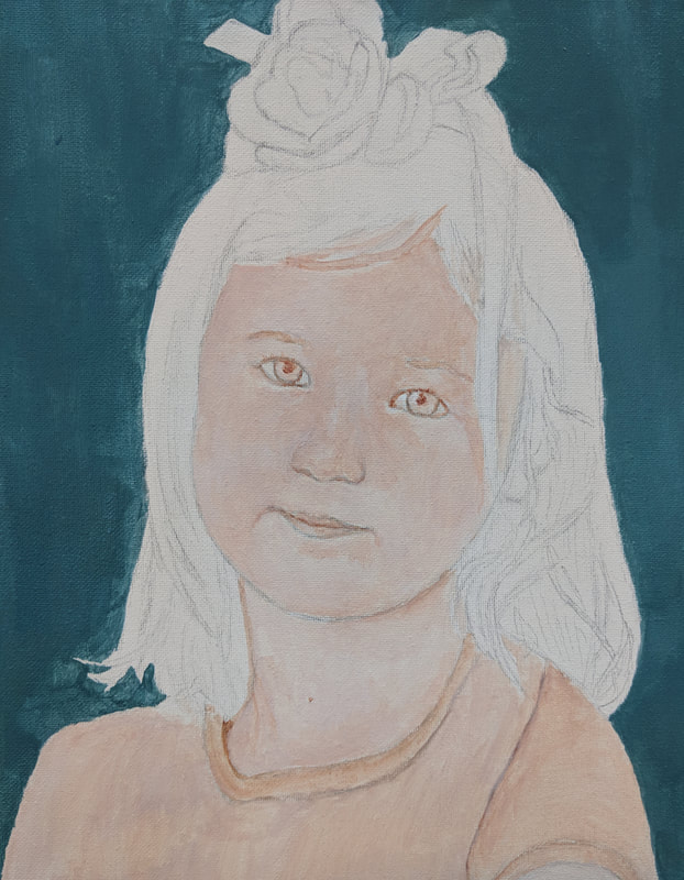
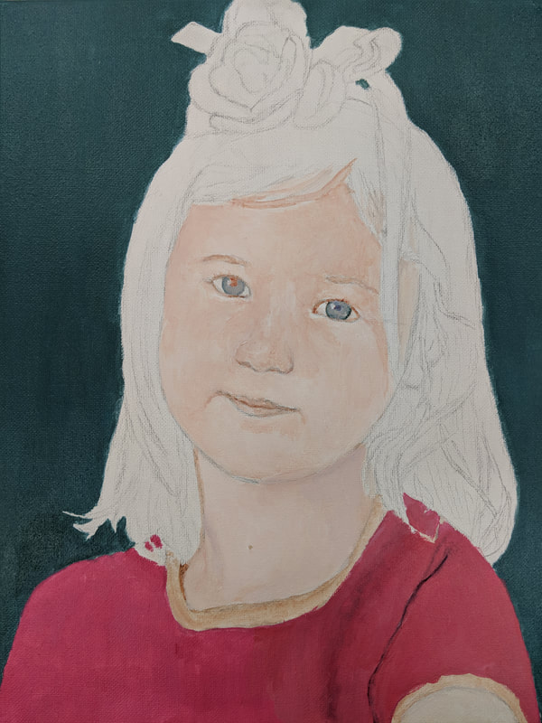
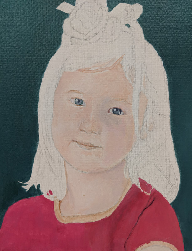
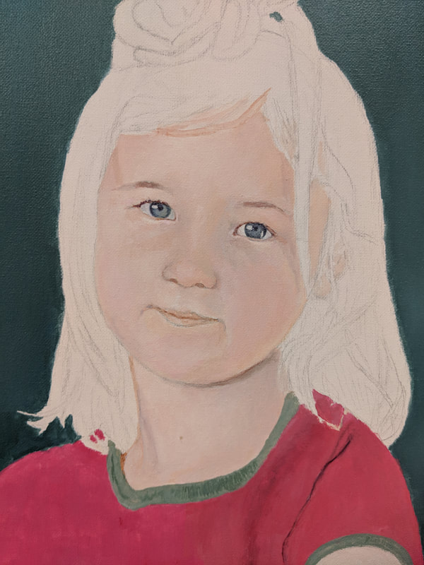
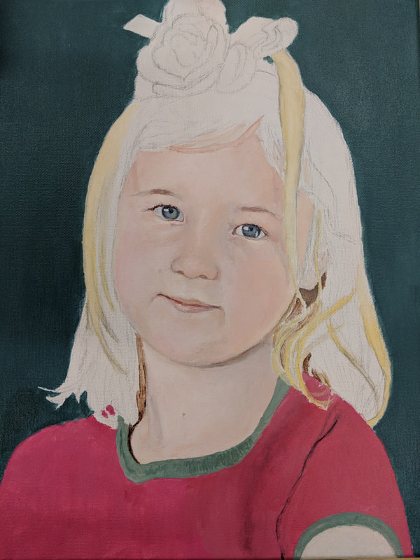
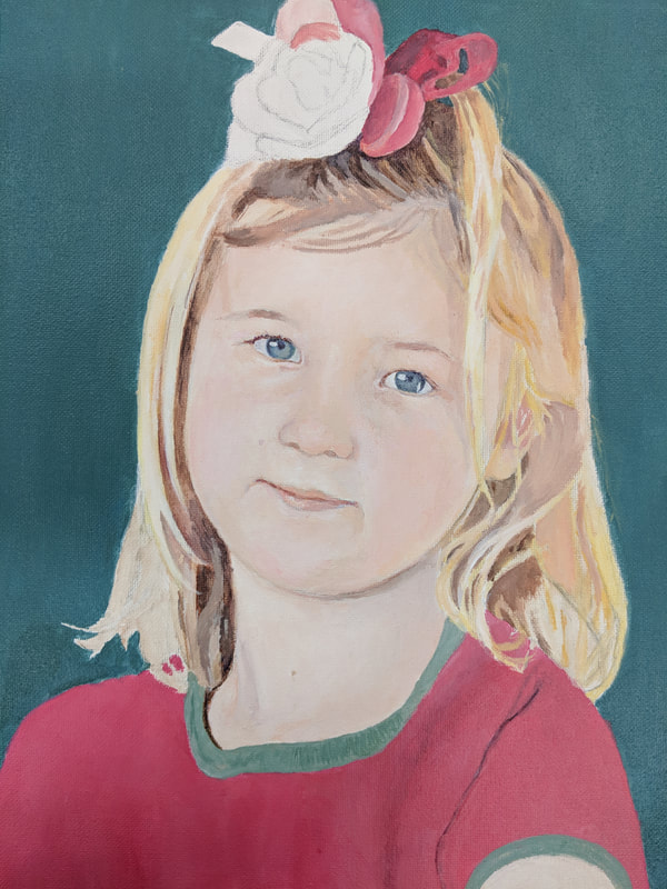
The above photos are the in progress photos of my self-portrait painting. I started by sketching an outline of my head and basic facial features in graphite pencil on the canvas, and then I painted slowly, starting with neutral colors and then adding color.
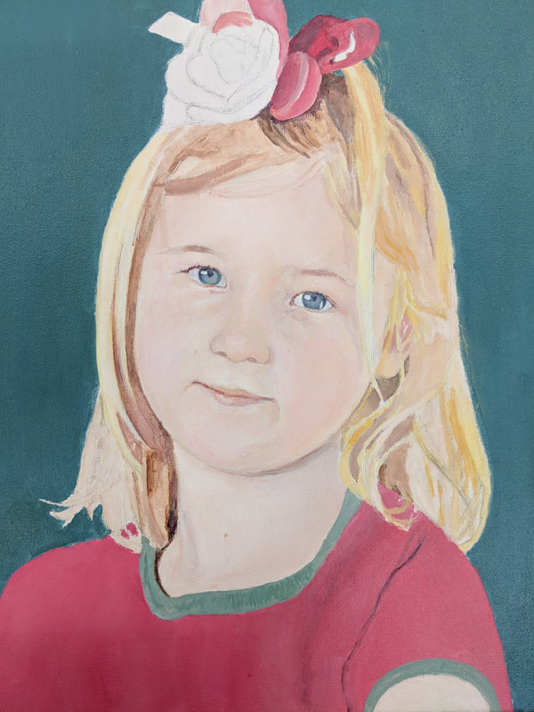
"The Girl with the Pink Flower"
The photo above is my final piece for the self-portrait painting project. The first thing that I did when starting this project is sketch out the outline of my head shape and the outlines of my eyes, nose and mouth shapes. After a long time of erasing and redrawing these lines in graphite pencil, I moved on to my first layer of paint. As seen in the in progress photos above, I did not start painting with any color, rather I started with a burnt umber wash. In doing this I used the burnt umber acrylic paint and watered it down to mark the different values of the face, and I also mixed in a little bit of white paint occassionally to mark the lighter values.
After the value wash was done, I started to add the first colors. When starting with color, I started by painting the eyes. I used many shades of green, blue, and purple to create the color and depth in why irises. Then I also used some muted blue and purple with the white to create the shadowed value of the white of the eye. Rather than using a harsh black for my eyelashes a used a somewhat dark shade of purple and brown, and I did the same for the pupils. After I was satisfied with the eyes, I moved on to matching paint to my skin tone in the photo. My skin tone was created using all of the primary colors and a very large portion of white paint. My skin is very pale, especially in this younger photo of me, and it also has a lot of pink and peach undertones that I had to create. When applying the paint to the canvas, I started with white highlights just like I do with colored pencil drawings, and then built up the other colors from there.
When painting this self-portrait, I had a few things that I found challenging and a few things that I think I could have done better on. When I started this piece, I found that I had a really hard time getting the head shape accurate, especially since my head is slightly tilted in the photograph. I think that something in the facial orientation of the painting is a bit off in relation to the photograph, but once I had started painting, I didn't really know what was off to know how to fix it. Later on in the painting, another thing that I found very challenging was painting my hair. I think I started to get nervous with the hair when I realized how many different values and colors are in my blonde hair. I had to use various shades of yellow, brown, peach, gray, and even some hints of blue to create the colors and shadows of my hair. A final thing that I think I could have done better on is the shirt that I am wearing in the painting. I think that if I had spent more time on the shirt, I could have had slightly more accurate dimensions and more realistic details.
Overall, I think that this is a successful piece. I was really scared when this project was introduced because the last time that I had done any kind of painting was a landscape painting from freshman year, and I had never painted a person before. I think that I did a lot better on this piece than I originally expected myself to, and I think that my success in creating this painting comes from my perfectionism. I don't think I would have been able to create as realistic of a painting if I was not a perfectionist because this side of my personality forces me to pay attention to all of the smallest details which eventually results in a more realistic outcome.
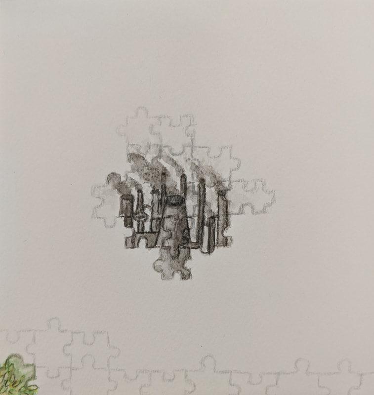
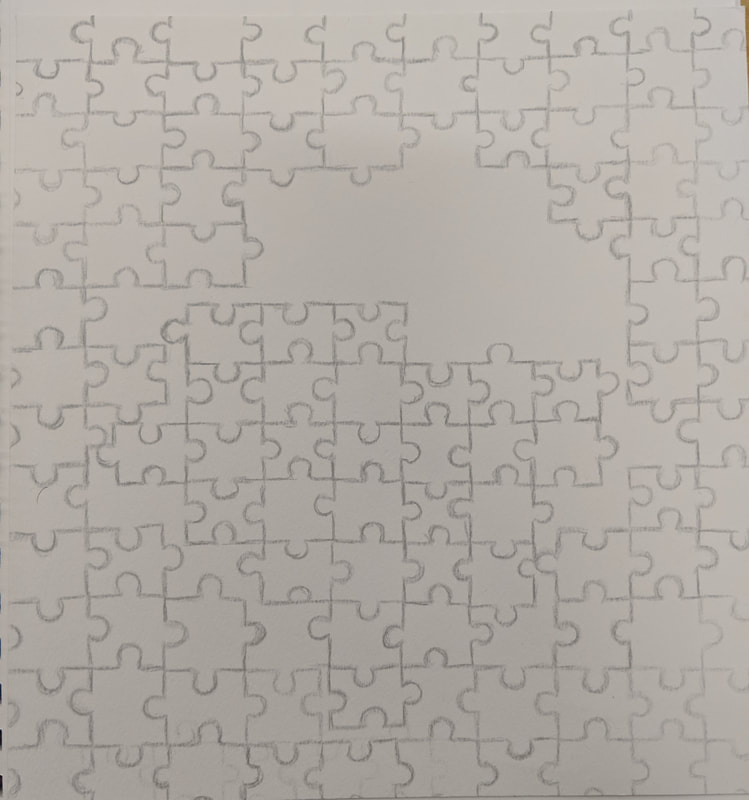
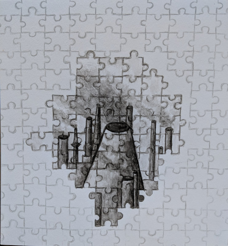
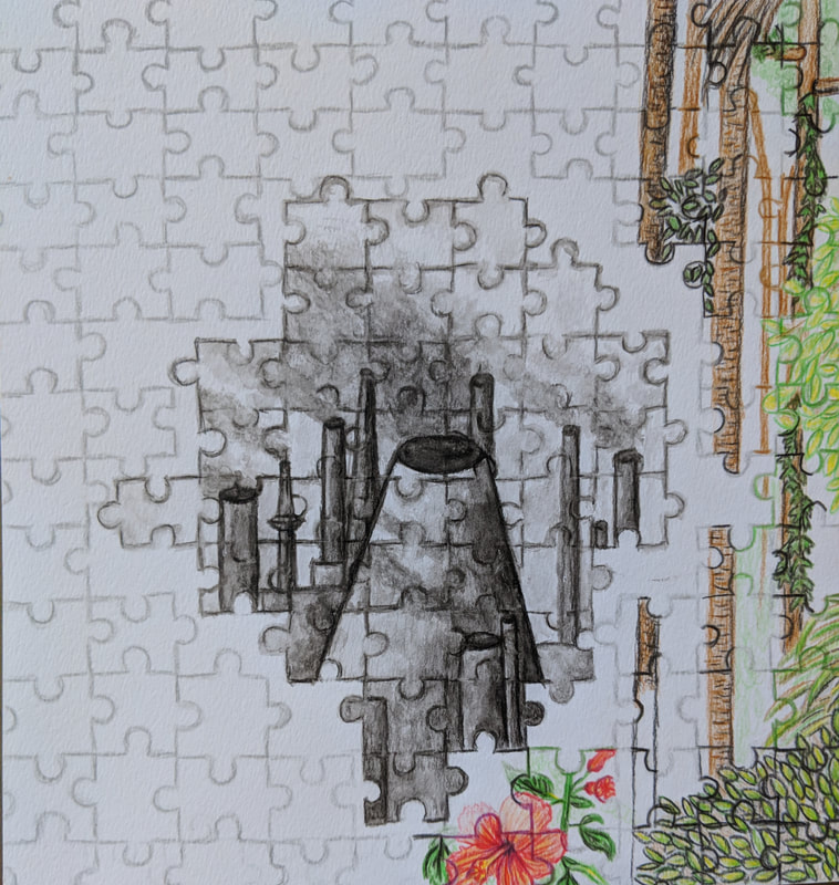
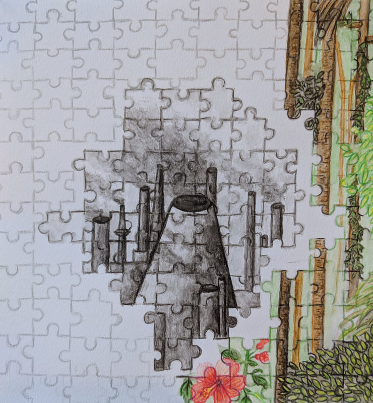
Internal Spaces Prisma Color Pencil Drawing
The above photo shows the list of ideas that I came up with for the internal spaces project. My favorite ideas were the courtyard of a college, inside an empty or full glass/cup, and the inside of the space shuttle.
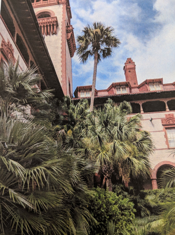
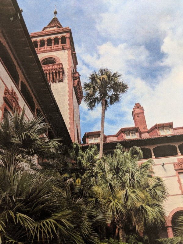
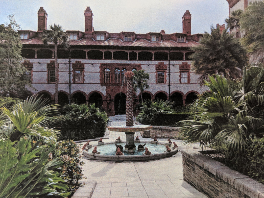
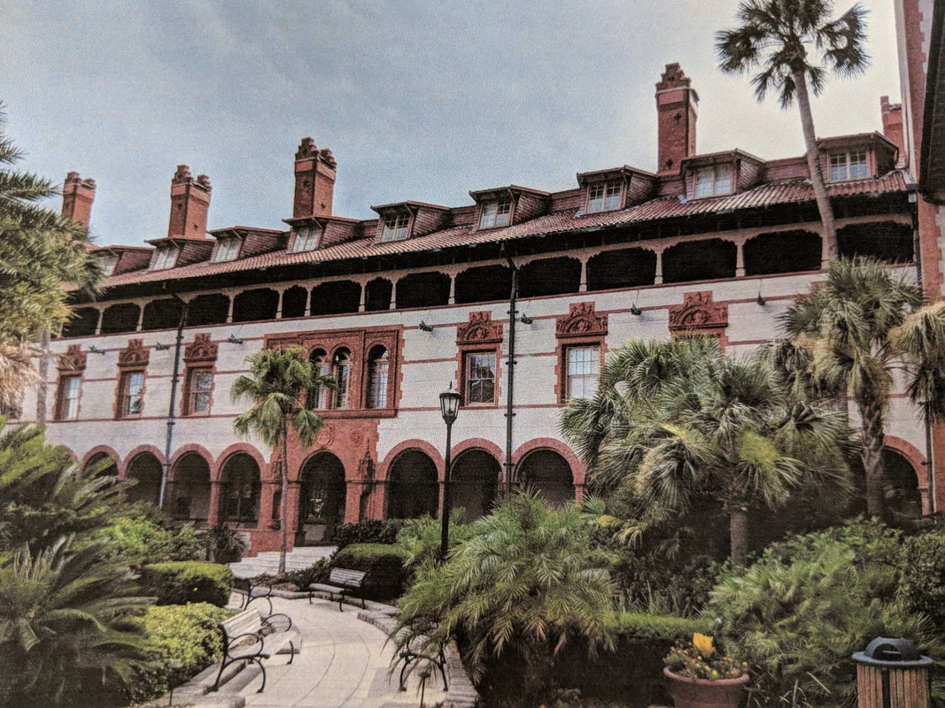
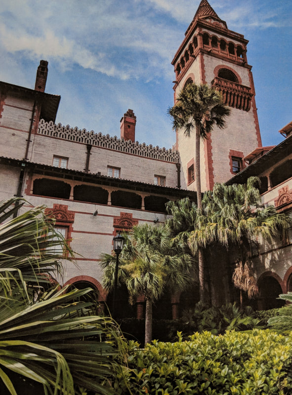
The five photos above are my reference photos that I took of the inside of a courtyard at the Flagler College in St. Augustine, Florida. I chose this idea as the idea that I would use for my final piece, and I decided to use the fifth photo.
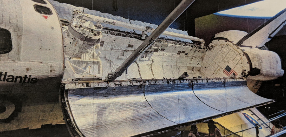
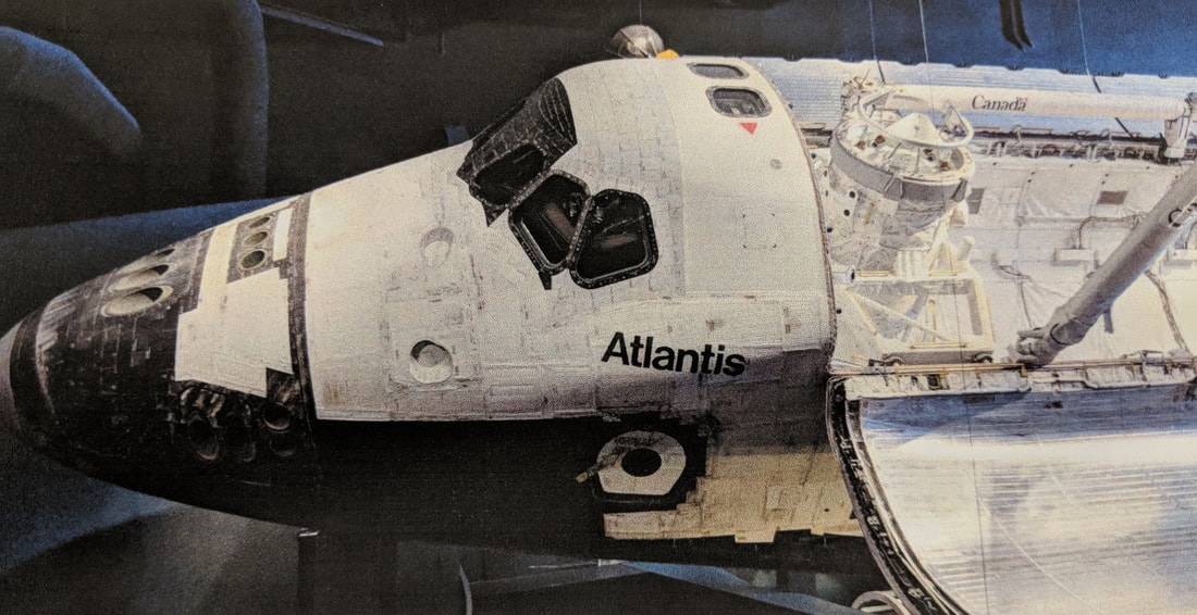
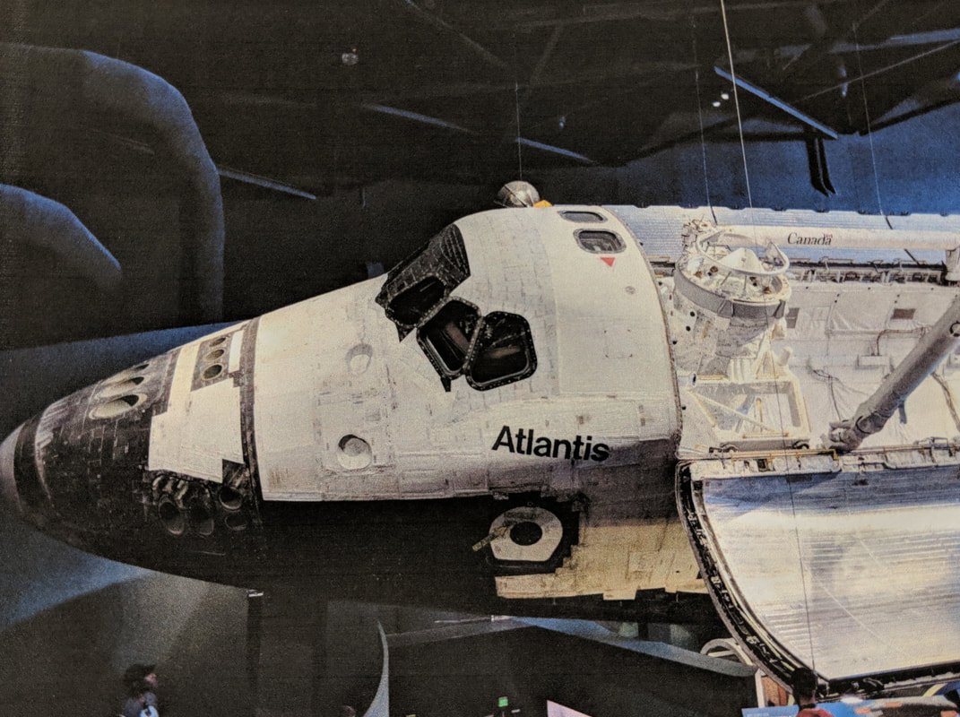
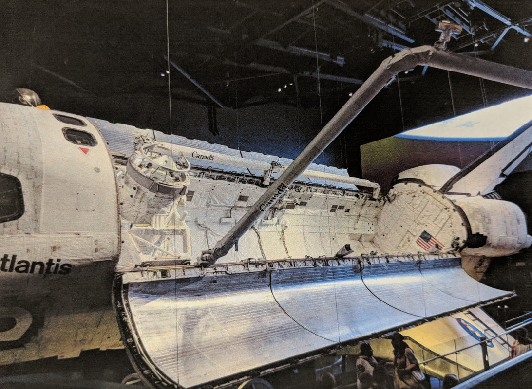
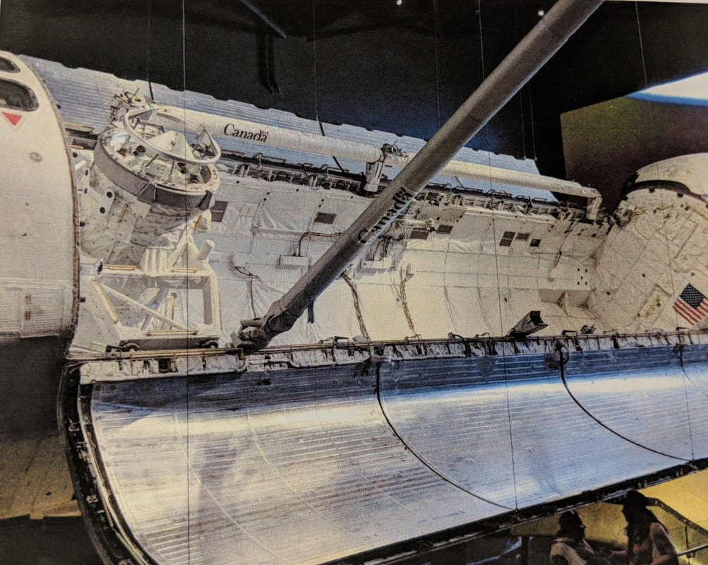
These five photos are the photos that I took of the Atlantis Space Shuttle at the Kennedy Space Center. However, I decided not to use this idea for my final piece.
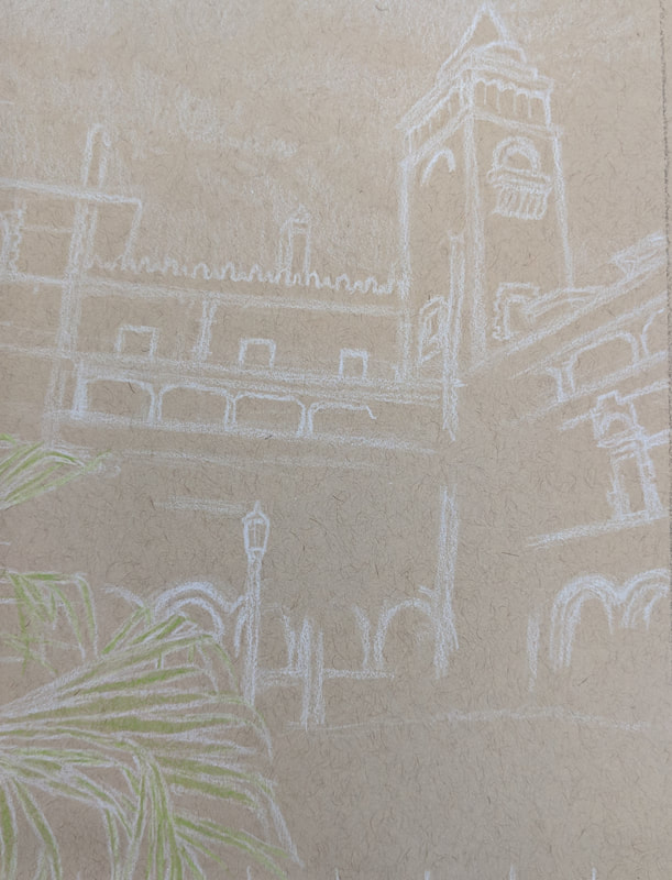
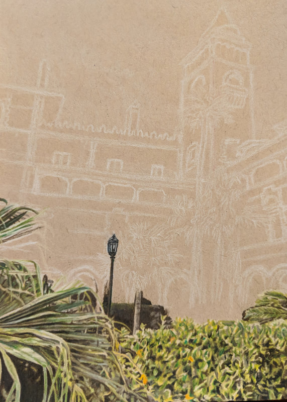
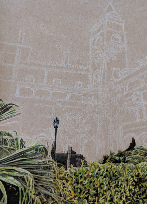
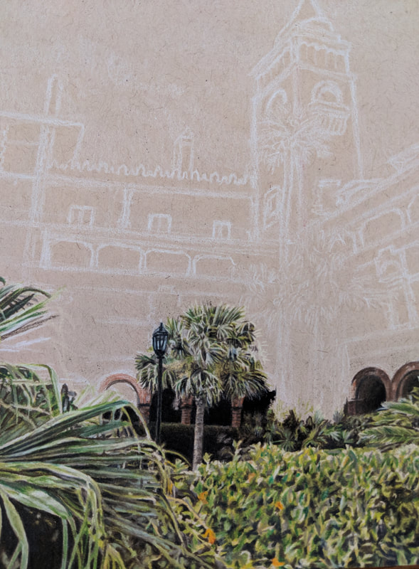
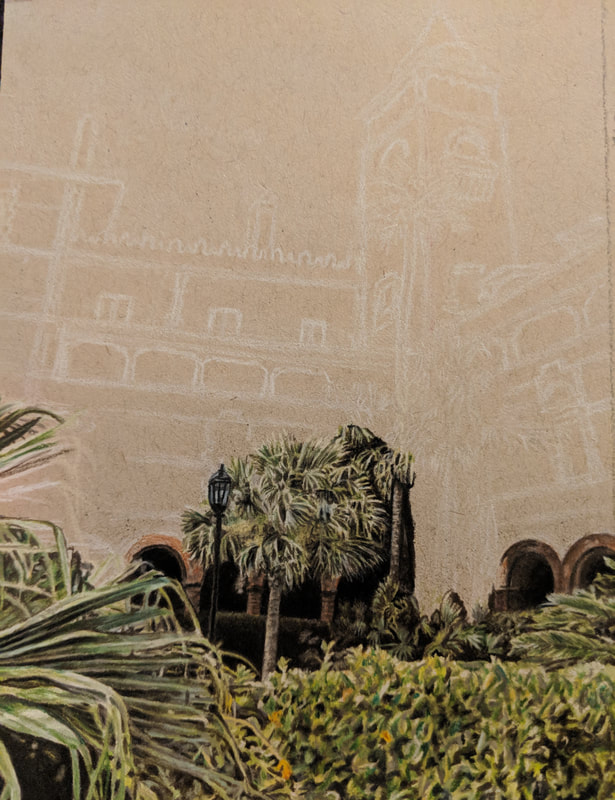
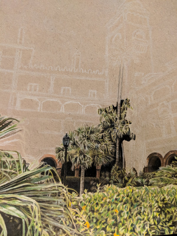
The photos above are the in progress photos of my internal spaces Prisma color piece. This series of images demonstrates the process by which I created this piece.
Ordinary to Extraordinary Watercolor Pencils
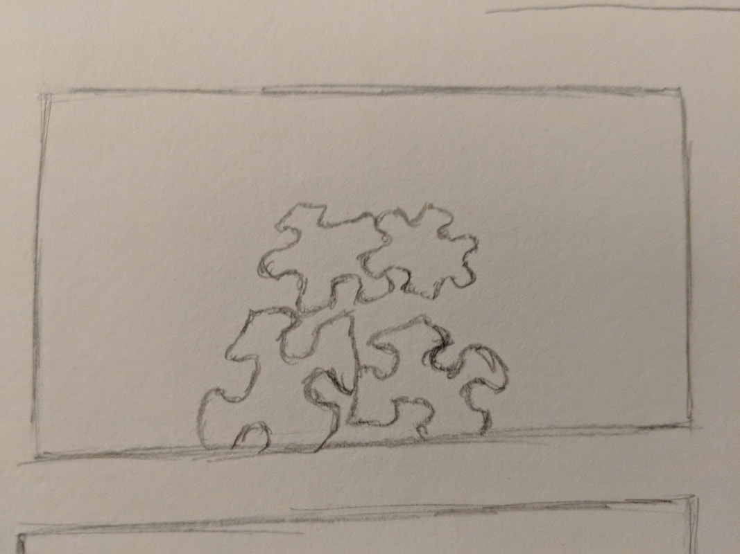
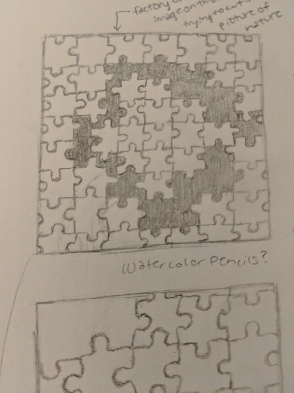
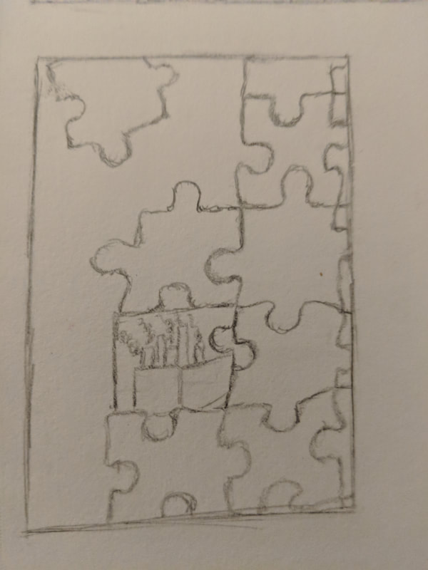
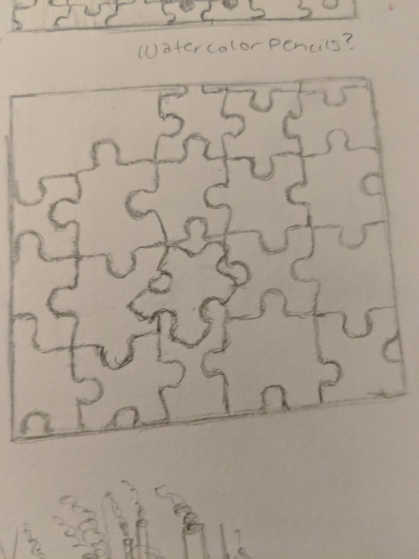
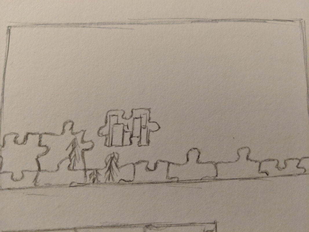
The above photos are the compositional sketches for the ordinary to extraordinary project. I chose to model my final piece off of the second sketch.
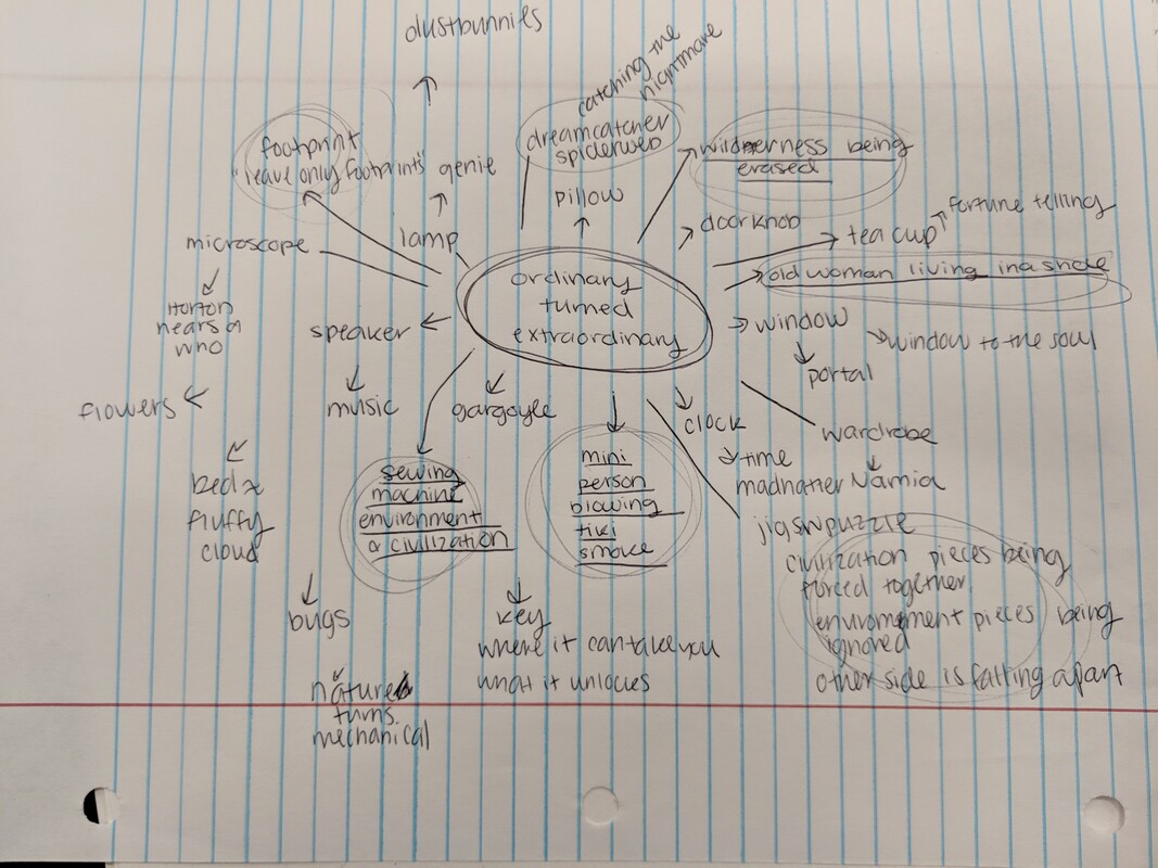
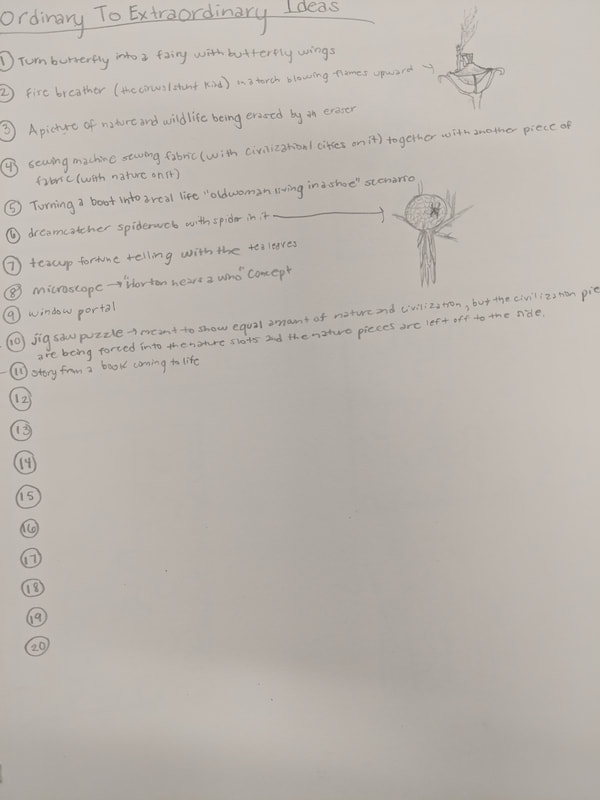
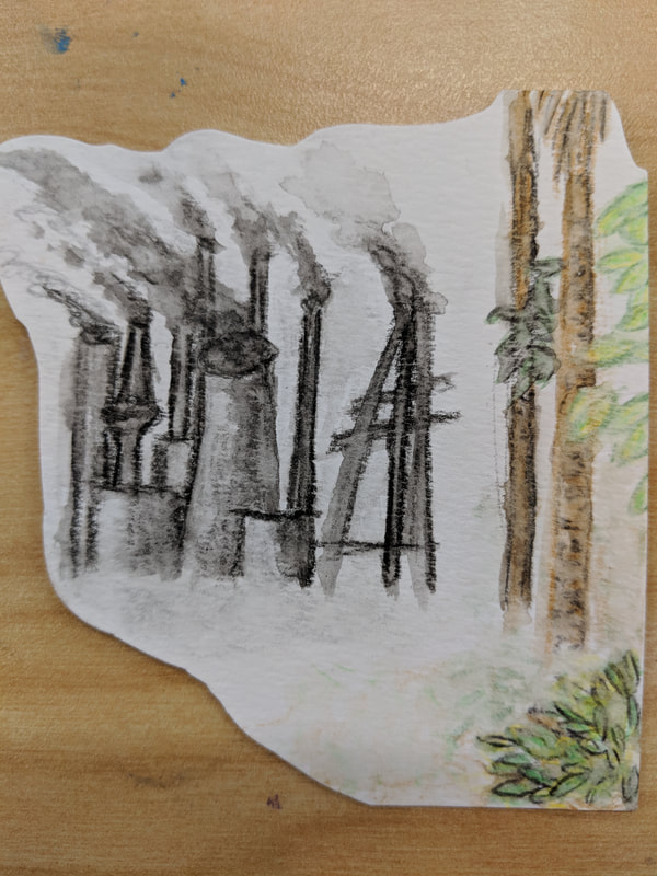
The images above show the preparation that was done for the ordinary to extraordinary project. First, my sister helped me brainstorm ideas by creating a bubble map. Then, I created a list of more developed ideas using the basic ideas that were on the bubble map. The third image shows my first practice using watercolor pencils, since I have only ever used watercolor pencils once before, and that was not even for a full piece. The fourth image shows my design for the project because I wanted to lay out how I wanted my final piece to look before I started working on it.
Oil Paint Landscapes
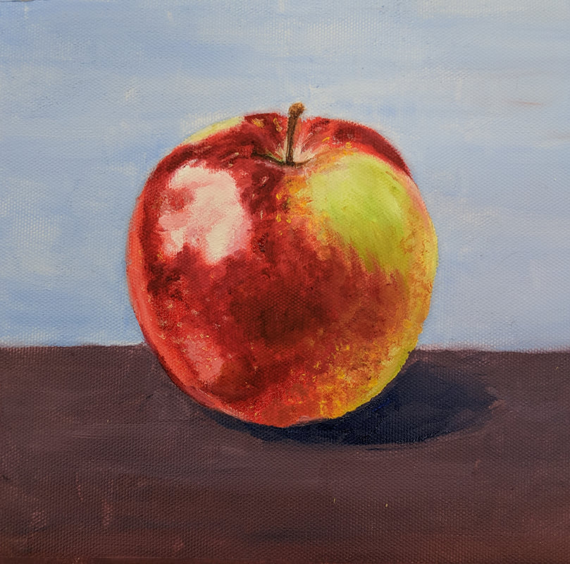
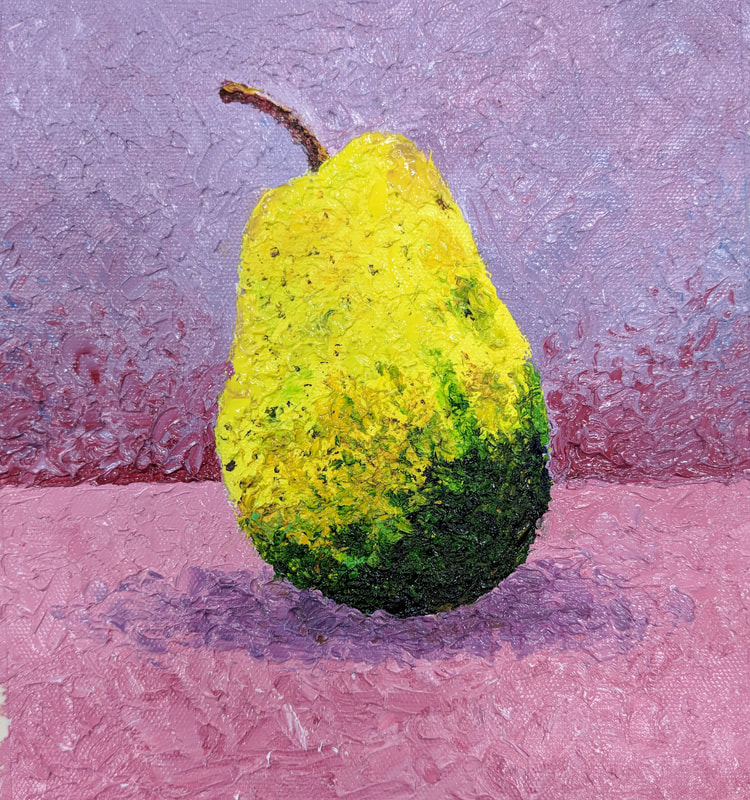
The two pictures above depict my first two pieces that I have ever done in oil paint because I have never used oil paint before. The first one that I painted is the apple, which I painted using brushes. I started by painting the light base colors of the apple while leaving white places for where the highlights would be. Then, I built up the layers of paint and colors from there. The second painting is the pear, which I painted using a palette knife. This was much more difficult for me because my style of art has always centered around making it as realistic as possible, including every little detail. However, the palette knife did not allow me to add the little details that I wanted to.
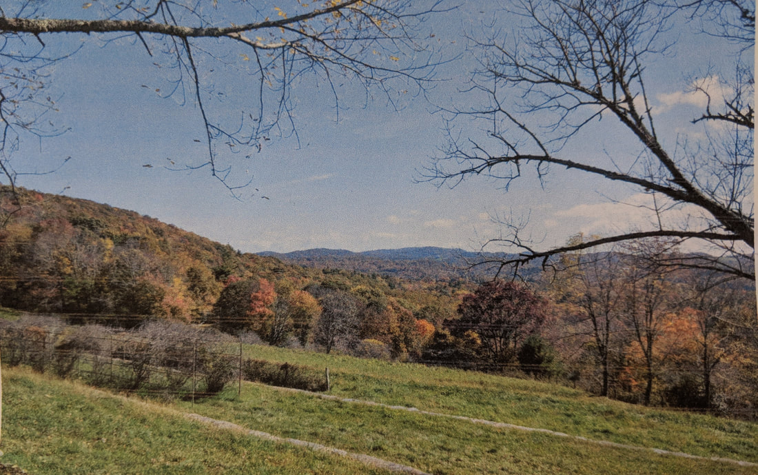
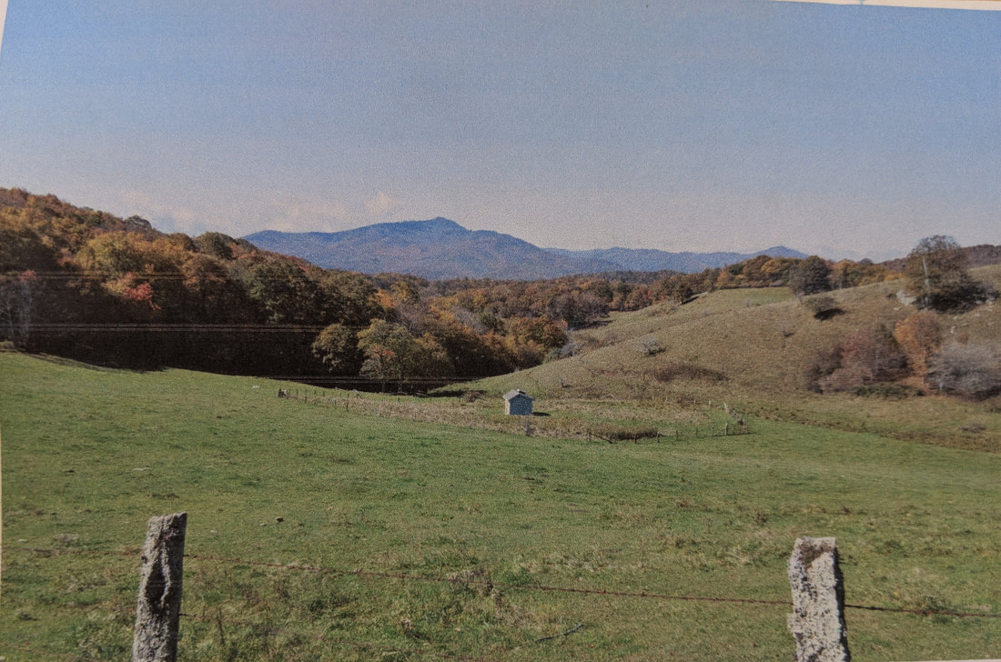
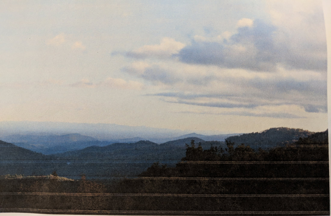
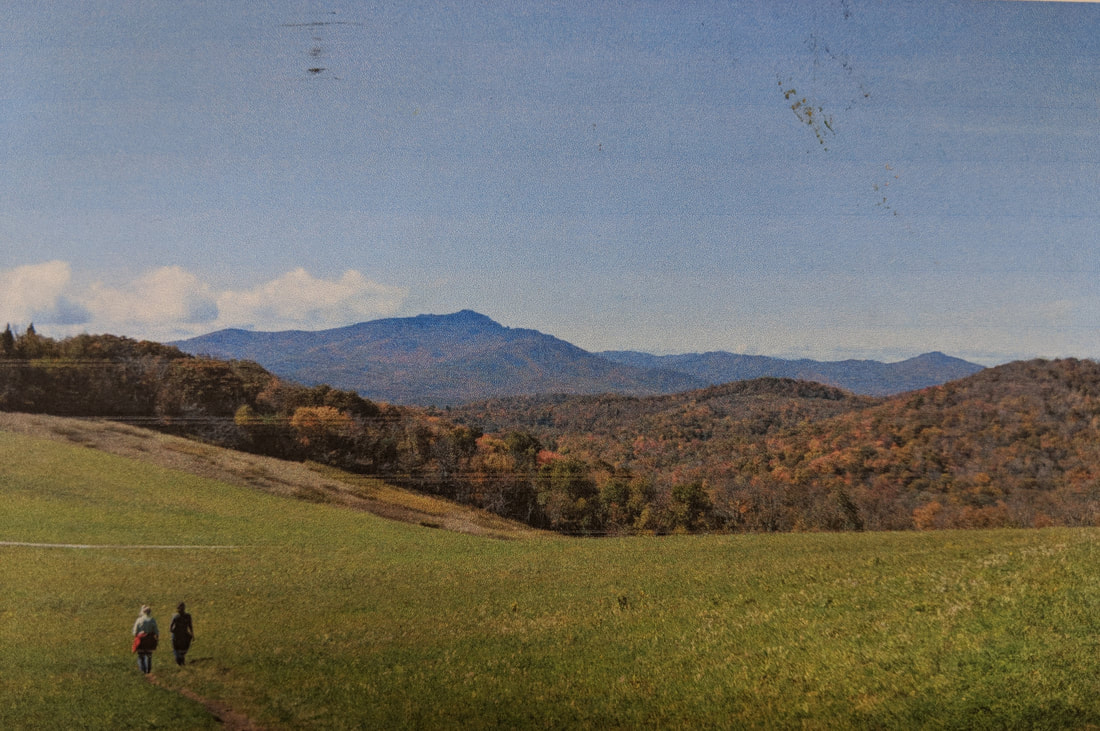
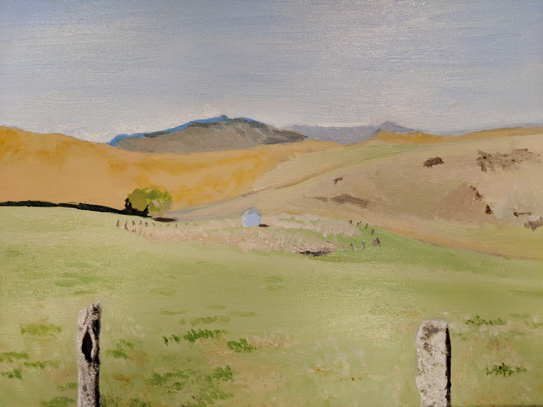
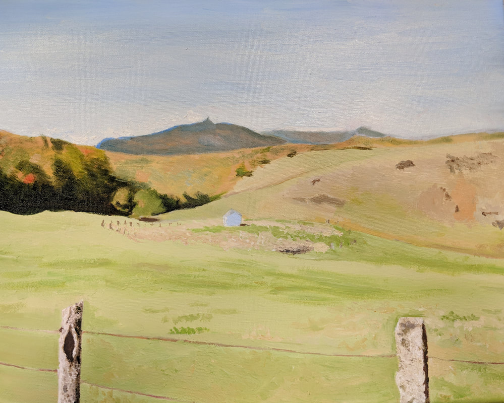
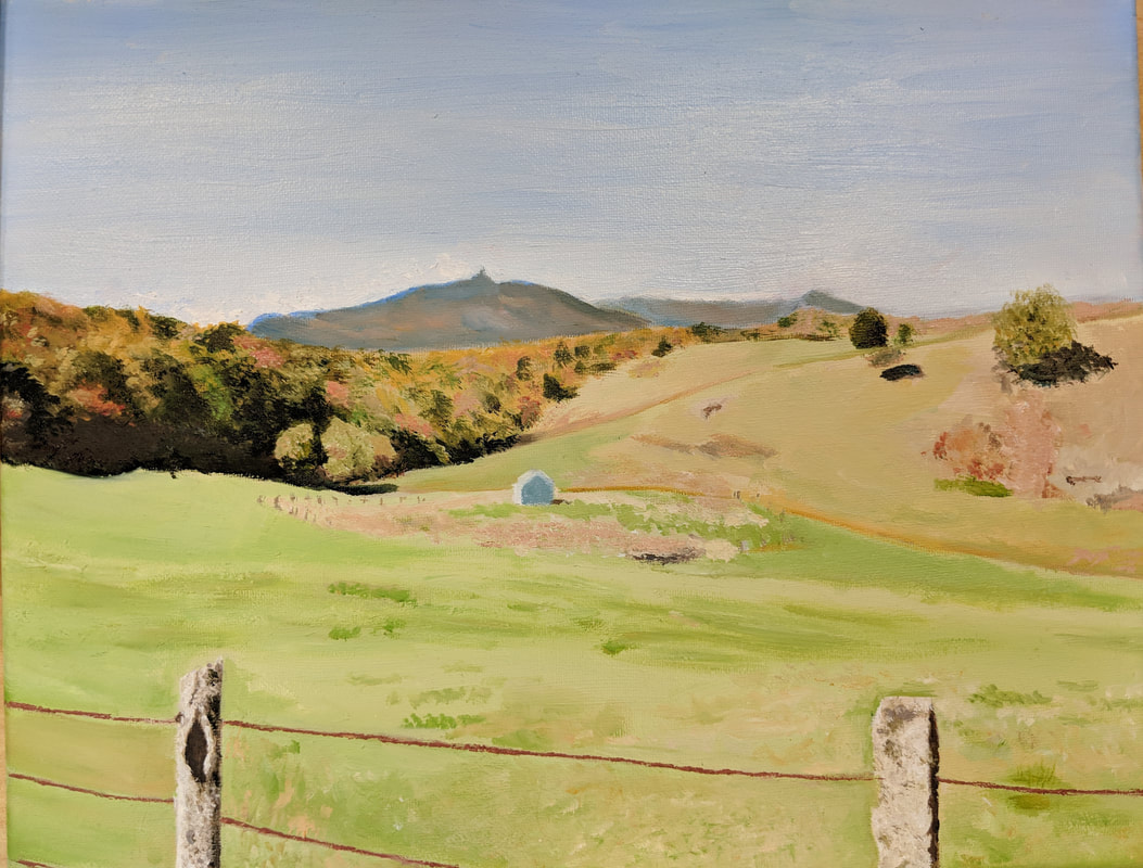
The photos above are the reference photos that I was choosing between to use for my oil paint landscape. I chose to use the second image for my final piece.
The photos above are the in progress photos of my landscape painting using oil paint. This series of images demonstrates the process by which I completed this piece. I started by adding light base colors for main sections of the picture, and then I built up the colors from there.
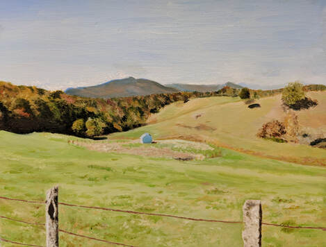
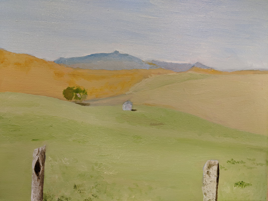
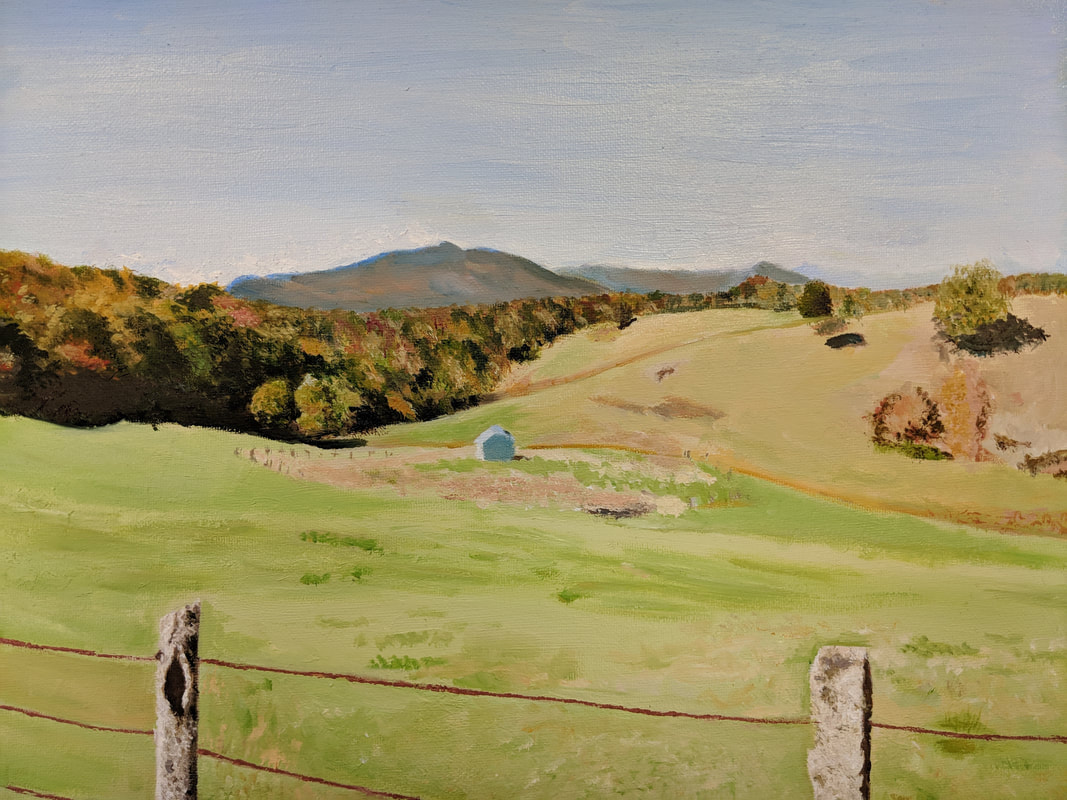
"Moses Cone"
The image above shows the final product of the oil paint landscapes. The painting is of a landscape in the mountains of NC, using a photo taken on a hiking trail at Moses Cone Memorial Park. I found this piece very difficult to create, which I am not sure is due to this being my first oil painting or just the difficulty of the image to begin with.
I started this piece by sketching out the basic lines of the hills and the wooden posts of the fence line. Once I had sketched out the format, I painted each section with a solid light color that showed up in that section. Therefore, for the closest grassy hills, I painted the section a pale greenish cream color. For the background hills I painted them a light green and gold mixture. Then, for the section that would eventually be the trees, I painted it a light orange gold color.
After I painted the primary sections of the piece with solid colors, I slowly built up the colors going from light to dark as I went. The first part of the painting that I painted in detail was the wooden posts of the wire fence. I started by painting them white, then I built it up with darker creams, grays, browns and yellows, while leaving white highlights. I used a very rough painting style for these posts because the wood looks very rough and textured.
When painting the grass, I built up from the light green base color and added darker green and gold mixtures. To create the texture of the grass closer to the front of the image, I roughly added colors over each other to appear more like clumps of overgrown grass and weeds.
I painted the sky by starting with a very light blue and adding darker blues to fade it from light to dark as it got higher into the atmosphere. Once the paint had dried somewhat, I went back over with white closer to the mountain tops to add the clouds.
Upon completing this piece, I have come to the conclusion that the most challenging part of this project was painting the trees. This is because the trees were far into the distance, which means that I don't have much details to put in to make them look realistic, and the trees had a huge variety of colors as it seems to be the beginning of fall, with some trees still green, and others turning orange, red, and brown. I painted this section like I did the others by building up colors from light to dark, and I used a mixture of dark brown and dark blue to create the shadows.
Overall, I believe that this is a successful piece, especially since this is my first attempt at painting using oil paint. I found it challenging, but I am happy with how the oil paint creates such vibrant and beautiful colors. It is not my favorite piece out of everything I have done, but I am proud of how it turned out.
Final Reflection
During the semester I gained a large amount of skills ranging from art to life experiences. One thing that has become very clear to me during this semester is that I have become even more of a perfectionist as I become more experienced in art because I am unable to ignore any little details in my pieces.
My best medium, that has become more evident the more pieces I complete, is prisma colored pencils. I used this medium for two of my pieces this semester. Both of these pieces, the reflection piece and the interior spaces piece, took me an extremely long period of time to complete since this medium is the one that I am the most picky about making perfect. I also learned that despite my extremely slow process that can often become very frustrating, the time that I put into my pieces is worth the end result. The "Dancing on Water" prisma color piece was the first one that I completed during this semester and I believe that the hours that I spent every day for a week during Christmas break were well worth the result because the tiny details in the water reflections is very important in creating the outcome that I wanted. The second prisma color piece, however, I am not as happy with because I was more tight on time and had to somewhat rush through certain parts of the piece. I know that others don't notice it as much as I do, but my eyes are instantly drawn to the places that I didn't do exactly like the photo and it is very frustrating to me. I have learned from this experience though, and despite trying to teach myself to work at a slightly faster pace, I know that if I want to truly feel successful when completing a piece, I need to stick to my own style and perfectionism.
Throughout the experimentation with mediums during this course, I have also learned that I have better luck working at a fast pace as well as being content with the piece when I am painting because both my acrylic self-portrait and my oil landscape came out fairly well and I was able to complete them in much less time.
When it comes to life skills, this class, as well as my previous art classes, have strengthened my patience. I have never been super impatient, but working on these art pieces has definitely pushed the limits of my patience and I came out of the class better because of it.
One thing that I value from this class is the critiques that we have because it can be very uplifting to give and receive positive feedback, and it is very helpful for improving our artistic skills to receive and learn from constructive criticism.
I am also glad that this class gave me the opportunity to explore and improve my skills with new mediums and mediums that I have rarely worked with before. The acrylic painting was the first time I had painted anything since freshman year, and I believe that this assignment greatly improved my skill in painting because I have become much better at planning out my paintings before I start them, and I have become better at mixing and matching colors to the reference photos that I use. I am also happy that I was able to use oil paint for the first time because it helped me develop my skills in painting using a type of paint that I was previously unfamiliar with. In addition to the painting pieces, I am glad that I had the opportunity to choose the medium for a couple of the pieces, so that I could become more experienced with watercolor pencils. Although, the outcome of this piece was my least favorite of all my pieces during this semester, I believe that considering my lack of experience with the medium, I did fairly well, and I know that if I gain more experience with this medium, I will be able to improve my skills.
