Skill Assessment Drawings
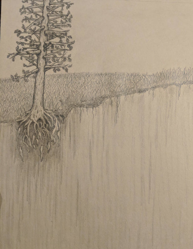
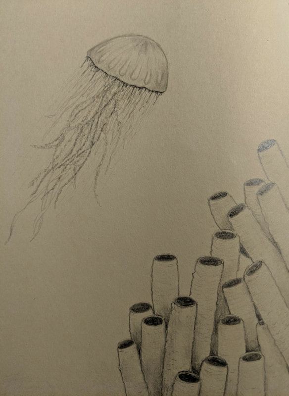
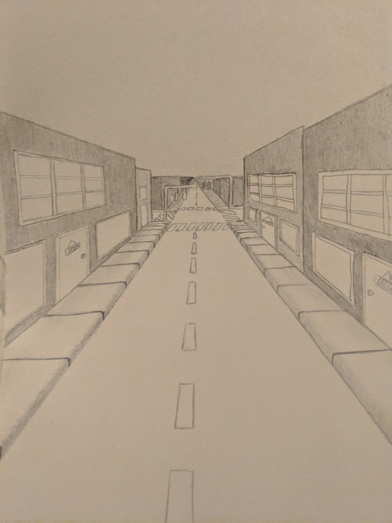
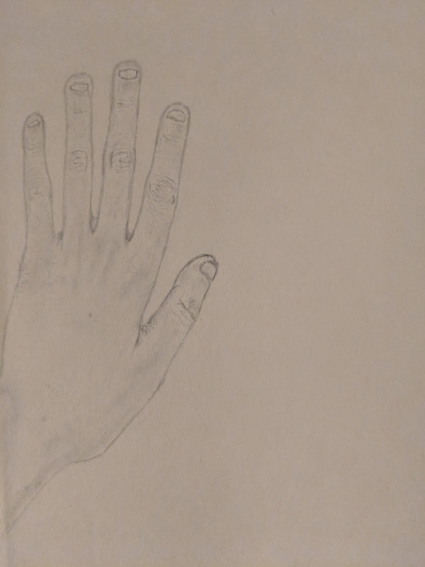
For this assignment, we were tasked with drawing first a tree with leaves in a natural landscape, then drawing an animal, a perspective drawing of a street and finally drawing a hand. These drawings were assigned in order for our level of practice and knowledge of art techniques could be evaluated. Each of the drawings were given in order to specifically test a certain type of art skill. We also had to create these drawings without using any reference photos.
Still Life Objects Practice
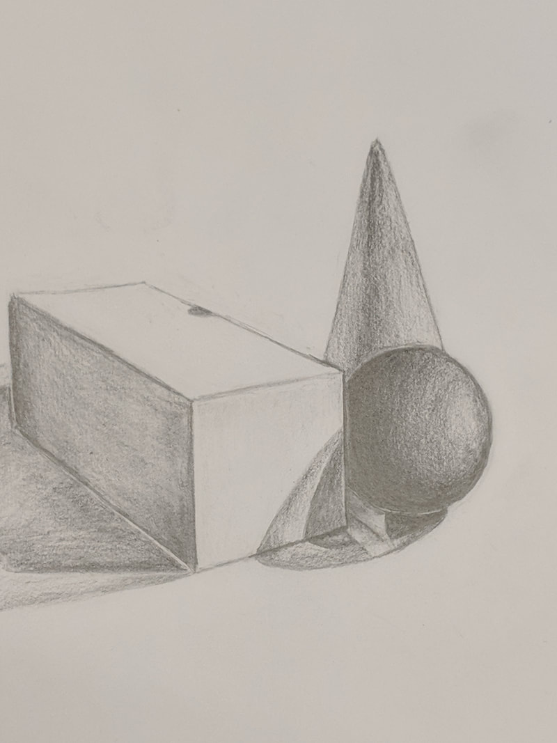

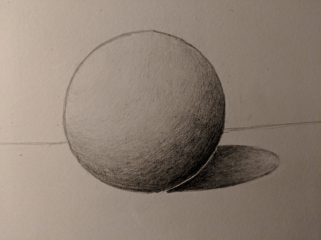
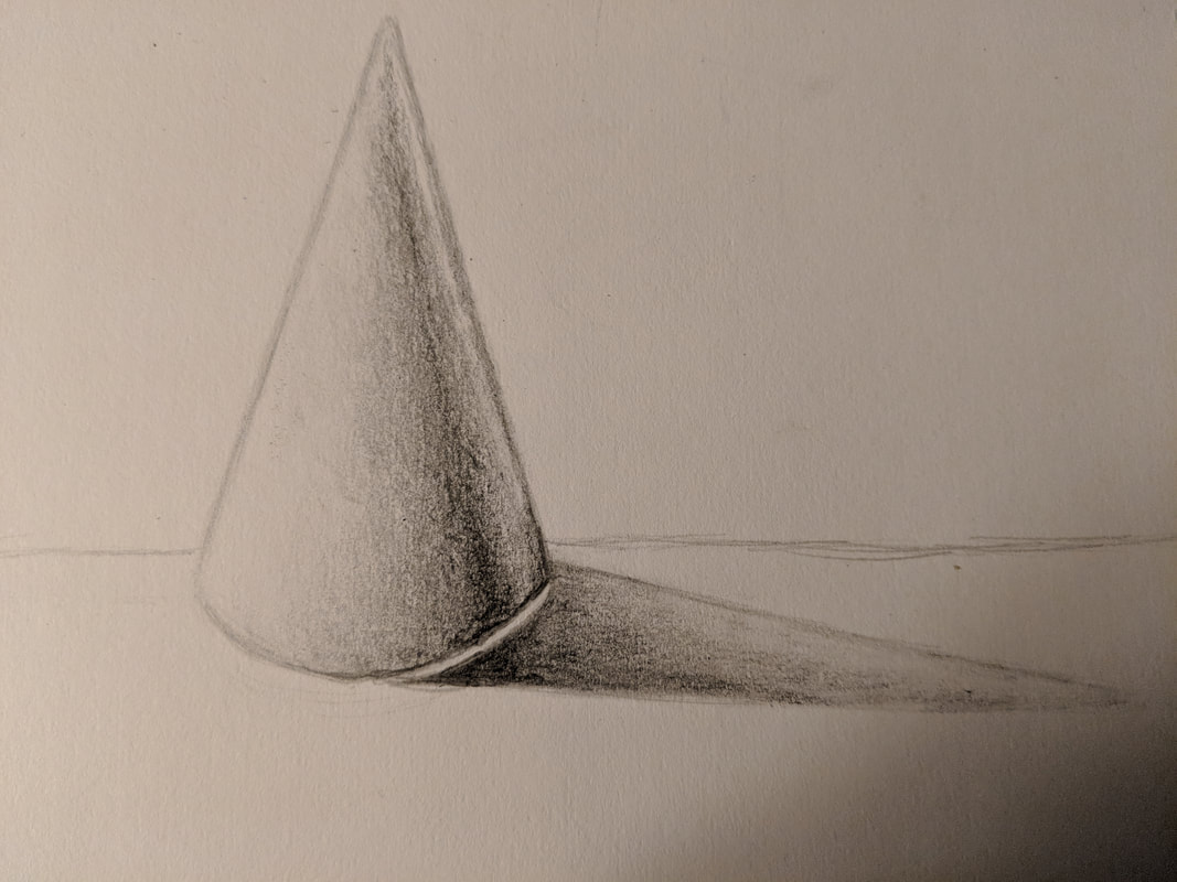
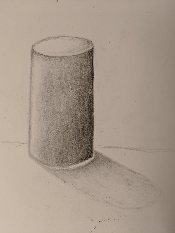
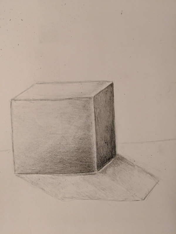
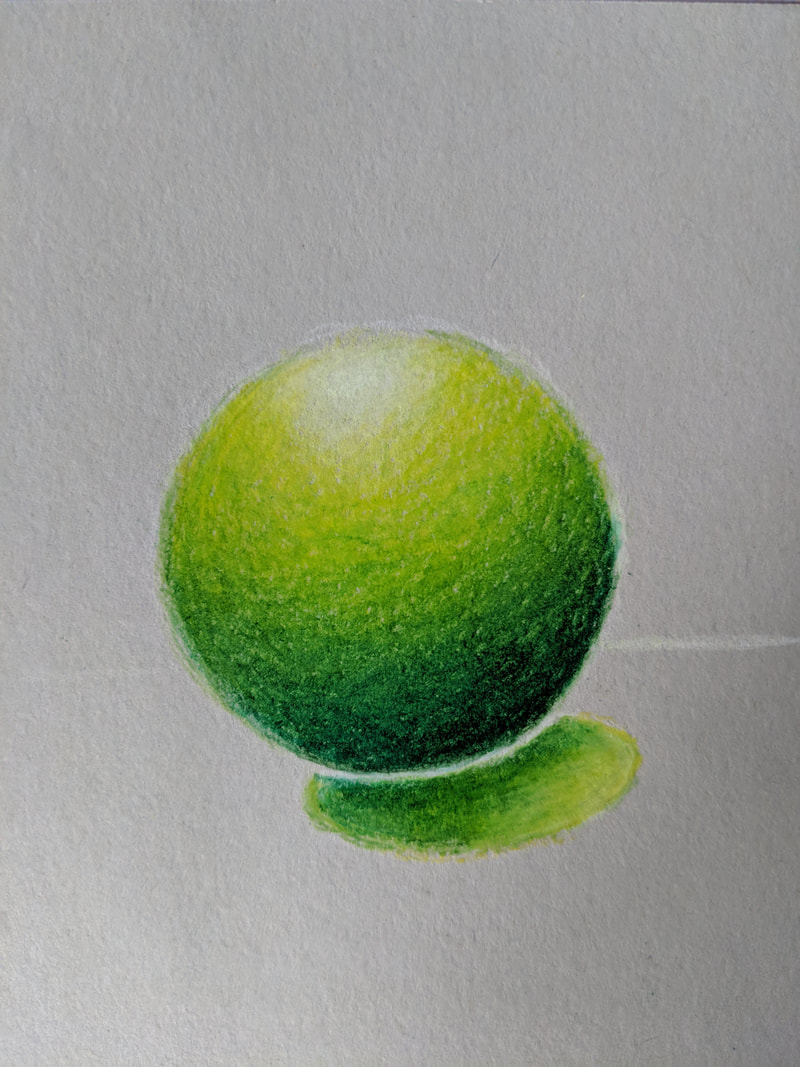
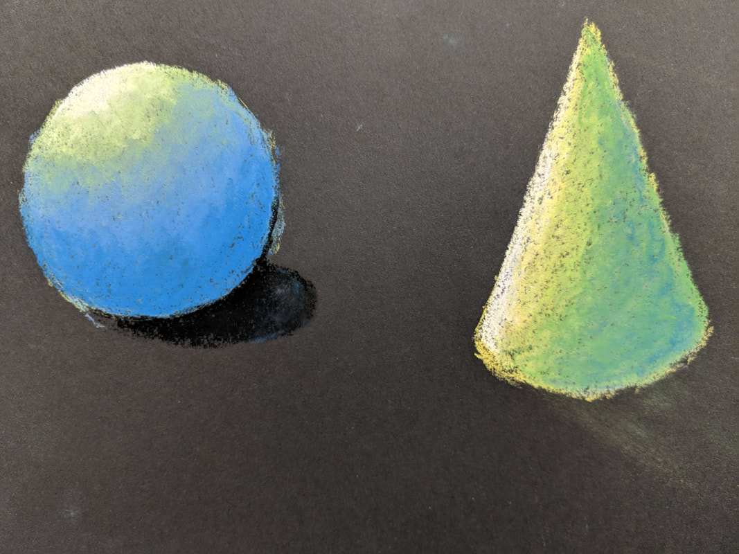
In the above drawings, we practiced drawing still life objects with light creating many different contrasting values. In the first image, we practiced drawing multiple objects that, due to the multiple spot lights used, cast shadows upon each other and onto the table in various ways. This drawing was done using graphite pencils. In the second drawing, the same process was repeated except prisma colored pencils were used in order for us to practice blending a few colored pencils to create strong values. The remaining four images above are each drawings of individual three-dimensional shapes in order to practice and visualize basic values and shadows of objects with a light source from one direction.
Still Life Project
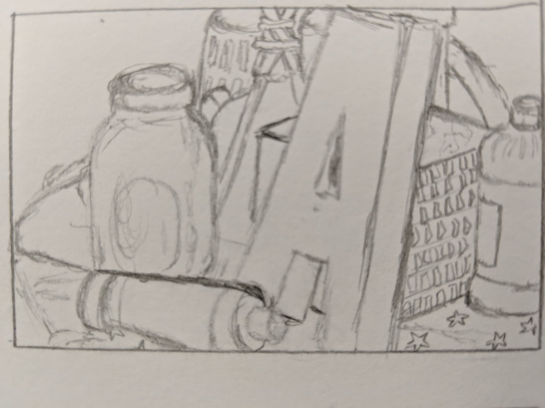
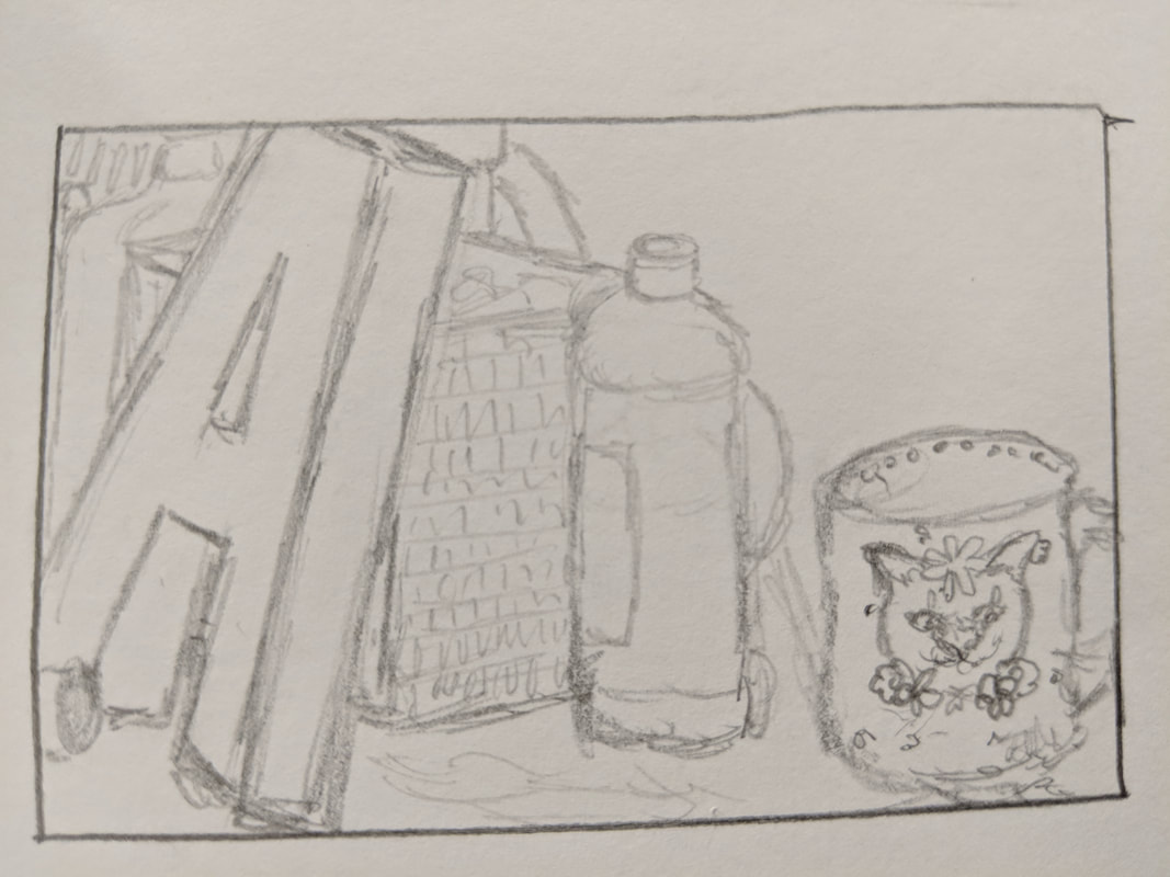
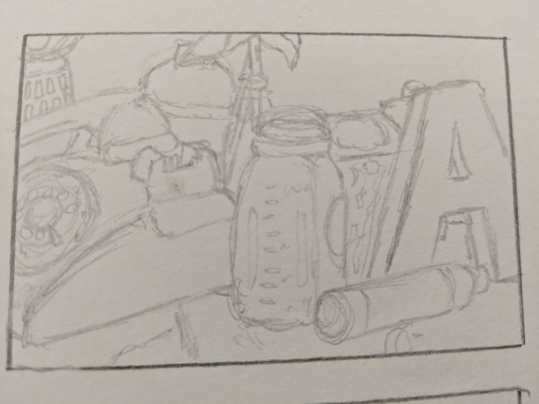
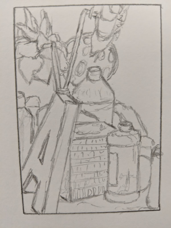
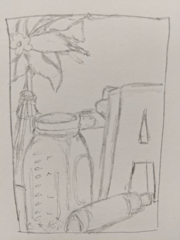
The five drawings above are practice sketches for my still life final drawing. They are each different sketches of angles in which i could use to create my final piece. The fourth practice sketch is the perspective in which I chose to use for my final drawing.
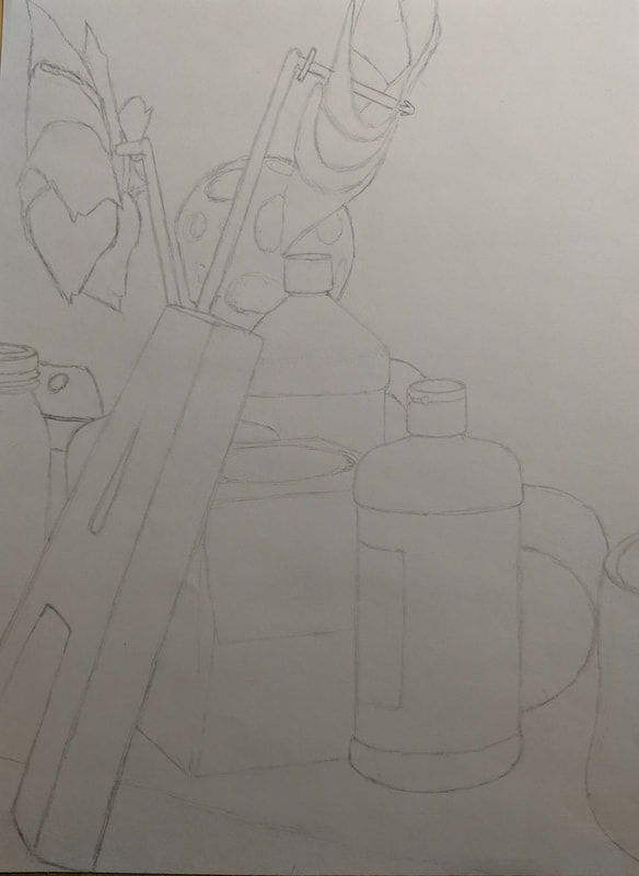

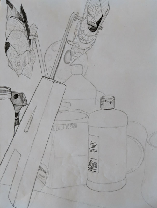
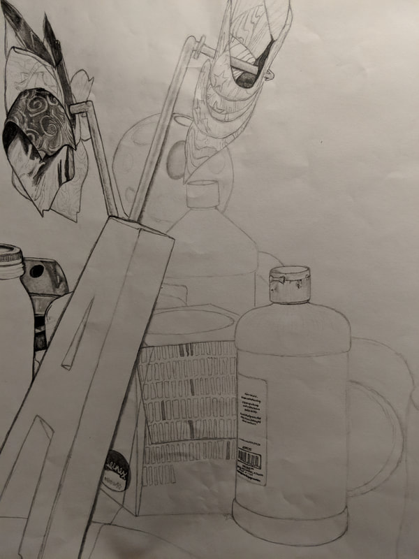
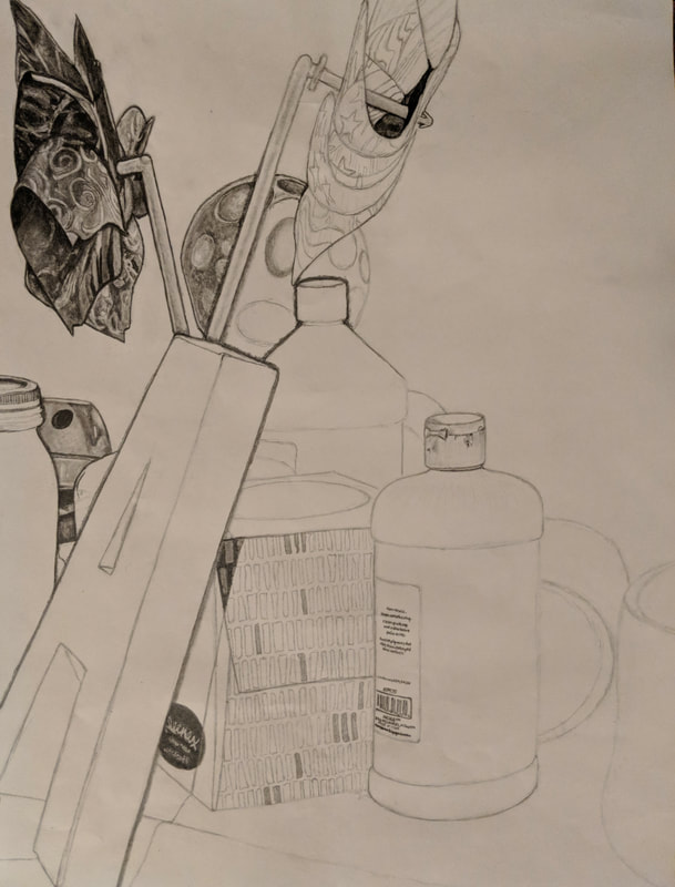
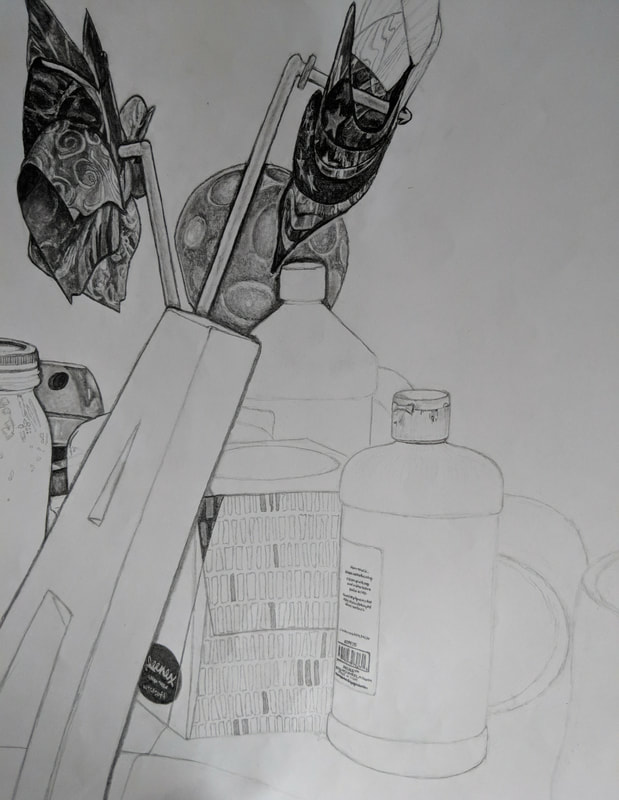
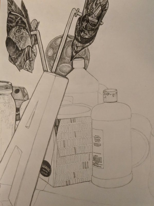
The photos above show the stages of my final still life drawing as I progressed. The first photo shows how I sketched an outline of every object before beginning to add value. From there, every photo shows my progression as I worked on adding value from left to right on my drawing.
- Describe how you arranged your composition. Discuss your use of the elements and principles. Is it a successful composition? My composition was arranged in a way that, when I chose an angle of the table full of objects, the objects were set in a vertical arrangement in which the area has negative space in the upper right hand corner of the piece. Since the objects are overlapping in front of each other, I had to use emphasized values for shadows to distinguish the edges of the items. I also had to accomodate for the depth of the photo, by this I mean that I had to make sure that the farther back an object is the smaller it gets. Doing this and solid, distinguishable values, I was able to create a more realistic three-dimensional affect. This is a successful composition because it shows how different techniques applied with graphite pencils can create a realistic portrayal of reality through the use of highlights in glass, shadows across neighboring objects, and small details that may often be overlooked at first glance.
- Did you use a wide range of values? (A range from white to black with at least 9 values). Explain how is this evident? I used as wide range of values as I believed possible in order to create contrast throughout the drawing. It is evident that I used at least nine different values when observing my drawing because the shadows and darker colors have the darkest shading, while things that are light in color or have reflections and highlights have hints of bright whites.
- Explain how your knowledge and creating practice studies with value contributed to your piece. My prior knowledge of value contributed to my piece because I have developed certain strategies and procedures of how I will draw using graphite pencils. I first used these skills by reminding myself that I should never start with dark values, I always sketch and shade lightly so that I have the ability to erase later in order to bring out white highlights. Creating practice drawings with value also contributed to my piece because besides being extra practice, doing these drawings allowed me to refresh my memory of creating realistic values as well as retrain my hand to use the right amount of pressure in order to create different values.
- Describe the blending and transitions in your objects (discuss your use of pressure with pencil and other techniques to achieve this).
- Explain how your interpretation of texture is essential in capturing the look of the object.
- If you could recreate your pieces what would you do differently to enhance the final outcome?
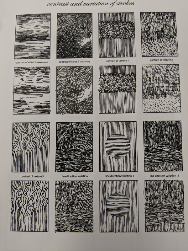
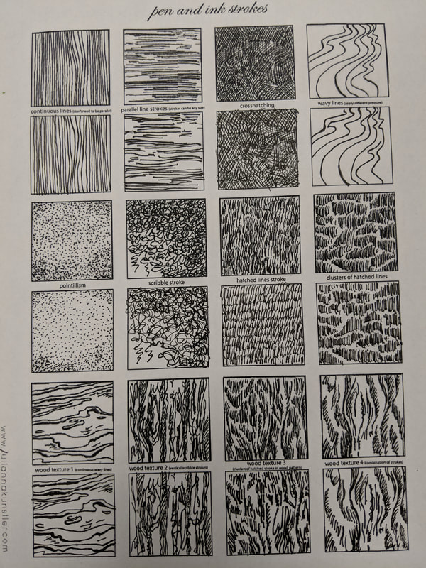
Pen and Ink Unit
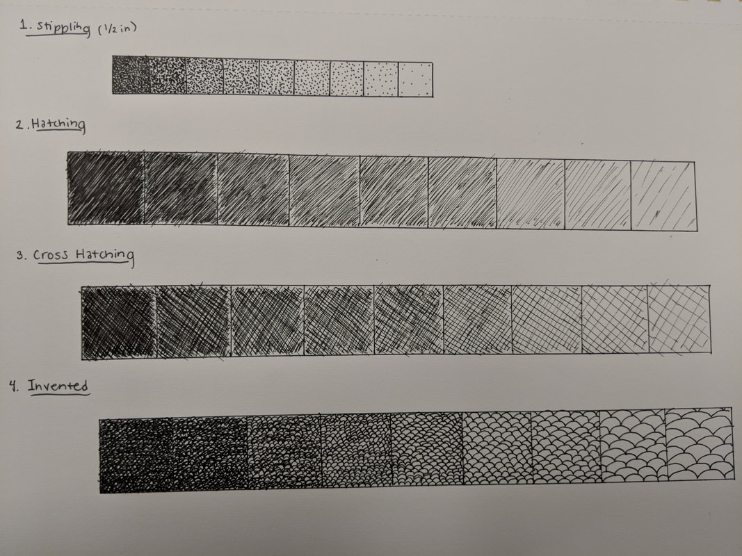
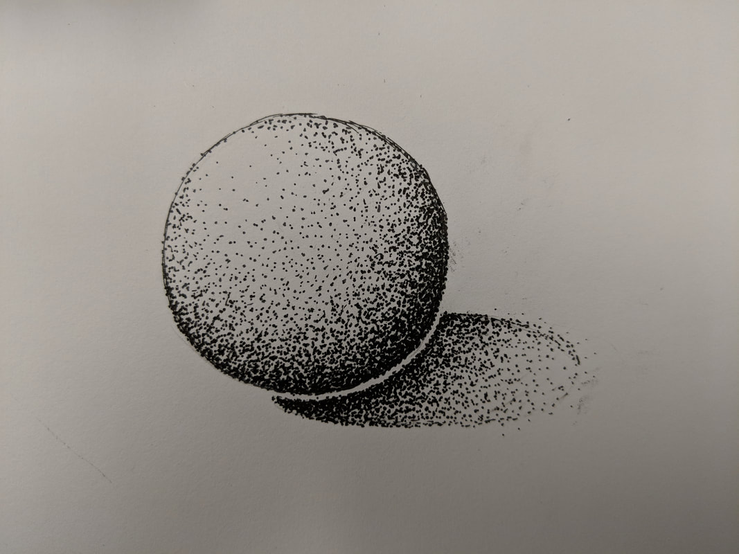
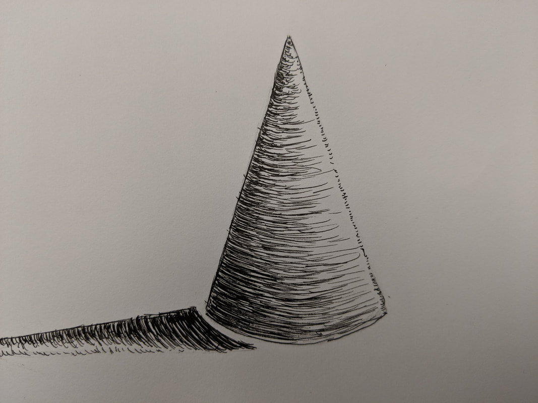
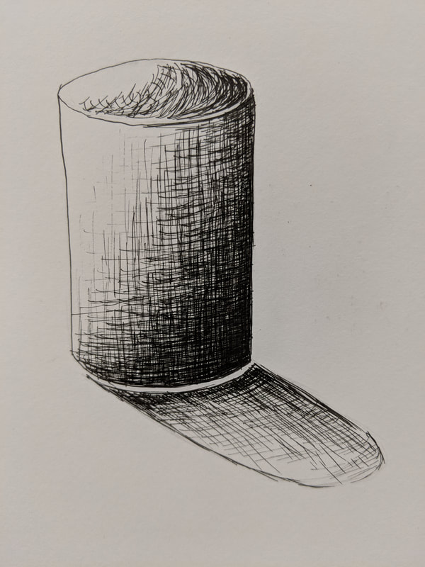
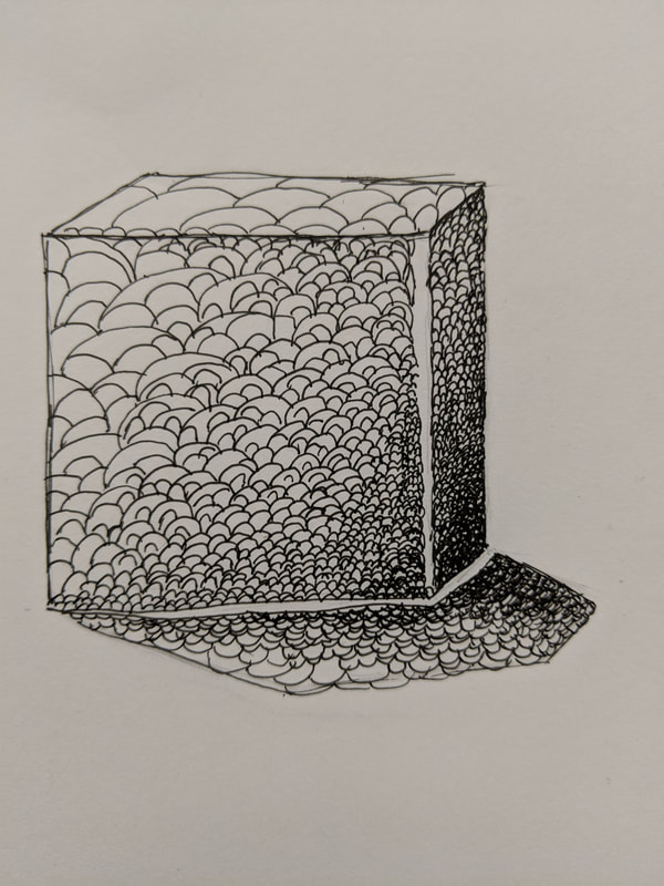
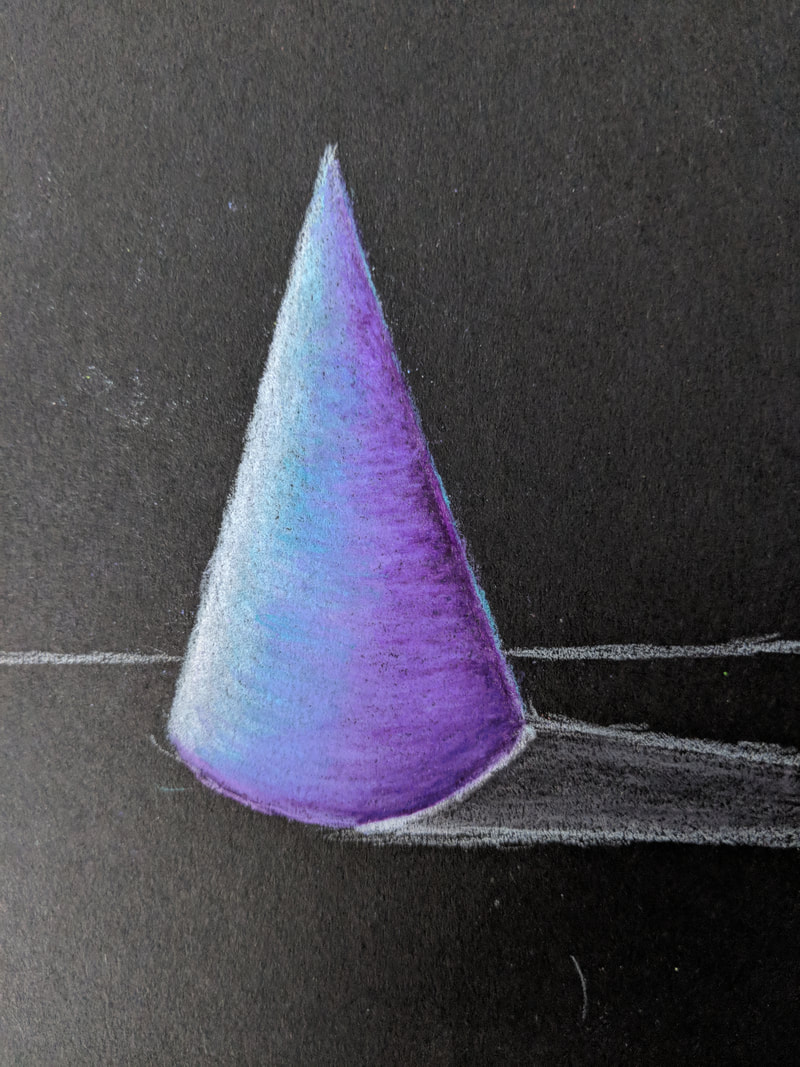
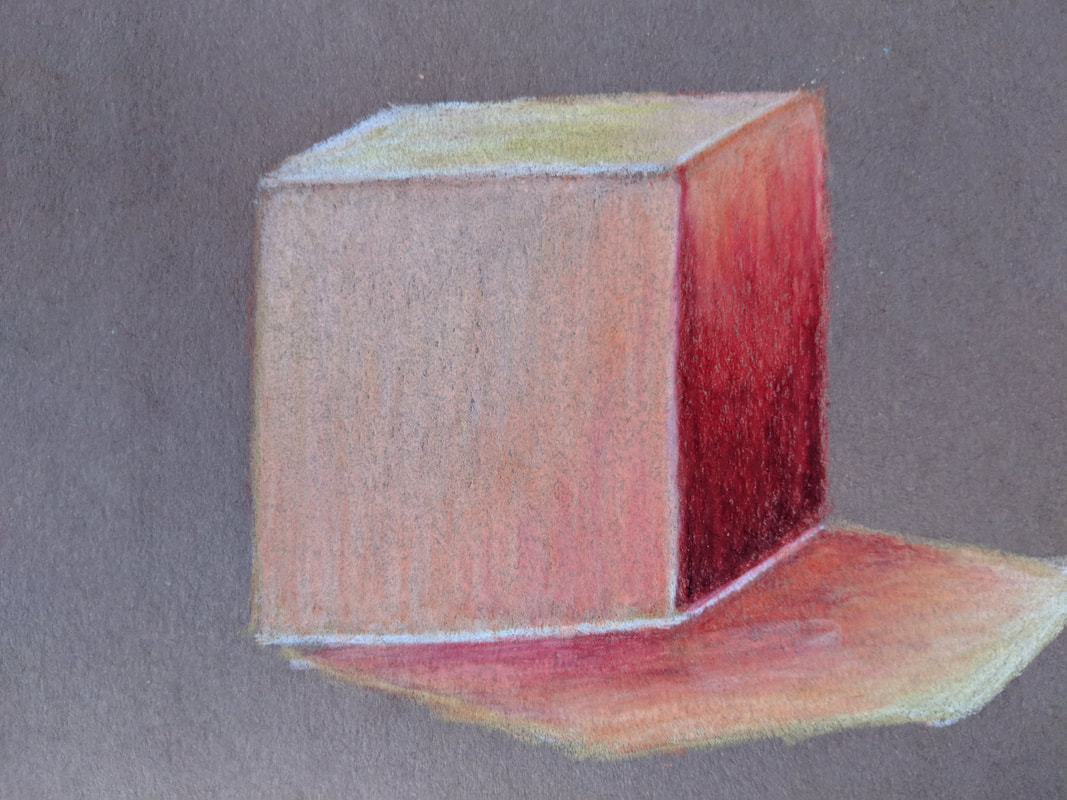
In these photos, we practiced the use of pen and ink to create value through different techniques. In the first photo, I created four value charts. The first value chart, 1/2 in by 1/2 in, has 9 boxes using the stippling technique. The second value chart uses hatching, the third uses cross-hatching and the fourth uses an invented technique. These three charts are 1 in by 1 in. The second photo shows a sphere that was drawn using stippling. The third photo demonstrates the use of hatching to create values in a cone drawing. The fourth photo shows the use of cross-hatching to create the three-dimensional appearance and values of a cylinder. The fifth photo uses the invented design I created in the fourth value chart to create the values of a cube.
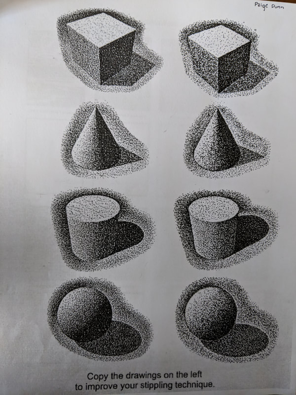
In the above three photos, I filled out three pen and ink drawing practice worksheets. In the first photo, I filled out a stippling practice worksheet in order to practice creating values of shapes with the stippling method. In all of these worksheets I practiced using different pen techniques to create values and textures by copying the provided images.
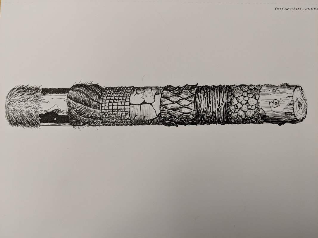
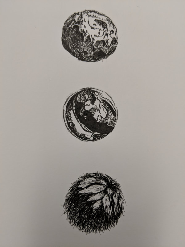
The two drawings above were done in pen and ink. In these drawings, we were asked to watch two different videos, one drawing a log with different textures and values and the other drawing spheres with different textures and values. I followed the video step by step to create my own copies of the pen and ink drawings. These drawings allowed me to practice the use of pen and ink in creating real life natural textures, and helped me learn to still create a 3-dimensional appearance while using pen.
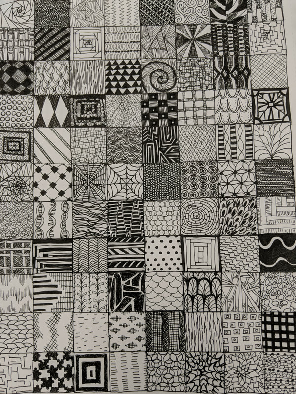
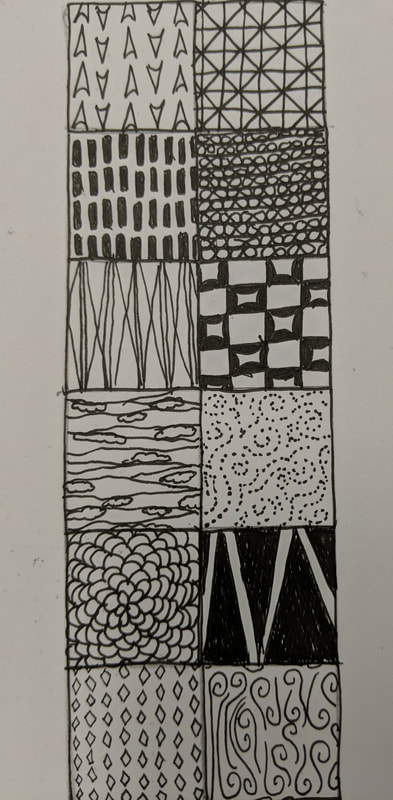
In the photos to the above, we created 100 (88 in the first photo, 12 in the second), one inch by one inch boxes, in which we designed 100 different patterns with a variety of values ranging from very light to very dark. The purpose of this is to use these designs in our next project by creating an image using the values we created in each of these patterns.
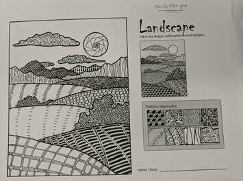
In the above photo, I used chosen patterns and design that I created in the 100 boxes to create the textures and values of the scene provided. This is a practice for our final pen and ink assignment where we will use the designs to create values in a scene that we create.
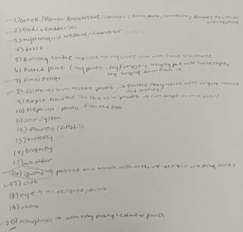
The photo on the left is the list of twenty potential ideas of what I will draw for the Pen and Ink Pattern Final Project. The better ideas of these included Greek or Roman architecture, gods and goddesses, mythological creatures, dress design, California architecture, an iguana, a crab, or a kangaroo. Out of these the two ideas that I selected to create compositional sketches are the California architecture and the iguana.
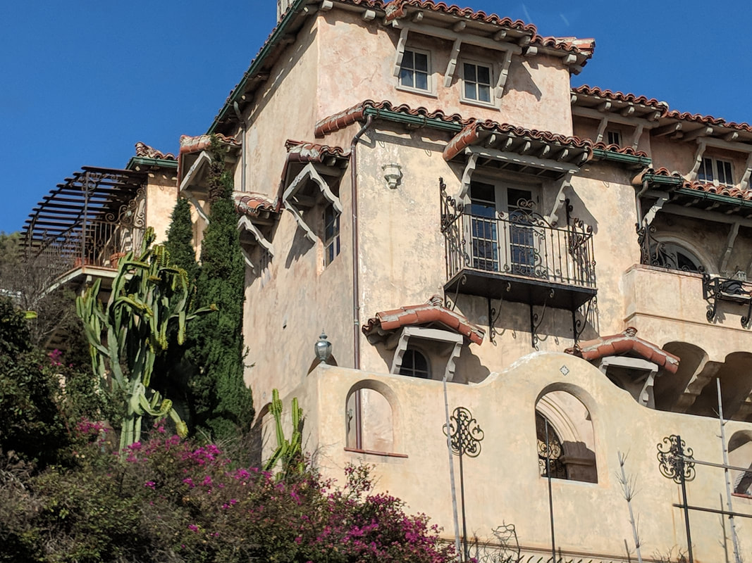
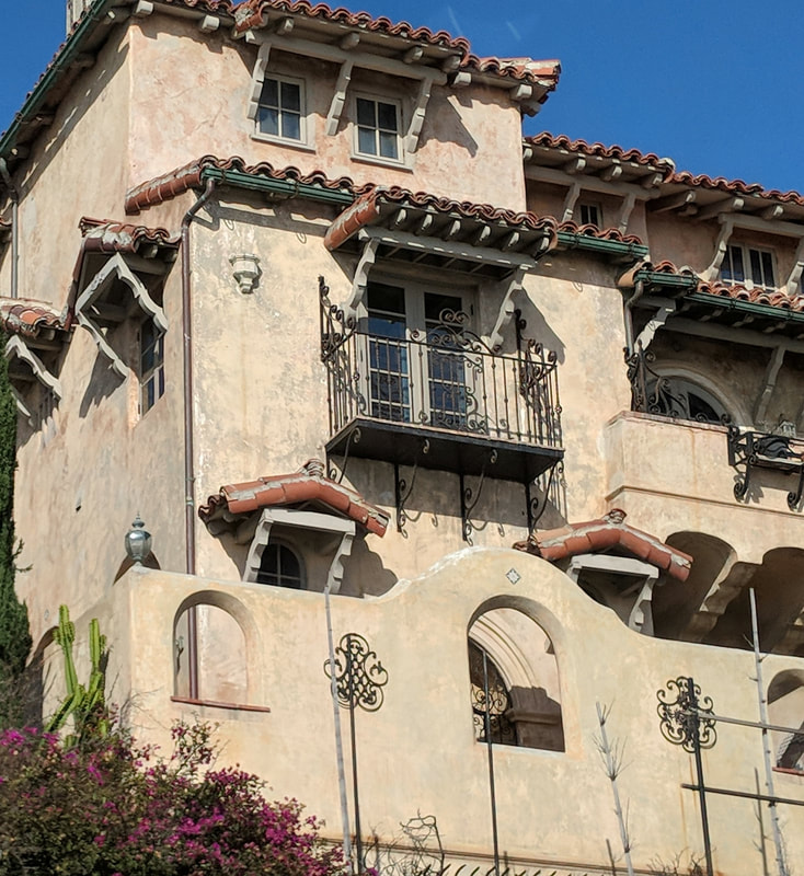
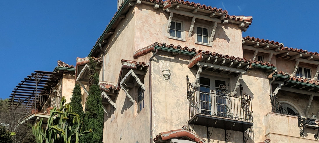
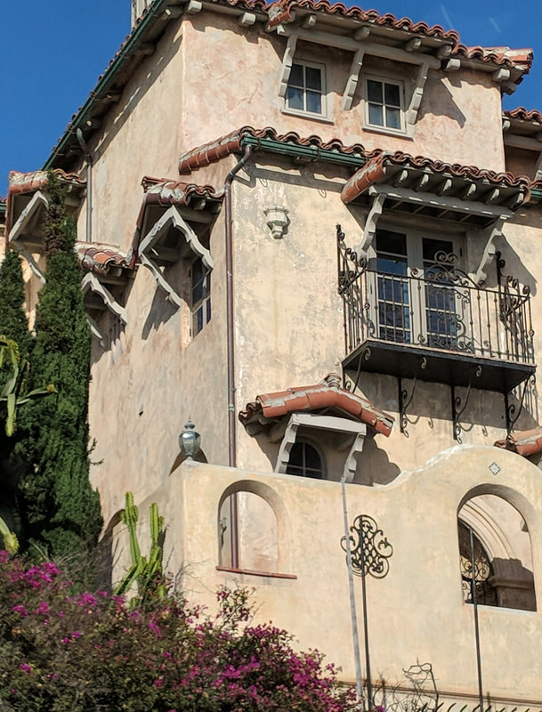
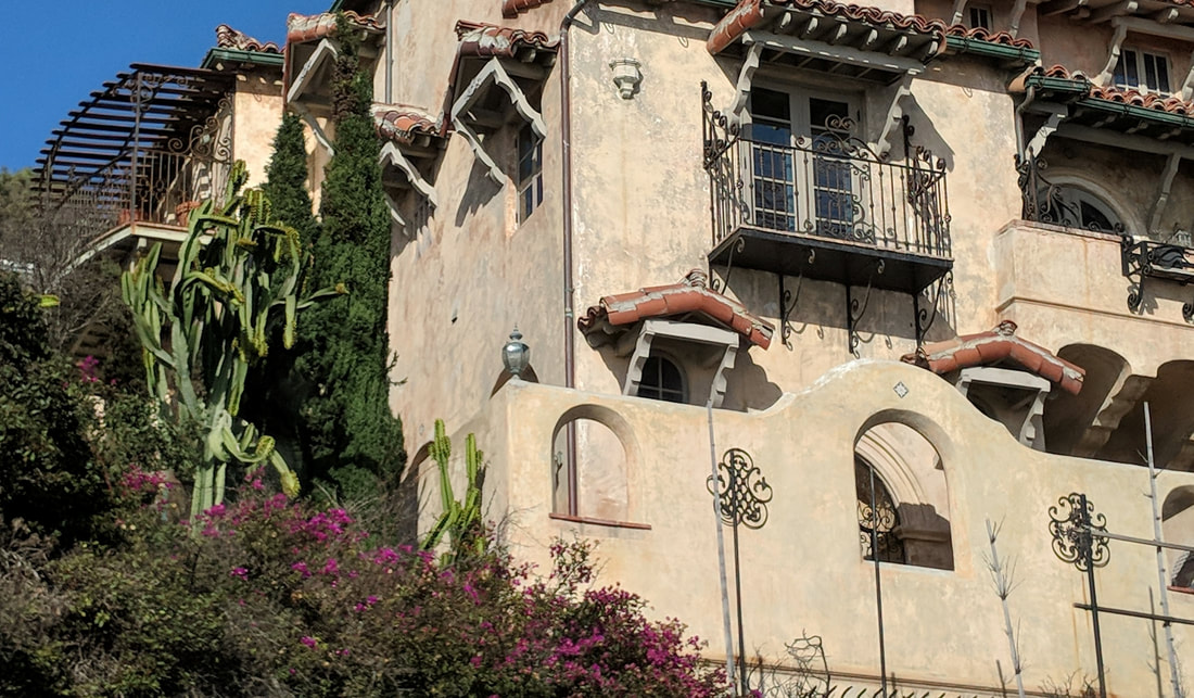
These photos are the composition photos I am potentially using to create my final pen and ink project. This is a photo that I took in Los Angeles, California and it is cropped in different ways.
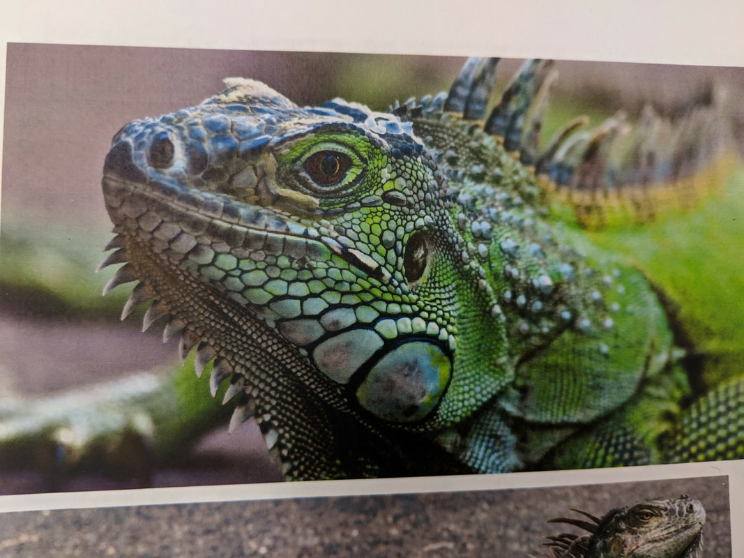

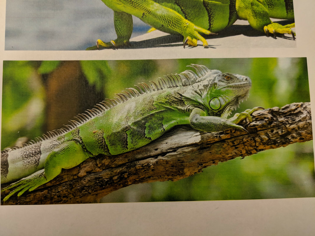
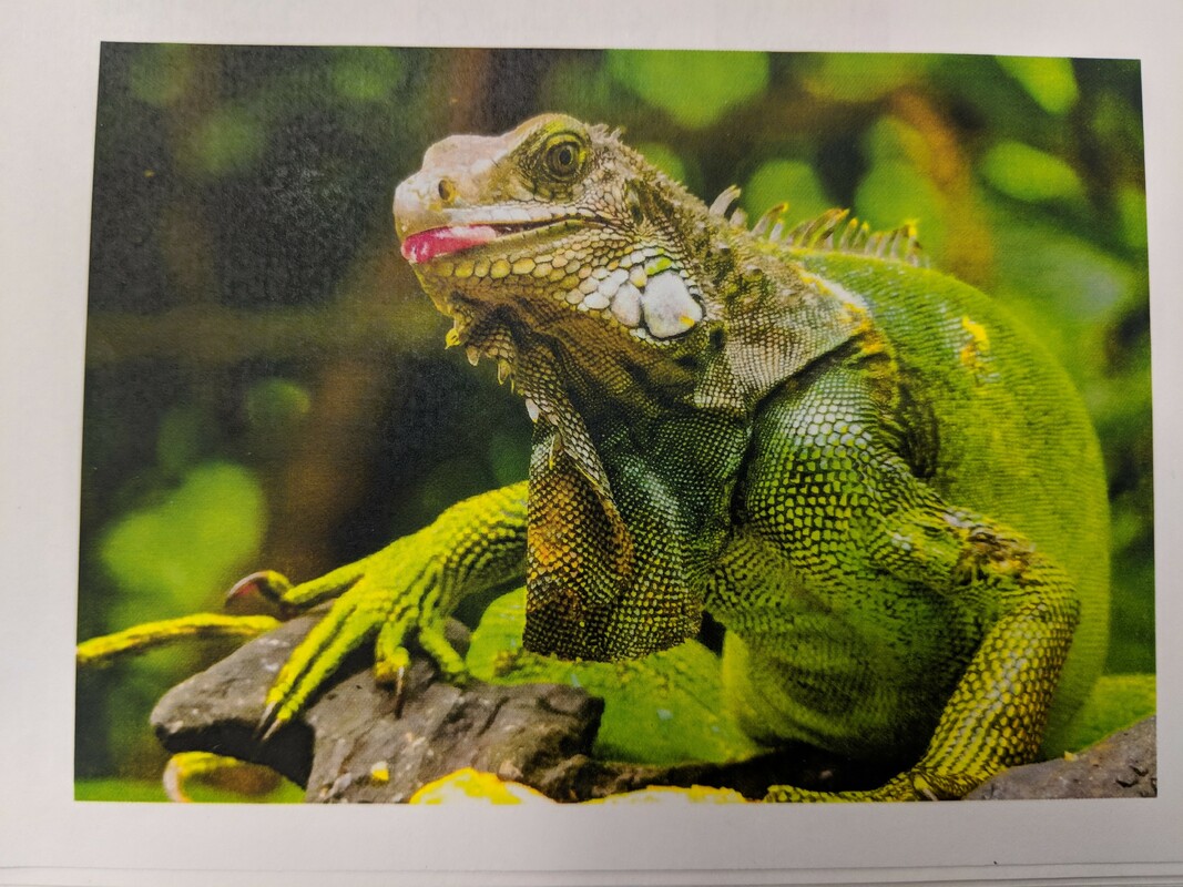
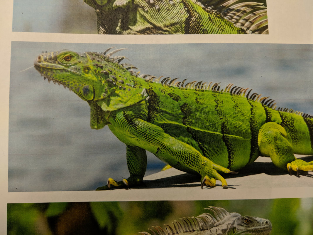
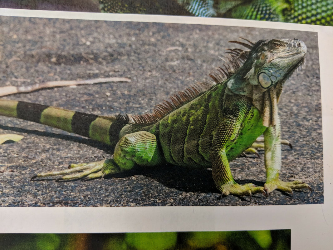
The above six photos are reference photos that I used to create my pen and ink iguana drawing. These photos depict multiple different iguanas in different positions. I used these reference photos to create the compositional sketches below by using elements of each of the photos in each of my sketches.
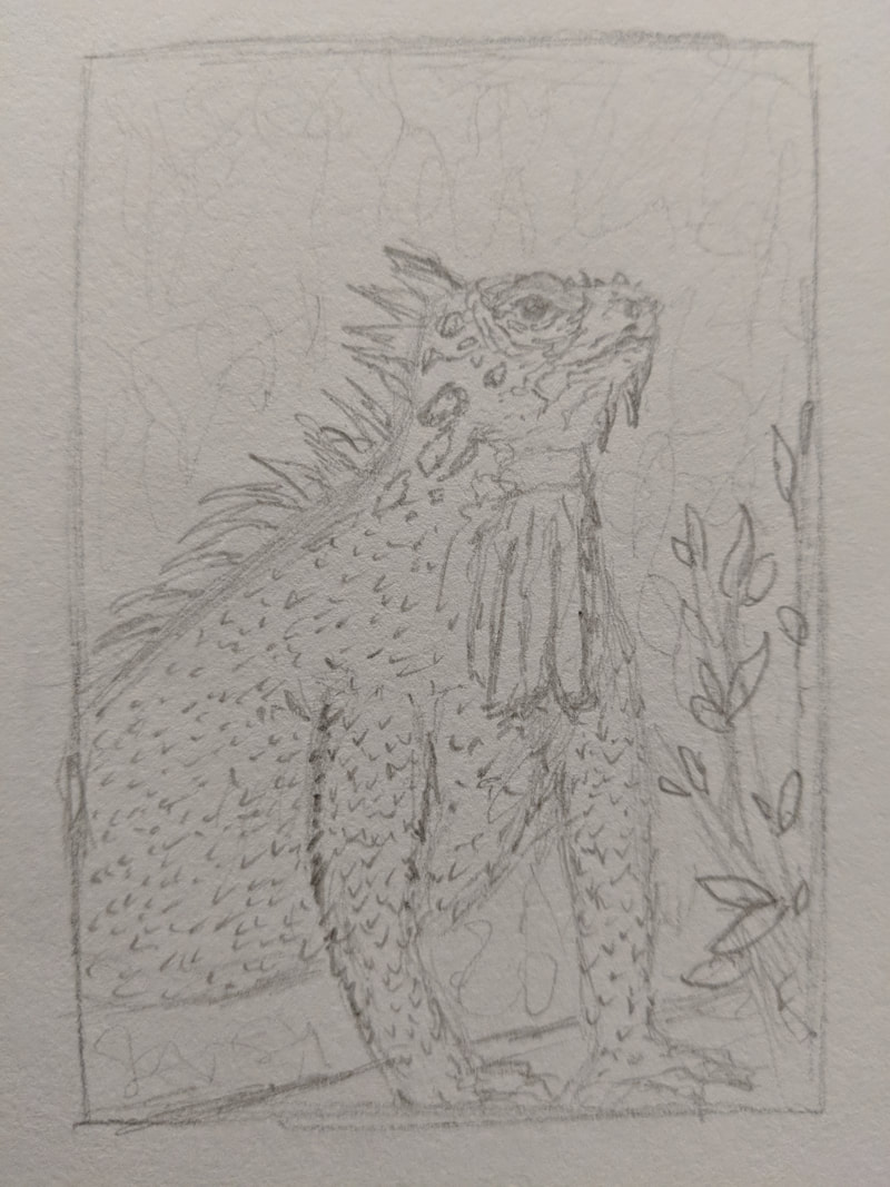
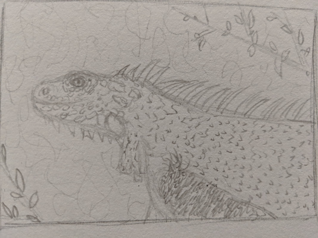
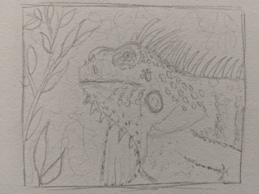
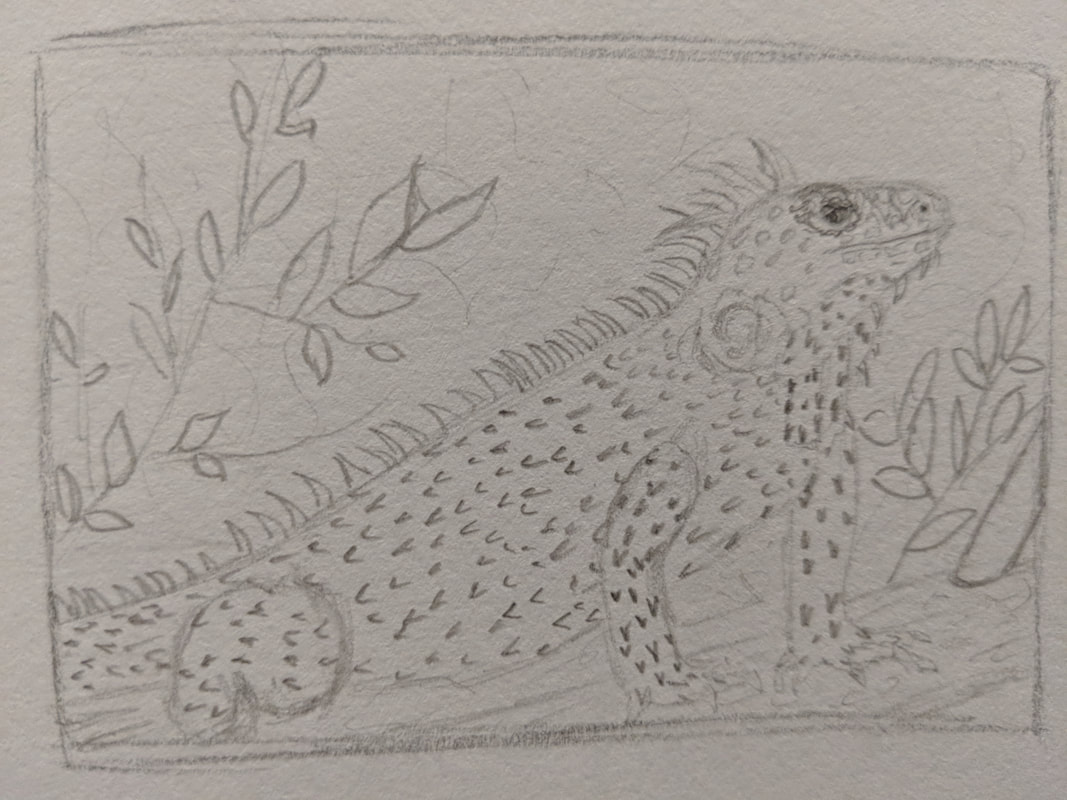

The above photos show my five compositional sketches of an iguana that I created by combining elements of the six reference photos in the previous post. I chose compositional sketch number three to use for my final piece.
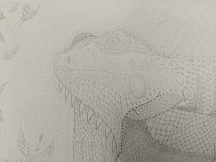
The drawing above is my final sketch for my pen and ink project before creating a final drawing using pen. In this drawing I used a graphite pencil to plan out what I wanted my drawing to look like and decide on all the patterns that I would use to resemble the textures of the iguana and its surroundings. Creating this first allowed me to work faster when it came time to do my final drawing because I didn't have anything left to plan out and I could just jump right in and finish it.
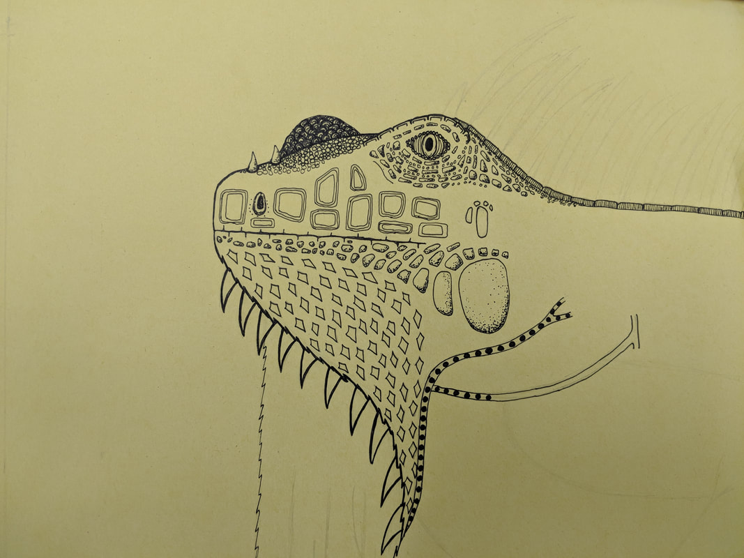
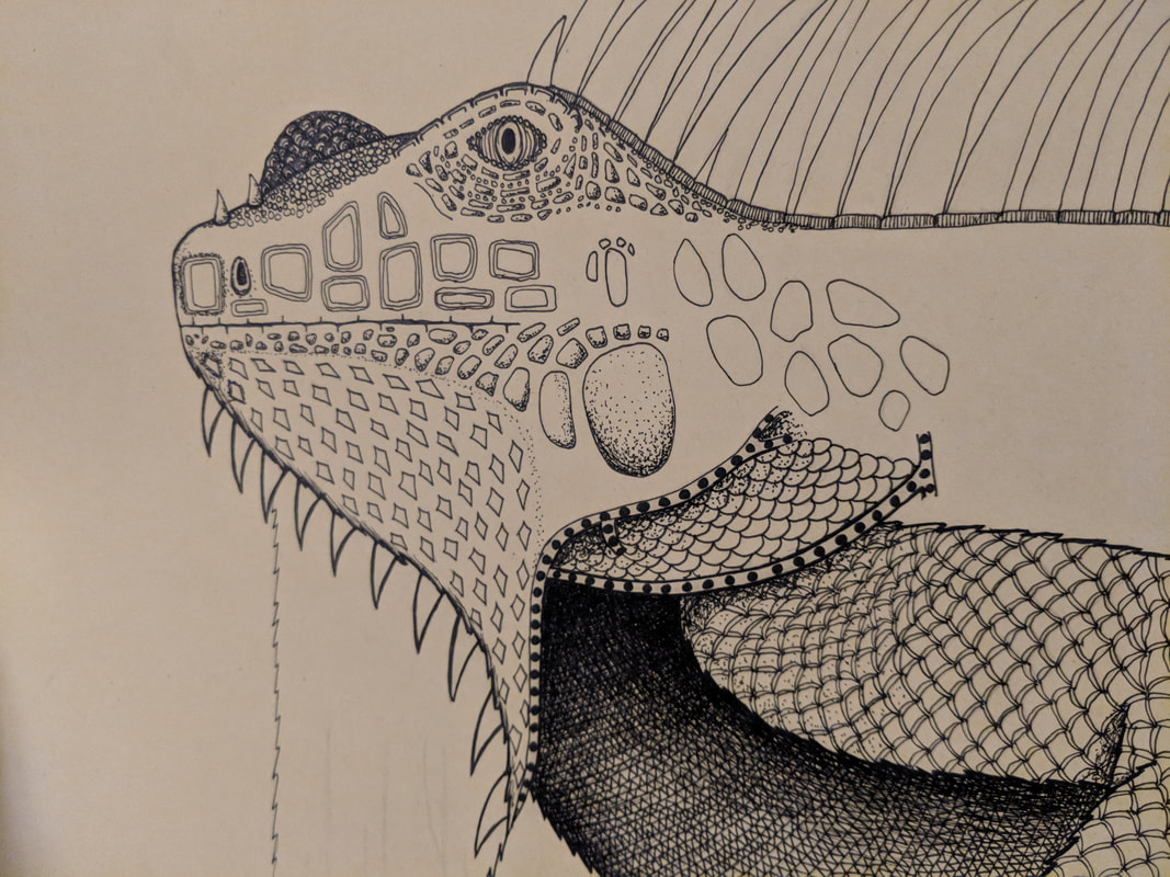
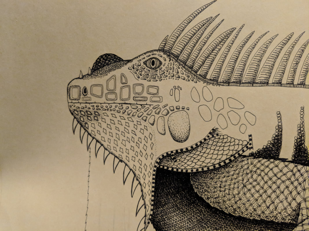
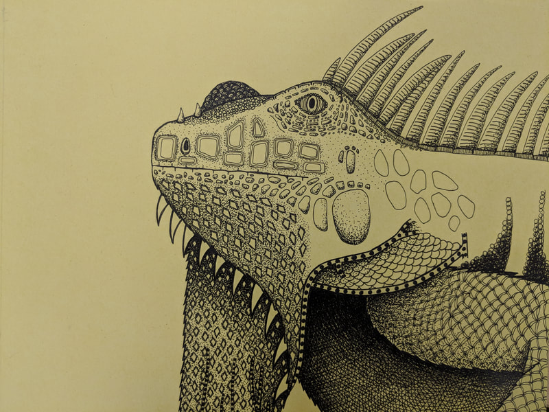
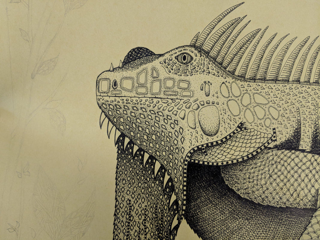
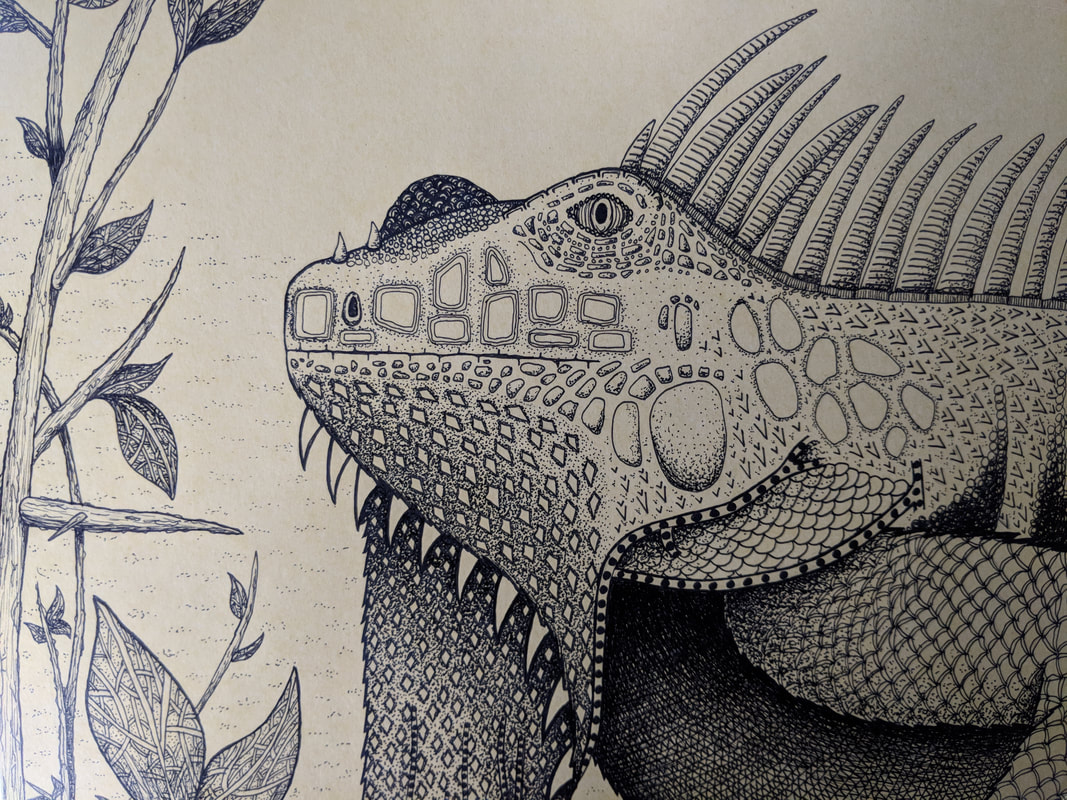
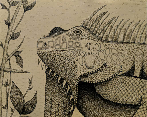
- Describe how you arranged your composition. Discuss your use of the elements and principles. Is it a successful composition? I arranged my composition by first laying out the outline of my iguana in graphite pencil and then going to do it in pen and ink. When using the pens, I started by only doing a basic outline over the pencil without the patterns and designs. Then, as I went, I added designs that correlated with the texture of an iguana's actual scales and the direction of them. Once, the designs were added in, I added shadows and darker values to emphasize parts of the iguana that would be shaded from the sun by using both hatching, cross hatching, and stippling depending on what pattern I was going over. This was a successful composition because I was able to still catch the realistic elements of iguanas while making a somewhat abstract drawing through pen techniques and patterns.
- How is texture and pattern are important in your composition? Texture and pattern are both very important in my composition to make it a successful piece. Texture is important because it gives a three-dimensional feeling to viewers that makes them understand what it would feel like in real life. Patterns are also very important because they can be used to create depth based on varying sizes of the pattern.
- Why is value so important in this project? Value is very important in this project especially because of the use of pen and ink. Pen and ink needs emphasized value because the ink on its own is a solid dark color, therefore, the emphasis of value through layering and other pen techniques is crucial when creating a bold piece that has contrast between objects or different parts of objects.
- Describe your craftsmanship (How well the project is crafted technically). This project was carefully crafted by doing numerous practice sketches, full pencil drawings and tracing of pen over pencil that was already exactly where I wanted it to be. All designs were drawn slowly and carefully so that they would remain as consistent and neat as possible. This is very important when using a pen medium because of its bold and irreversible nature. Whenever I added shadows and dark values, I layered the pen with thin layers at a time and repeated the process over and over again in order to prevent a mistake.
- Explain how your knowledge and creating practice studies with value and pattern contributed to the success of your piece. My knowledge of creating value and pattern using pen and ink was greatly influenced by all the practice that we did. I completed multiple pen and ink tutorials, worksheets and practices before creating this drawing. All of these practices allowed me to become comfortable with controlling pen techniques and creating realistic depth and textures. These techniques led to my success in the final project because I had to combine all my knowledge to create both an abstract but still realistic elements in my drawing.
- When applying the pen and ink/pattern techniques why and how is it important to make sure you understand the concepts taught in class? When applying the pen and ink/pattern techniques, it is important to make sure that I understand the concepts taught in class because using those concepts are key when hoping to create a successful piece. This is because in class we practiced creating a large enough variety of values that all the shadows and pieces of the drawing can be distinguished from each other. I had to remember when creating the final drawing that I must leave certain areas with a light value and not add much pen to them, and I also had to really emphasize and layer the dark pen to create the dark values so that the lighter parts of the drawing would stand out.
- As a growing artist how do you think what you have learned will guide and better your future projects. Explain. As a growing artist, I think that what I have learned will guide and better my future projects by helping me slowly gain more and more control over my technique and pressure. I will use all the techniques and advice received in the unit to correct any mistakes and perfect my application of pen and ink to create better pieces in the future.
- If you could recreate your piece what would you do differently to enhance your final outcome? If I were to recreate my piece, I would do a few things differently to enhance my final outcome. First, I would work slower because I believe that under the pressure of staying on track with all my projects and grades rushes my project and may allow for more error, therefore slowing down my pace and allowing myself to be more careful may benefit the resulting product. Another thing that I may do differently in the future is further emphasis of values. I believe that my piece did a fairly good job at distinguishing between values but there is room to emphasize them even more and make the piece stand out more.
Colored Pencil/Watercolor Pencil/Chalk Pastel Unit
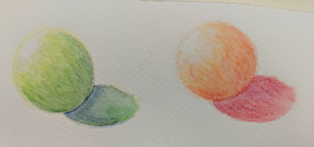
In the above drawings, I practiced using prisma colored pencils to draw shapes and create colorful shadows through blending and mixing values. These allowed me to once again become comfortable and used to the medium before continuing and creating more detailed pieces.
In the first drawing above, I practiced using water colored pencils for the first time. This practice was very useful because the it allowed me to gain control of the pencils in order to create a successful drawing. I used this practice to get a feel for how much pressure and precision this new medium required to create strong values and detail. In the second drawing above, I practiced using chalk pastel sticks to create the values of a sphere and cone. This practice was also beneficial because it allowed me to come to understand how much pressure to apply and what techniques to use to achieve vibrant colors and contrasting values.
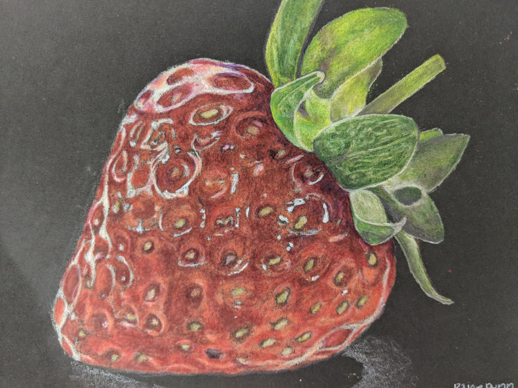
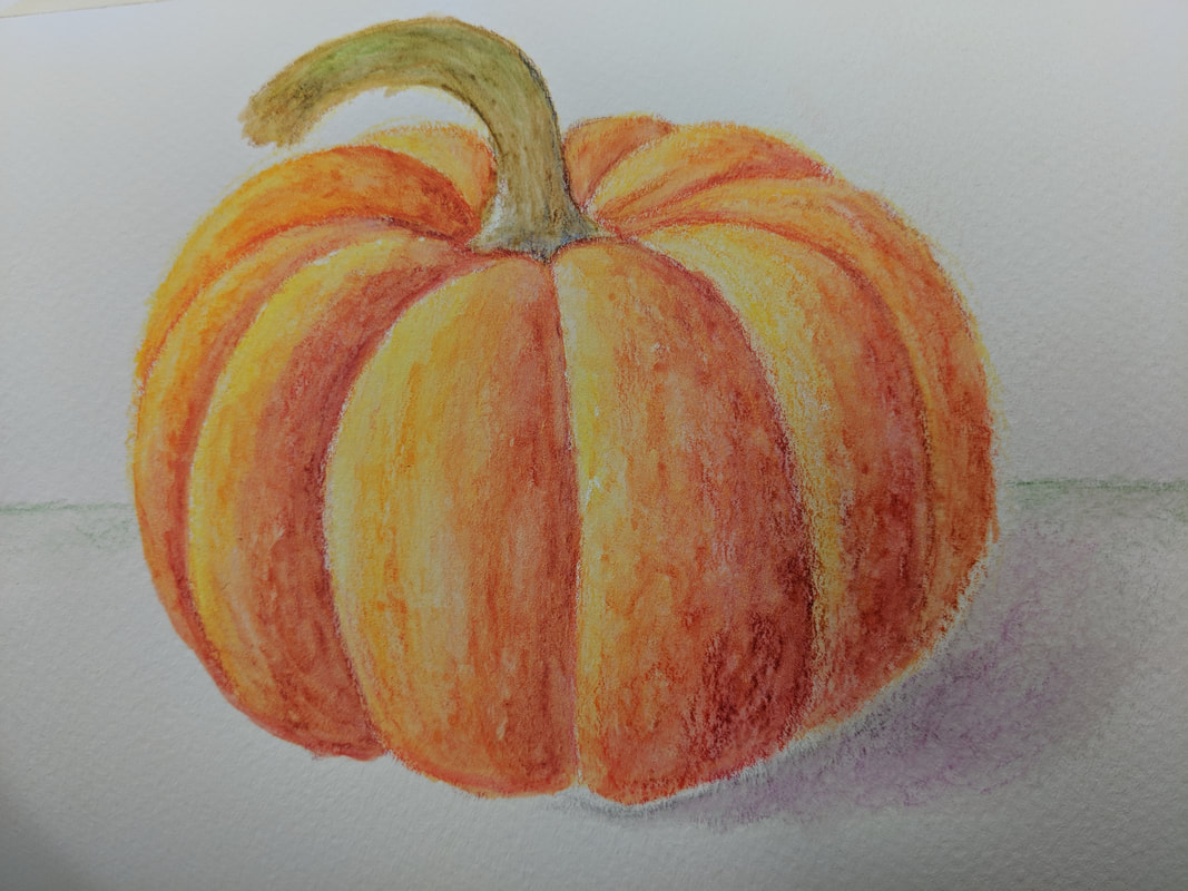
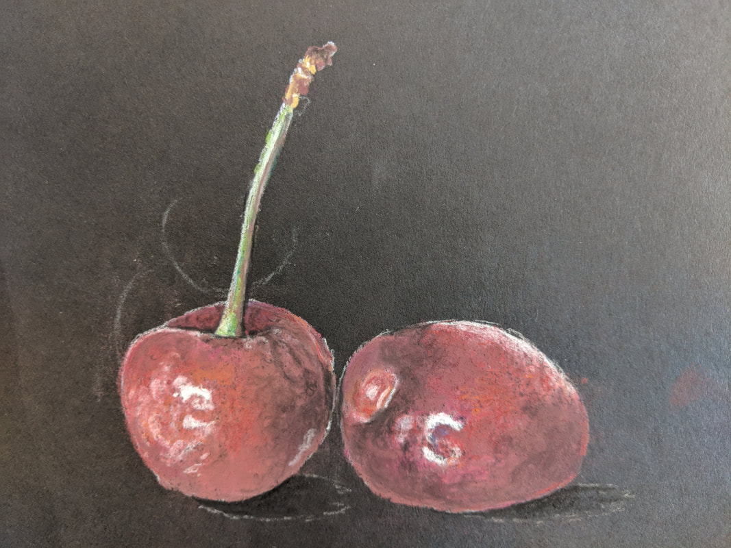
In the first drawing, I used prisma colored pencils to draw a strawberry. To create this drawing I slowly layered different shades of colored pencils, starting with the lightest values and building up to the darkest values. I started by outlining the basic shape of the strawberry and its leaves. Then, I added highlights of white to stand out on the black paper. From there, I used the highlights as a guideline to follow a provided photograph and create the texture and three-dimensional appearance of the strawberry. I used a mixture of gray blues and browns to create the darker values in the leaves and used light tan and yellow to create the light values. For the main body of the strawberry, I used a mixture of oranges, pinks, reds, grays, browns and purples to create the varying indentations and values of it. The second drawing above is a pumpkin drawn using water color pencils. I used light shading and building up of layers with darker values to create the values before applying water, then I carefully and lightly applied water, always brushing the water from the lightest values in the direction of the darker values in order to prevent dark values from spreading across the lighter ones. In the third picture, I used chalk pastel pencils to draw to cherries. I started by drawing the highlights again by shading the entire shape of each cherry lightly white and then adding more pressure to the white pencil to add my bright whites that would become the highlights. I layered shades of pink, orange, red, purple and browns to create the realistic color of the cherries and then used light shading with black to create shadows.
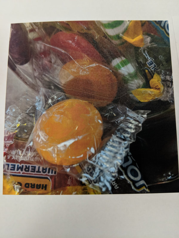
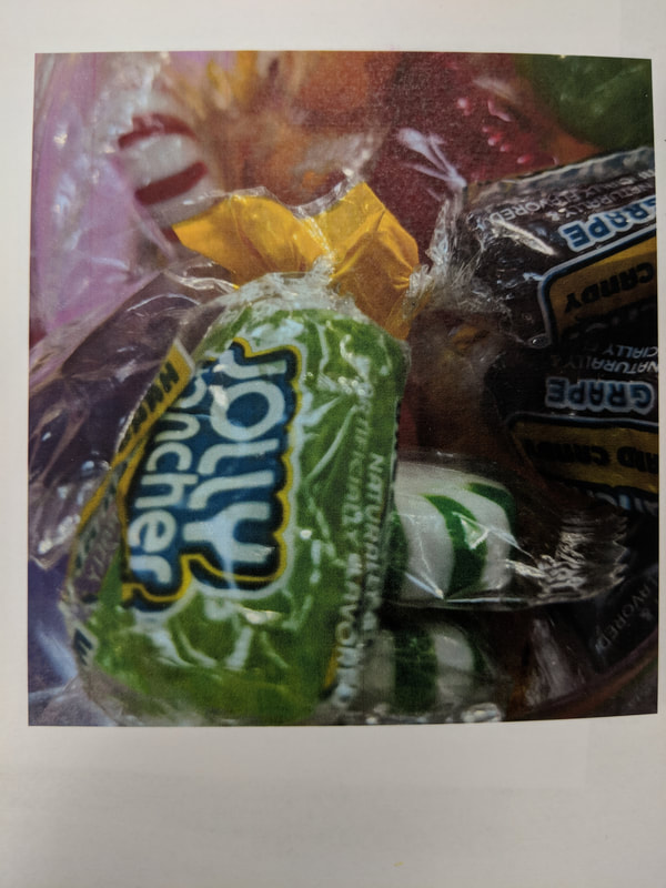

The three photos above are the reference photos I took up close of candy on colored paper. I selected the last photo to use for my drawing.
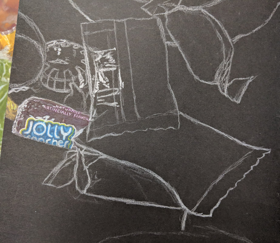
The photo above shows the prisma colored pencil drawing of a group of candy coming out of a jar. I was not able to finish this drawing, but I was able to complete the one jolly rancher and add highlights for some of the other candies.
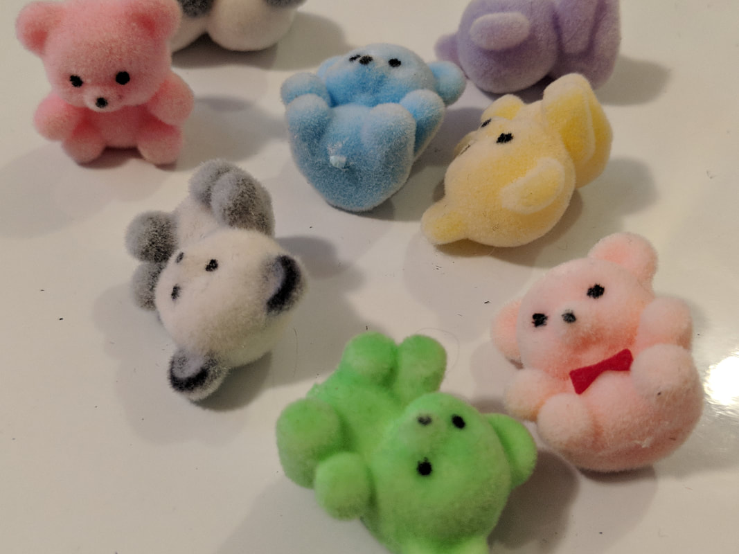
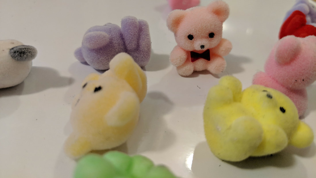
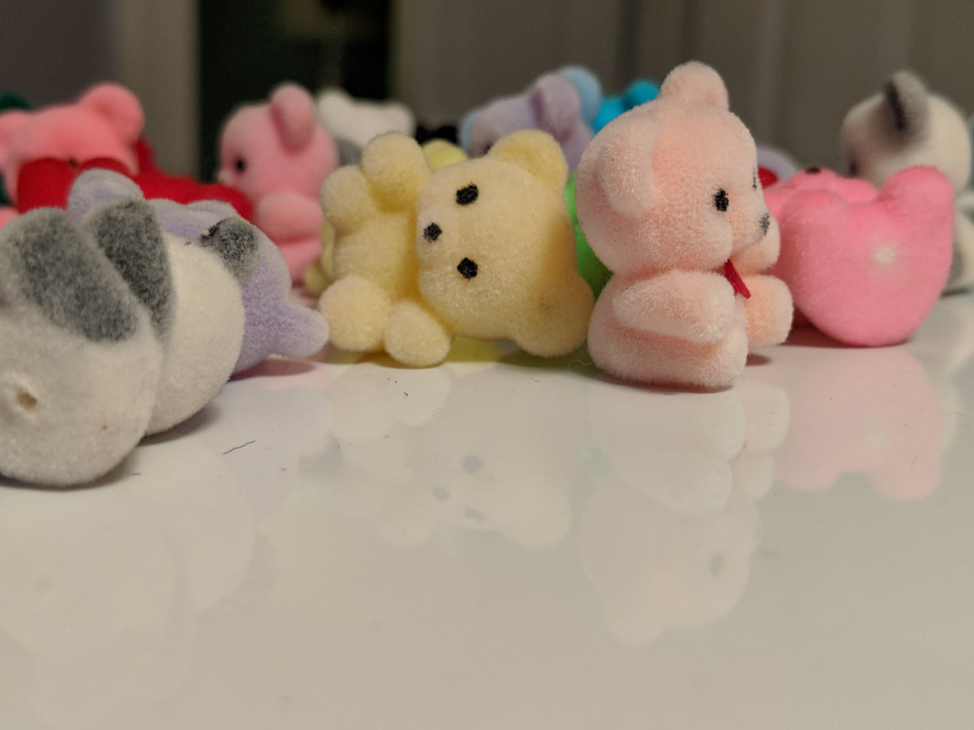
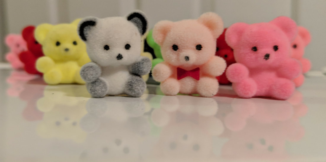
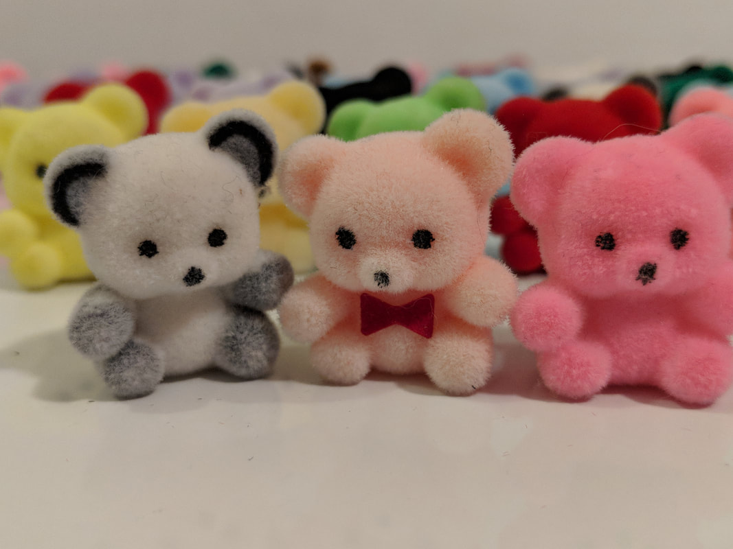
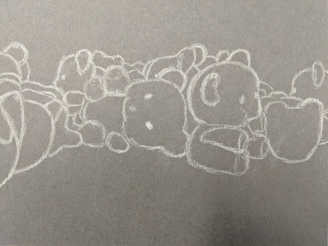
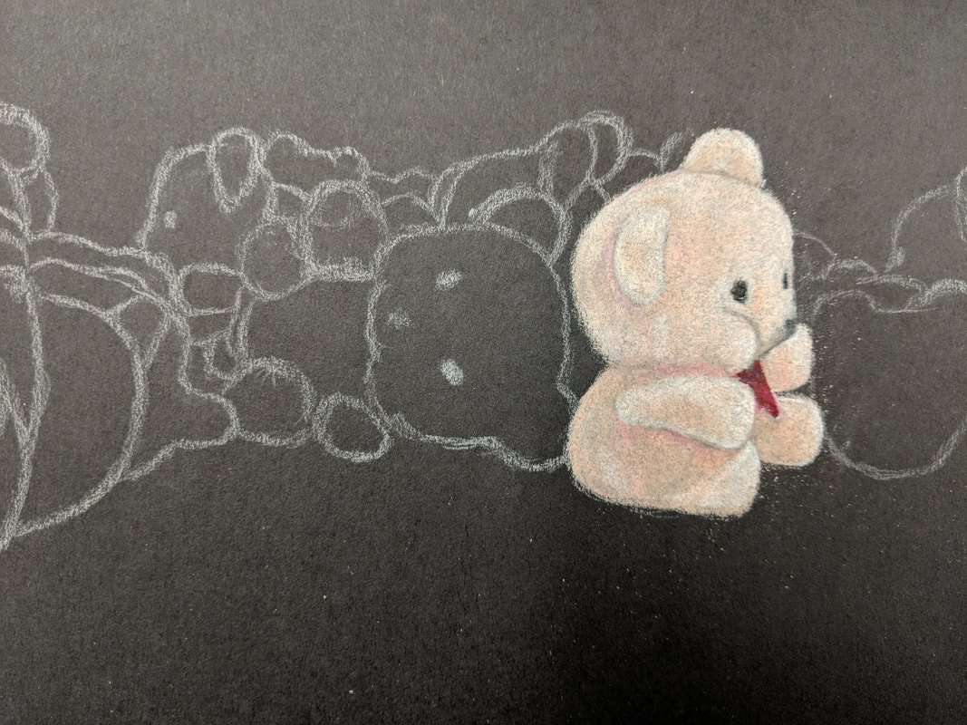
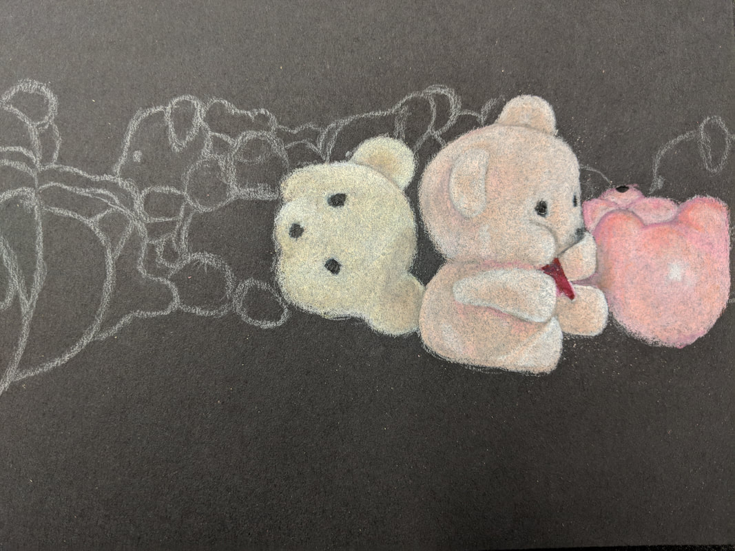
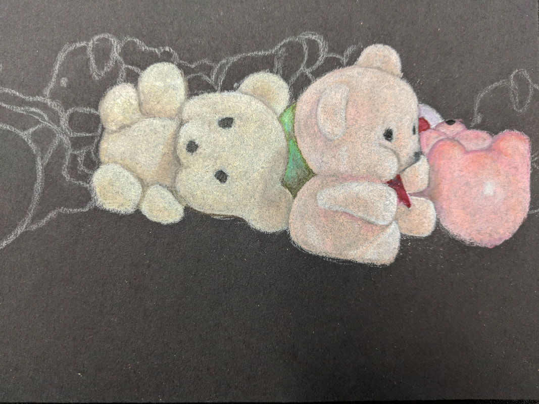
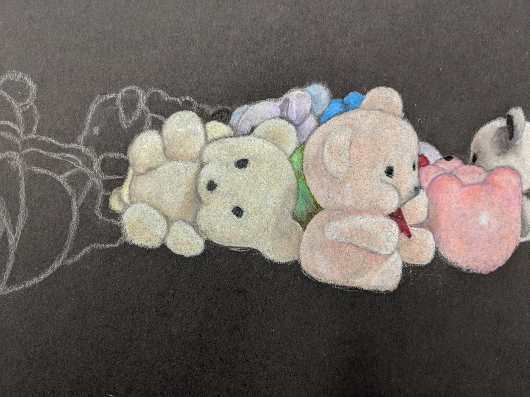
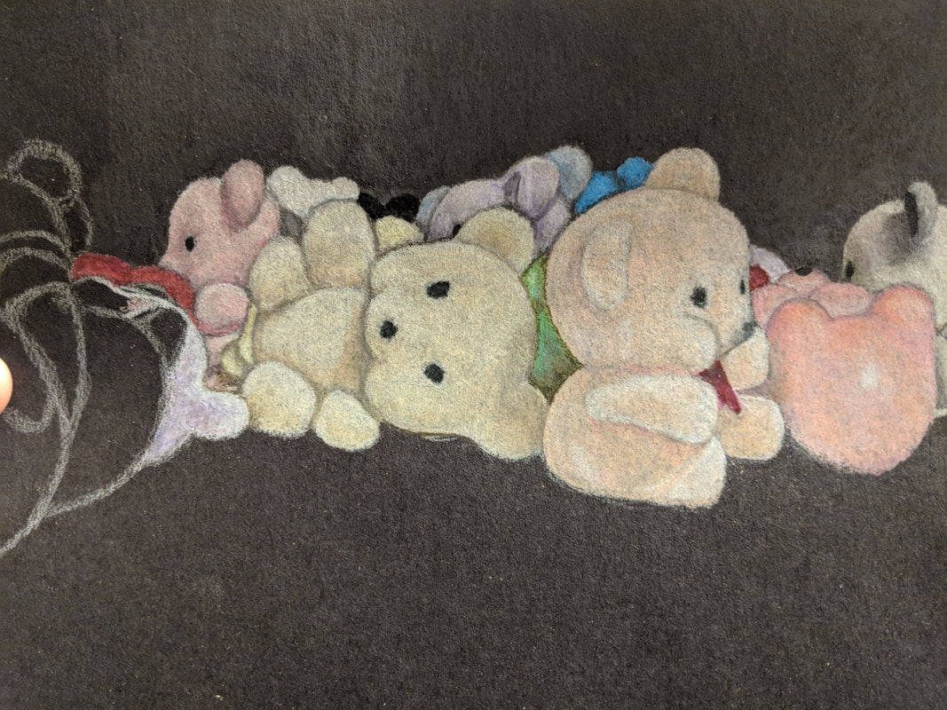
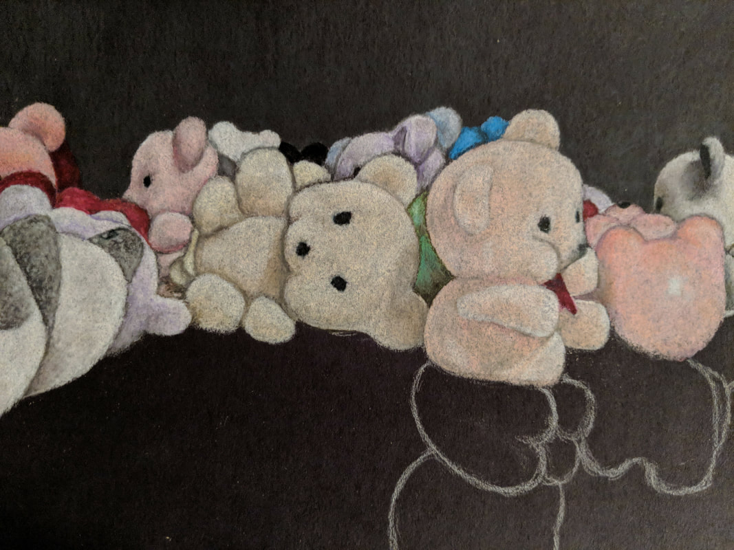
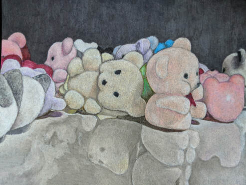
The photos above are my five compositional photos of the little toy bears from AC Moore. I took all of these photos myself and chose to do my final prisma colored pencil composition on the third photo. These photos include reflections of the bears on a white surface which is a white board that I placed them on.
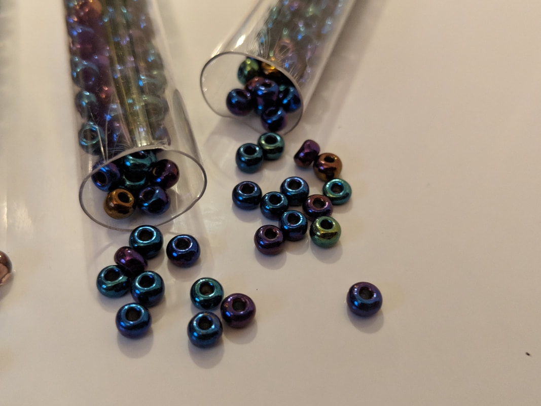
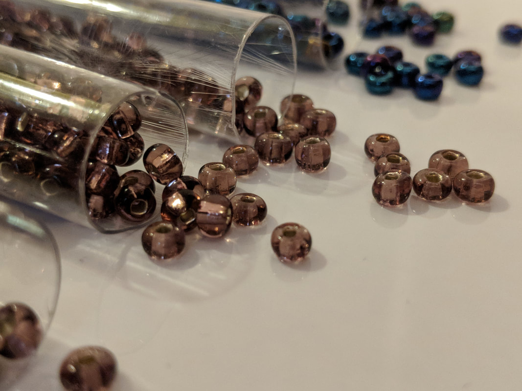
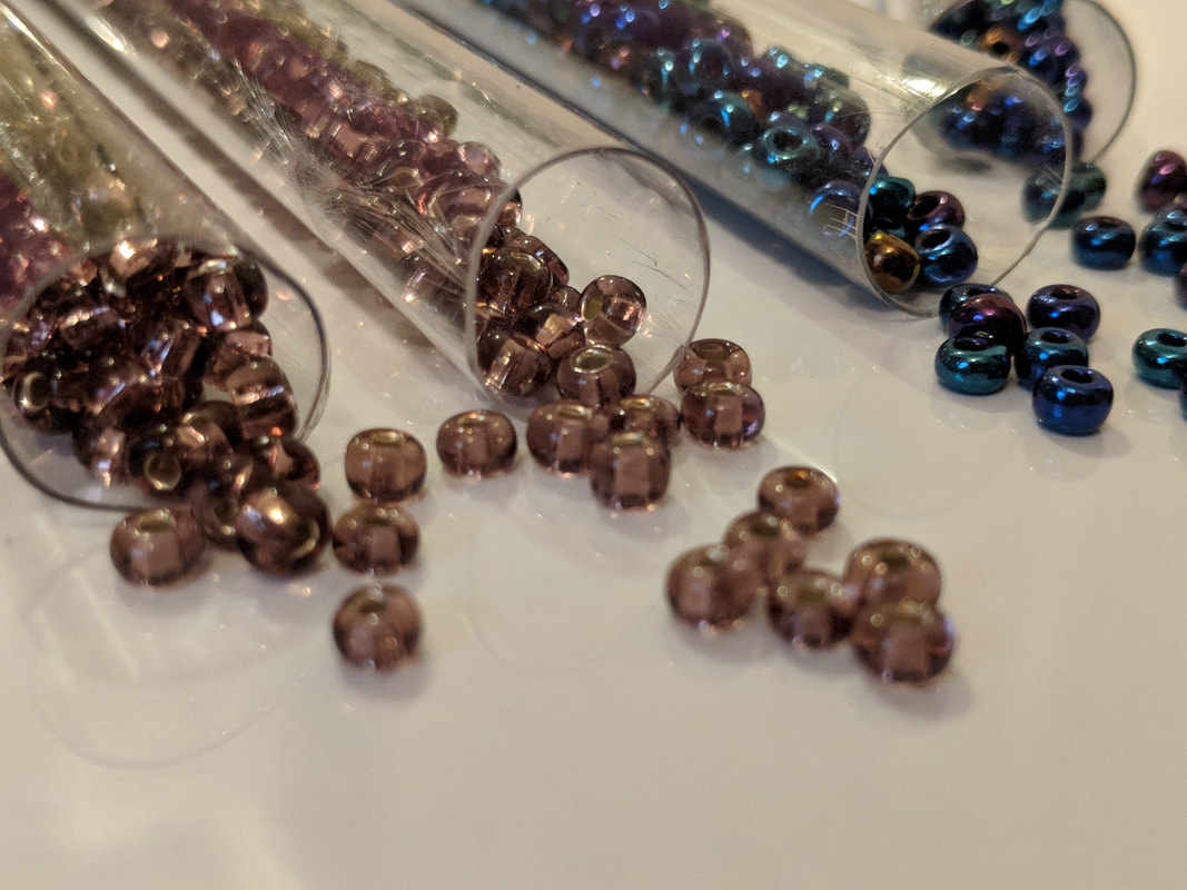
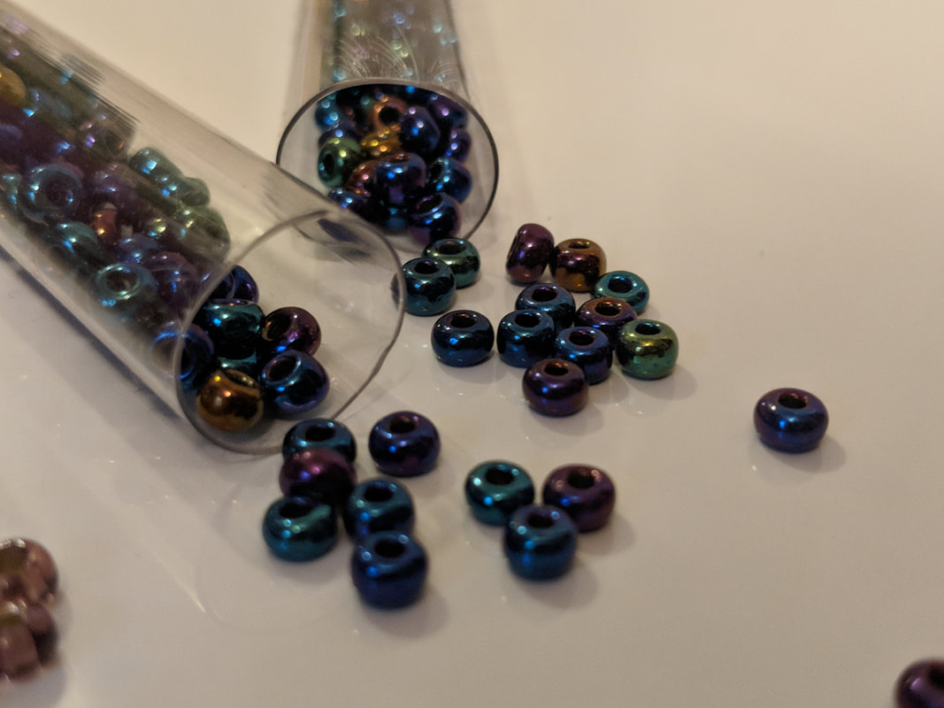
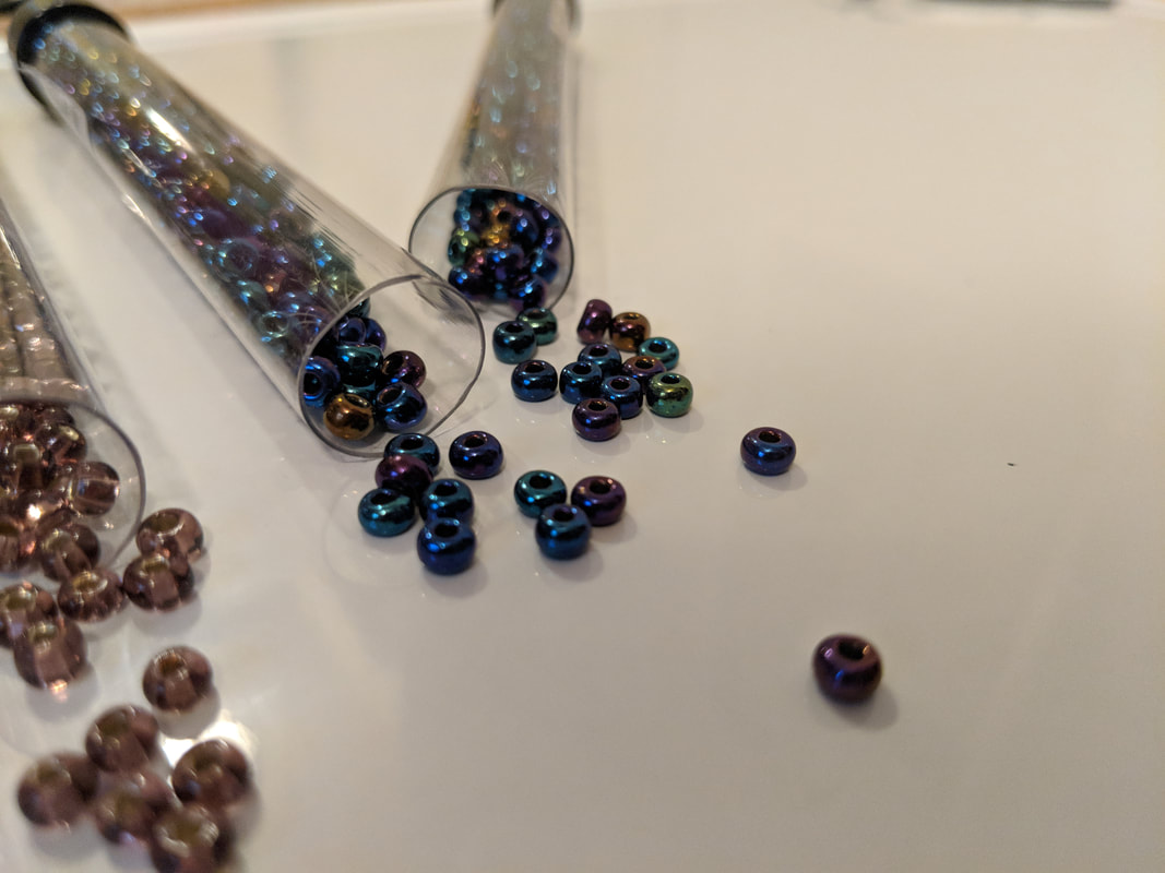
My second idea for my final prisma colored pencil project was doing spilled collections of colored beads. The five compositional photos above were also taken by myself on a whiteboard. I decided not to use this idea for my final project.
1) Describe the overall composition of your artwork (balance, unity, rhythm and movement).
My artwork's continuity centers around the constant hand motion I used when creating the furry texture of every AC Moore bear. The piece seems unified and put together because I made sure that the placement of bears was very precisely in accordance with the photo. The bears also created a more unified scene by overlapping with each other and casting shadows upon each other. I did my best to capture these details when drawing them.
2) How did you use value to create dimension? Is this important? Why?
I created dimension by use of shadows and reflections. I used value to create shadows on the bears to create dimension. To create shadows on the different colored surfaces of bears, I had to blend the normal colors of the bears with darker colors. This allows for different values of these different colors to create a three-dimensional appearance. This appearance is created by value because shadows help viewers easily distinguish between overlapping bears and take note of which bears are closest to the front. This also helps draw the immediate attention of viewers to the front line bears.
3) What did you achieve by using exaggerated colour?
By using exaggerated colors, I was able to achieve a more vibrant but still realistic image. I used especially bright colors because the bears already have bright colors so in order to make bears that are in front of other bears more defined and separate from each other, I had to make the colors brighter so that they would be more distinguished and easily recognized as different bears. I also exaggerated my use of white pencil in order to brighten some areas to enhance the boundaries between lighter and darker bears as well as their shadows and reflections on the white board surface.
4) Describe the craftsmanship of your colored pencil/chalk pastel. (How good the project is technically crafted.)
I think that my project was very well crafted. This is because I planned out my drawing very carefully in order to make it as realistic as possible. I started by drawing white outlines of all the bears on the black paper. Then I also outlined the reflections and shadows that the bears cast on the board. After outlining everything, I outlined some inner details in order to start creating a basic shape and three-dimensional appearance of the bears. Once this was done, I began to choose the right colored pencils to match the real life colors of the bears. I practiced the shades of colors on a spare sheet of black paper in order to blend colors to create the most accurate shade. I had to experiment colors and add colors that seemed odd but blended together created accurate shades. Then when applying these colors to the actual drawing, I moved my pencils in such a way, in small circular motions, to create a fuzzy looking texture to the bears. I repeated this process with all of the bears to make them look like they are actually soft and brightly colored. This shows the good craftsmanship of my piece because I planned the entire project down to every last detail to capture my photo through colored pencils in the most realistic way possible.
5) Were you able to achieve depth by showing a foreground, middle ground and background? Explain.
I was able to achieve depth by showing a foreground, middle ground and background in various ways. My foreground consisted of the very front bears that aren't cut off my anything and their shadows and reflections on the board in front of them. This is because it is the very front of the image and the first thing the eye is drawn to. The middle ground of the drawing is the bears that are still near the front but cut off by the other bears and not fully seen. This adds a three-dimensional depth to the image because the bears cast shadows upon each other, and the farther back the bears are, the smaller they appear in the drawing. Finally, the background consists of the bears that are the farthest back in the image with only a foot or an ear showing. This shows depth as well because these bears appear smaller and farther up in the image because of the angle of the photo and the distance these bears are from the camera. My background is also created by the grey-black color I used to fill in the rest of the paper because the change from light in the front to dark in the back of the image emphasizes the depth of the scenario.
6) Explain your experience with colored pencil/chalk pastel. What were the obstacles and advantages?
An obstacle that I primarily face with colored pencil is creating the appearance of texture while using the smooth pencils. However, with enough practice and experimentation of creating different textures I was still able to create accurate visuals. The advantages of using colored pencil in my opinion is the amount of control I have over the appearance of the piece. Since the pencils are fine pointed, I can capture extremely small details, and since the pencils have great blending capacity, I am able to use them to create lifelike and accurate colors when trying to create a piece using a photo.
Printmaking Unit
The photo above shows the list of ideas that I came up with for our printmaking project which all revolve around historical monuments, natural/ancient wonders of the world, ancient creatures, and mythology of ancient civilizations.
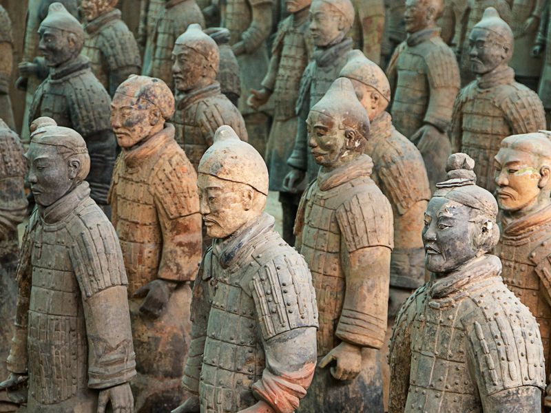
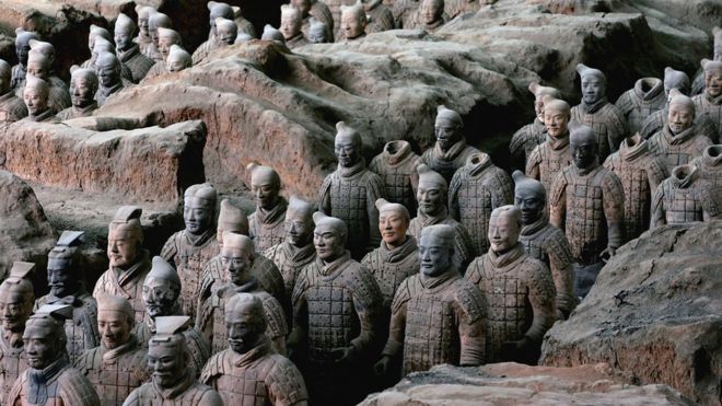
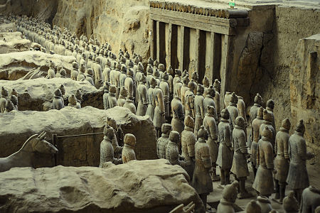

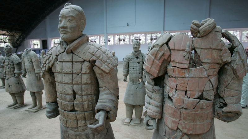
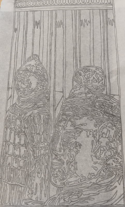
The five photos above are the reference photos for my terra cotta warrior printmaking project that I found when researching them online. I used elements of all of the photos to create the five compositional sketches.
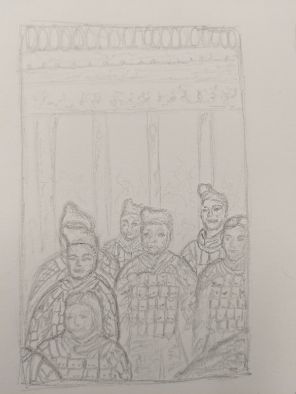
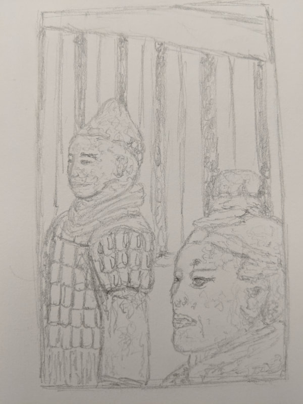
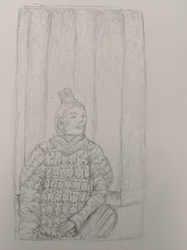
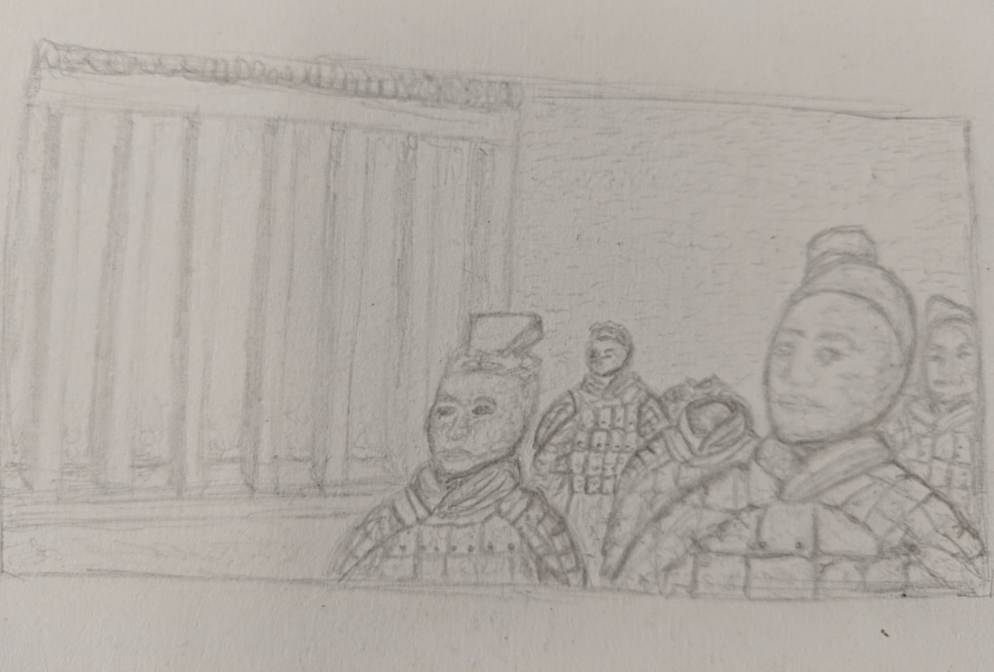
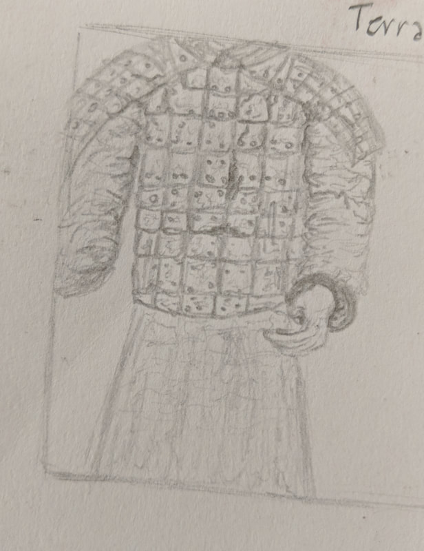
The above photos show my five compositional sketches for my terra cotta warrior printmaking project. To create these sketches, I used different characteristics of all the reference photos to create varying angles and styles of warriors in each drawing. I chose the second compositional sketch to use as the design for my final project.
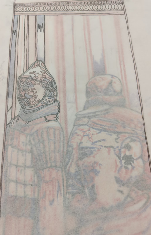
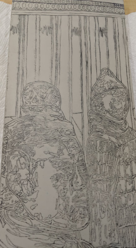
The photos above show the beginning process of my printmaking project where I traced my colored drawing of the terra cotta warriors on tracing paper, then transferred the image onto my piece of linoleum.
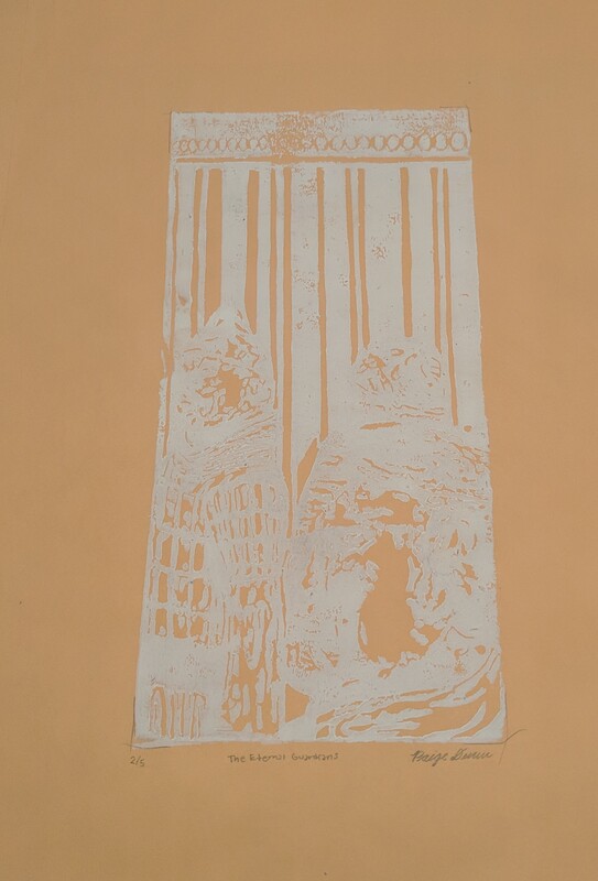
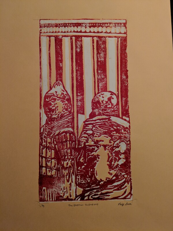
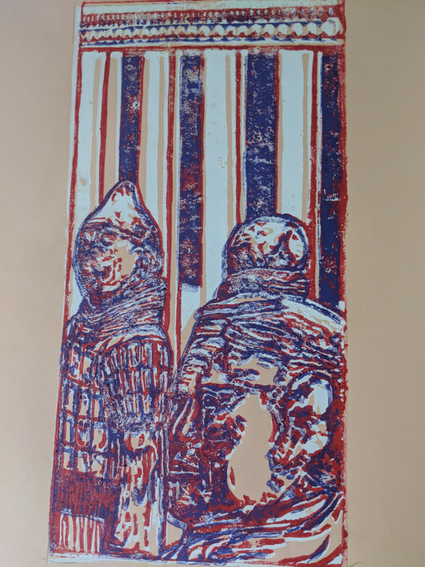
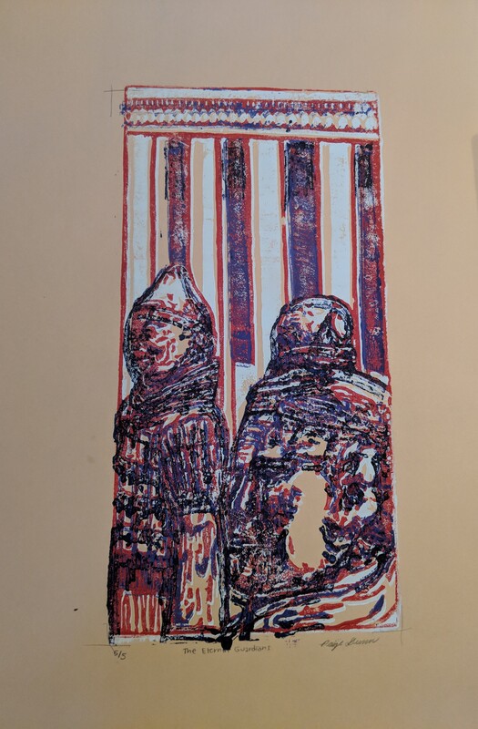

The photos above show each time I printed a new color for my printmaking project. I started with a paper that is a peach color (five of them to be safe). Then the first color I printed was white. Then I moved on to red, then to purple, then blue, and finally finishing with black.
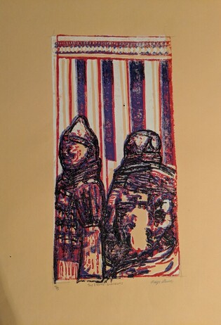
1) Describe the craftsmanship of your prints. (How well the project is technically crafted: registration and carving, burnishing and ink coverage)
My project was technically crafted very well. I designed my project very well by planning ahead. First, before using the linoleum, I had to create a drawing that matched the size of the linoleum block in color to plan what my piece would look like. When I did this I carefully planned out colors that I believed would look good together. Then, I had to carefully trace as much of the drawing as I could on to tracing paper, capturing as much detail from my drawing as possible. Once I had traced the drawing, I carefully transferred the image onto my piece of linoleum, tracing over the lines to get as much pencil to transfer as I could. From there, I slowly carved the paper color parts of the design on the linoleum out, which was the peach base color. I carved slowly in order to ensure that I didn't make as many mistakes and only carved areas that needed to be carved. I did my best not to miss any areas that I wanted to be the peach color. Then, I coated the carved linoleum in ink and I did my best to line up the linoleum in the rectangle drawn on the center of the paper when I printed. Then I repeated this process for the rest of the colors. Going in order, carving out the parts I wanted white, then the parts I wanted red, then purple, and blue.
2) How did you use texture, color harmony and balance to define your choice of subject? (texture, color harmony, balance)
Texture was used to define my choice of subject of Terra Cotta warriors in various ways. Since the actual print doesn't use a blend of colors like it would if it were a colored pencil drawing, when I designed my piece using colored pencils, I had to adjust my usual routine of how I draw things. I had to remember that each piece of it needed to be one of the solid colors I had chosen to use for the prints. Therefore, in order to create texture I had to use many small solid color details and then hope that the overlapping ink when printing would add to the texture of the piece. I used color harmony to define my choice of doing Terra Cotta warriors as well because I specifically chose my colors based on colors that worked well together but also colors that strike me as regal ancient colors. This can be seen in my piece because the red and purple are royal and seemingly ancient colors that really emphasize the status of the warriors guarding the tomb and protecting there rulers in the afterlife.
3) If you could recreate your pieces what would you do differently to enhance your final outcome?
If I were to recreate my piece, in order to enhance my final outcome, I would do a few things differently.
Clay Food Unit

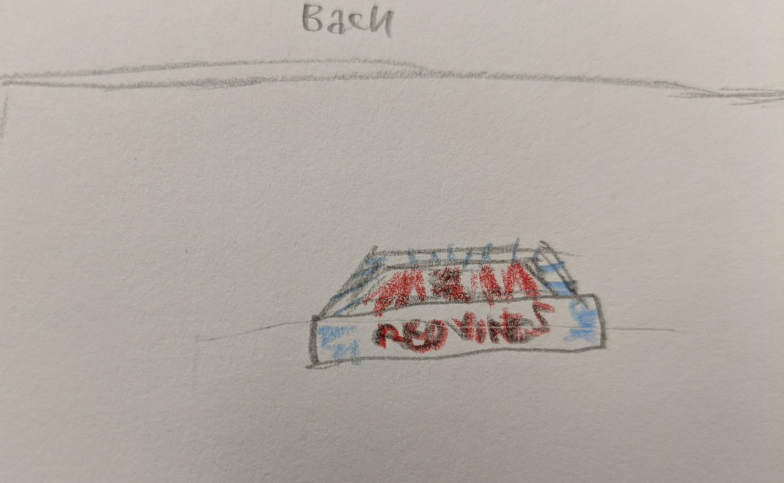
The photo above shows the list of twenty ideas that I came up with as possibilities for my clay food project. My top choices were the apple rose tart, strawberry shortcake and red vines.
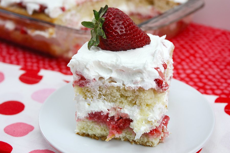
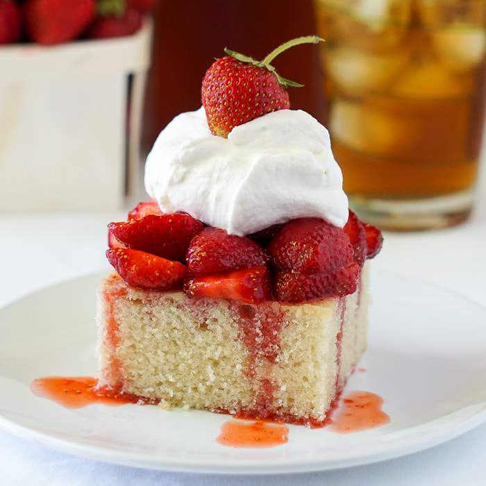
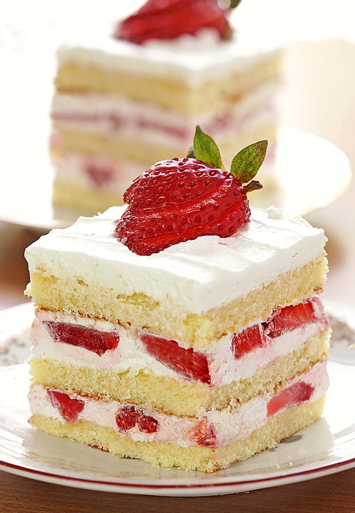
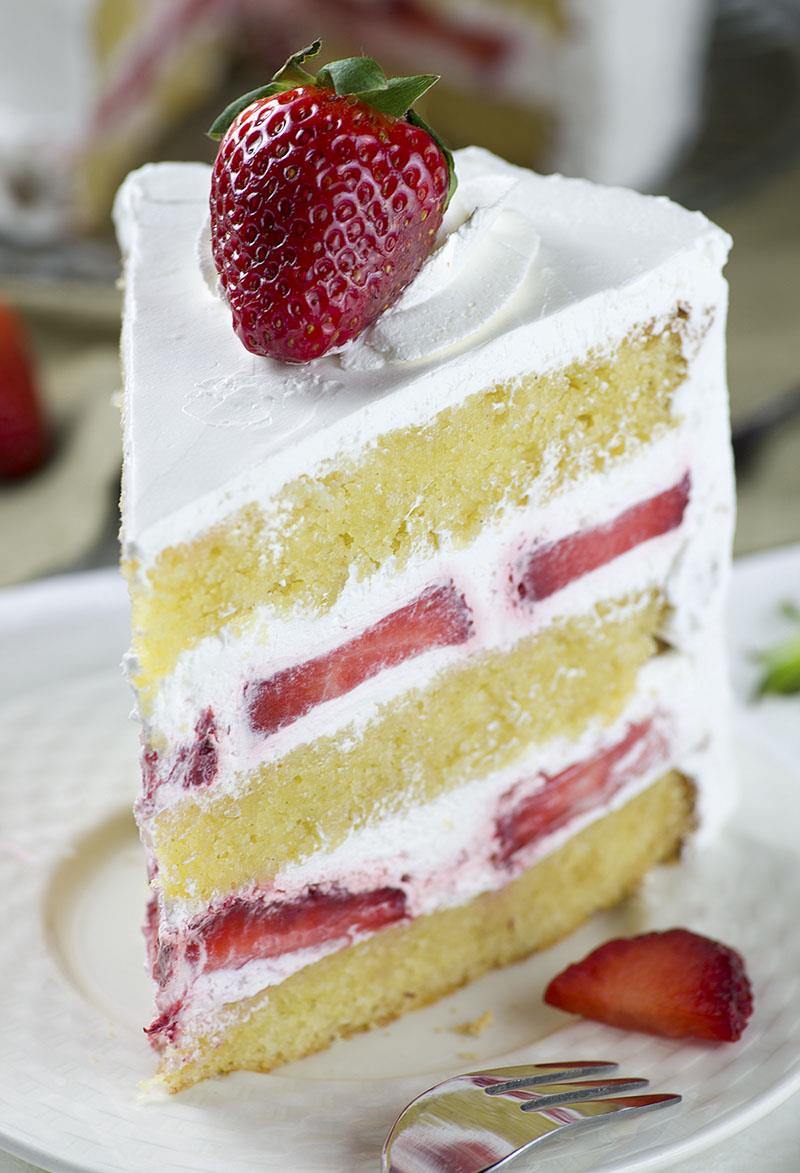
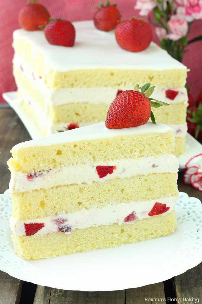
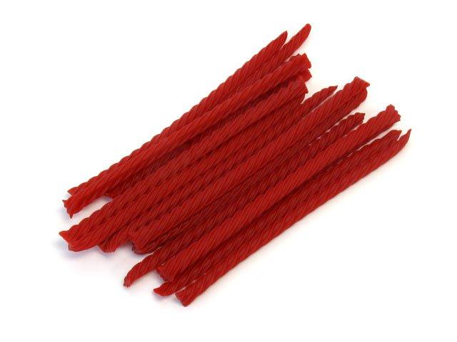
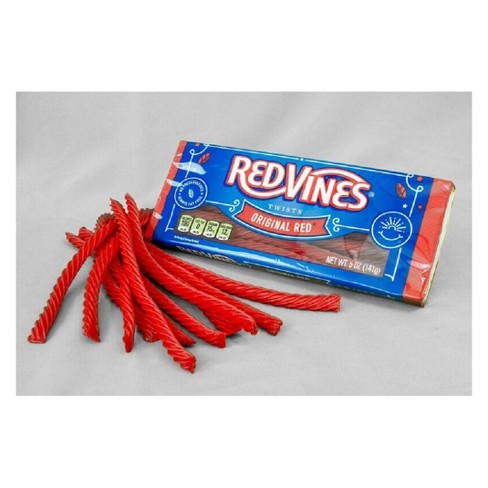
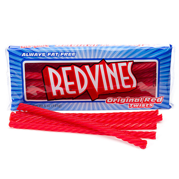
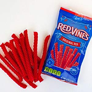
The photos above are reference photos I chose to use for my compositional sketches for the clay food project. My two ideas are a package of red vines and a strawberry shortcake. I used elements from all five reference photos to create the four different perspectives shown in my compositional sketches for each of my two ideas.
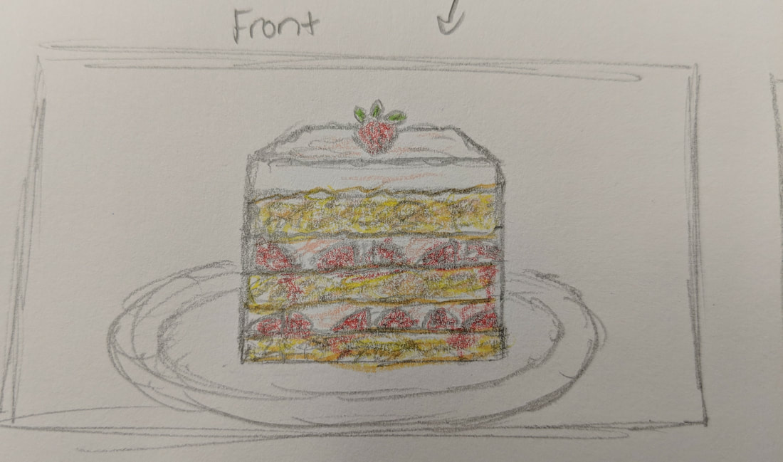
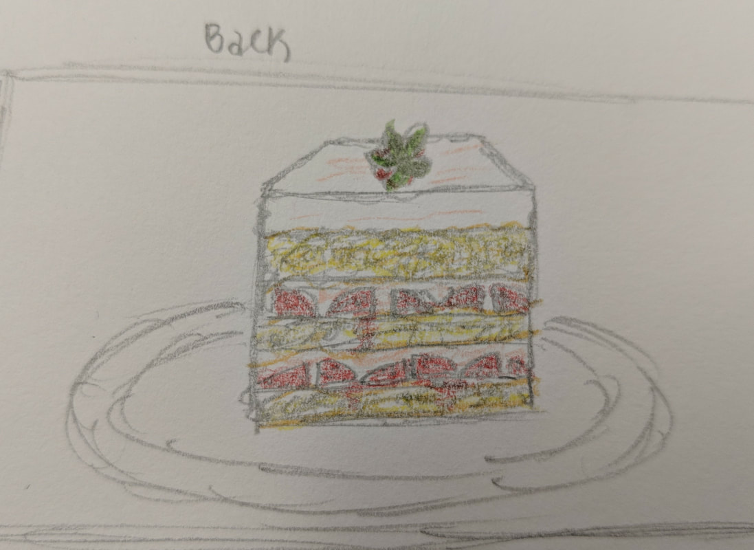
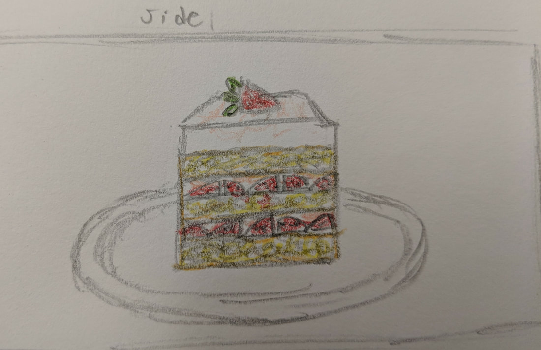
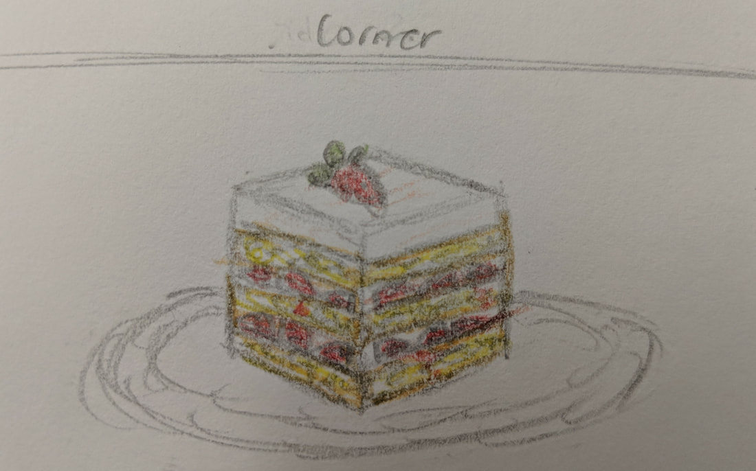
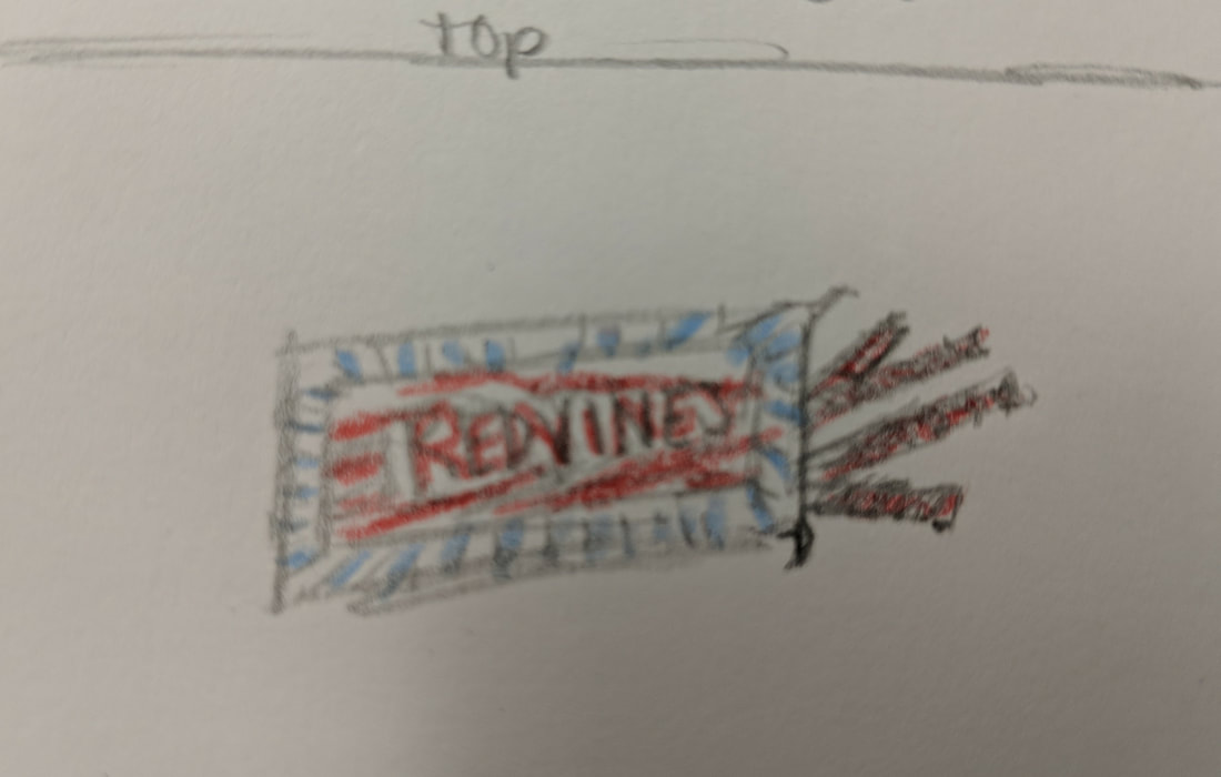
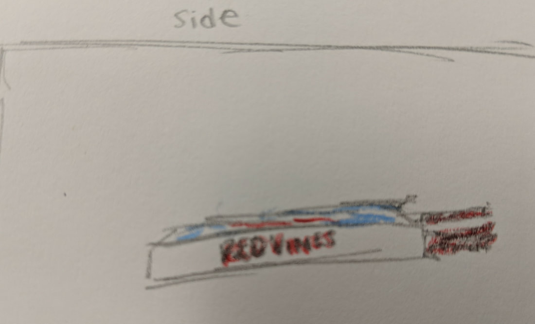
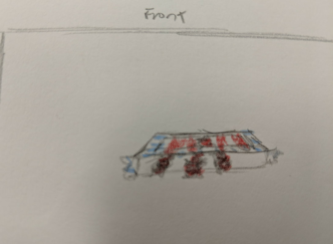
The eight photos above show my four different angles for practice sketches for each of my two ideas. The first four photos show the side angle, back angle, corner angle and front angle of a strawberry shortcake. The last four photos show the top side front and back angles of an opened package of redvines. These sketches are important to have before creating a clay piece because three-dimensional art requires planning from all angles and perspectives to come out realistic and successful. I chose the strawberry shortcake as the idea I used to create my final clay food piece.

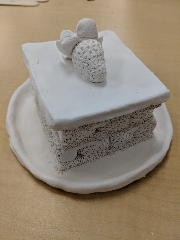
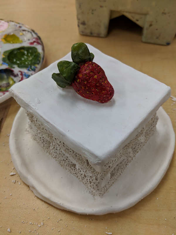
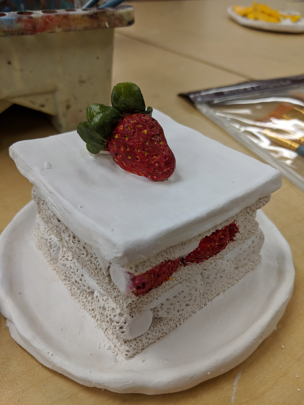
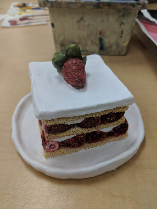
The photos above are the in progress photos of my clay food which is a strawberry shortcake.
1) Describe the craftsmanship of your sculpture. (Is is neat and well executed?)
The craftsmanship of my sculpture is very neat and well executed. I was able to keep the project neat by planning out everything ahead of time and working on it in an exact process. I started by creating the top layer of frosting with a strawberry and spent much of my time making it as smooth as possible and creating the most realistic texture on the strawberry as I could. Then I set that piece aside and started working on the plate. I made the plate by taking a large piece of wet clay and rolling it into a sphere in my hand. Then, I slowly flattened the sphere into a thin layer. When the clay had reached an appropriate plate-like thickness, I curled over the edges of the clay and smoothing it over to create the raised edges of the plate. From there, I added the first layer of cake to the plate by created a hollow square shape with thin pieces of clay in a square the same size as the top layer I already made. From there I built up the cake by adding clay strawberries to the edges to create a taller, hollow prism with alternating cake and strawberries with clay frosting to fill in the gaps. I created the clay texture by slowly adding thousands of holes in the clay with a toothpick and I creating the texture of the strawberries by hollowing slightly larger holes out with the toothpick to create the indentations where the seeds are. I executed this well by always using cross-hatching and water to add pieces together and keeping clay that was still in use wet.
2) What was the most difficult part of this project?
The most difficult part of this project was creating realistic textures for the clay strawberry shortcake. This is because the key to making the clay food as realistic as possible to creating accurate textures. If the textures aren't realistic, then no matter how well painted the piece is, it won't be convincing. Creating the right textures and dimensions create the realistic shadows and appearance of the actual food. It was difficult for me to create a realistic cake texture, and when I found my best option I had to take a lot of extra time to add all the detail with the toothpick to the clay.
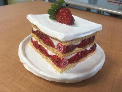
3) Did your color choices work together harmoniously?
My color choices worked very well together harmoniously. I chose the most realistic color choices as possible to create my final piece that looks like a very aesthetically pleasing, delicious dessert as possible. To do this, I had to experiment with the primary colors we are provided with until I found the best colors to display each aspect of my sculpture. I started by painting the started by painting the strawberry on the top of the cake. I used a blend of red, black and orange to create a realistic strawberry color. Before I actually painted the strawberry red, I painted the indentations a gold and brown mixture for the seeds. Then I painted over the strawberry with the red color I created and did my best to have to brush pass over the indentations without covering the yellow of the seeds. I painted all the other strawberries the same way and I painted all the frosting white. Then, to finish off the painting, I had to blend a light cream, yellow, tan color to create a realistic cake color.
4) Is your sculpture interesting from all views?
My sculpture is interesting from all views. Before beginning to sculpt my clay strawberry shortcake, I sketched the sculpture in color from all side angles. This ensured that I had a plan for every perspective of the piece. When creating my piece and did my best to ignore which side I was working on at that moment so that I put in an equal amount of time and effort into every side, not just the front of the piece. I did my best to create the strawberries three-dimensionally realistic from all viewpoints to seem like a strawberry in real life. I double checked the accuracy of my piece by looking at it from all angles and adjusting things if they didn't look realistic from all perspectives.
5) Describe the differences in constructing a sculpture and doing something 2D.
There are many differences between constructing a sculpture and doing something 2D. One difference is the method you must use to create depth and texture. When creating something 2-dimensional, to create depth, you must use darker and lighter shades as well as make things in the background smaller, but when using clay,
6) How did you create textures in your sculpture?
7) Does your sculpture look like the actual food? How did you accomplish this?
8) What would you do differently if you were to do this project again?
The craftsmanship of my sculpture is very neat and well executed. I was able to keep the project neat by planning out everything ahead of time and working on it in an exact process. I started by creating the top layer of frosting with a strawberry and spent much of my time making it as smooth as possible and creating the most realistic texture on the strawberry as I could. Then I set that piece aside and started working on the plate. I made the plate by taking a large piece of wet clay and rolling it into a sphere in my hand. Then, I slowly flattened the sphere into a thin layer. When the clay had reached an appropriate plate-like thickness, I curled over the edges of the clay and smoothing it over to create the raised edges of the plate. From there, I added the first layer of cake to the plate by created a hollow square shape with thin pieces of clay in a square the same size as the top layer I already made. From there I built up the cake by adding clay strawberries to the edges to create a taller, hollow prism with alternating cake and strawberries with clay frosting to fill in the gaps. I created the clay texture by slowly adding thousands of holes in the clay with a toothpick and I creating the texture of the strawberries by hollowing slightly larger holes out with the toothpick to create the indentations where the seeds are. I executed this well by always using cross-hatching and water to add pieces together and keeping clay that was still in use wet.
2) What was the most difficult part of this project?
The most difficult part of this project was creating realistic textures for the clay strawberry shortcake. This is because the key to making the clay food as realistic as possible to creating accurate textures. If the textures aren't realistic, then no matter how well painted the piece is, it won't be convincing. Creating the right textures and dimensions create the realistic shadows and appearance of the actual food. It was difficult for me to create a realistic cake texture, and when I found my best option I had to take a lot of extra time to add all the detail with the toothpick to the clay.
3) Did your color choices work together harmoniously?
My color choices worked very well together harmoniously. I chose the most realistic color choices as possible to create my final piece that looks like a very aesthetically pleasing, delicious dessert as possible. To do this, I had to experiment with the primary colors we are provided with until I found the best colors to display each aspect of my sculpture. I started by painting the started by painting the strawberry on the top of the cake. I used a blend of red, black and orange to create a realistic strawberry color. Before I actually painted the strawberry red, I painted the indentations a gold and brown mixture for the seeds. Then I painted over the strawberry with the red color I created and did my best to have to brush pass over the indentations without covering the yellow of the seeds. I painted all the other strawberries the same way and I painted all the frosting white. Then, to finish off the painting, I had to blend a light cream, yellow, tan color to create a realistic cake color.
4) Is your sculpture interesting from all views?
My sculpture is interesting from all views. Before beginning to sculpt my clay strawberry shortcake, I sketched the sculpture in color from all side angles. This ensured that I had a plan for every perspective of the piece. When creating my piece and did my best to ignore which side I was working on at that moment so that I put in an equal amount of time and effort into every side, not just the front of the piece. I did my best to create the strawberries three-dimensionally realistic from all viewpoints to seem like a strawberry in real life. I double checked the accuracy of my piece by looking at it from all angles and adjusting things if they didn't look realistic from all perspectives.
5) Describe the differences in constructing a sculpture and doing something 2D.
There are many differences between constructing a sculpture and doing something 2D. One difference is the method you must use to create depth and texture. When creating something 2-dimensional, to create depth, you must use darker and lighter shades as well as make things in the background smaller, but when using clay,
6) How did you create textures in your sculpture?
7) Does your sculpture look like the actual food? How did you accomplish this?
8) What would you do differently if you were to do this project again?
Painting Unit
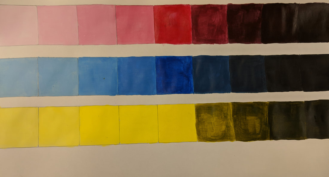
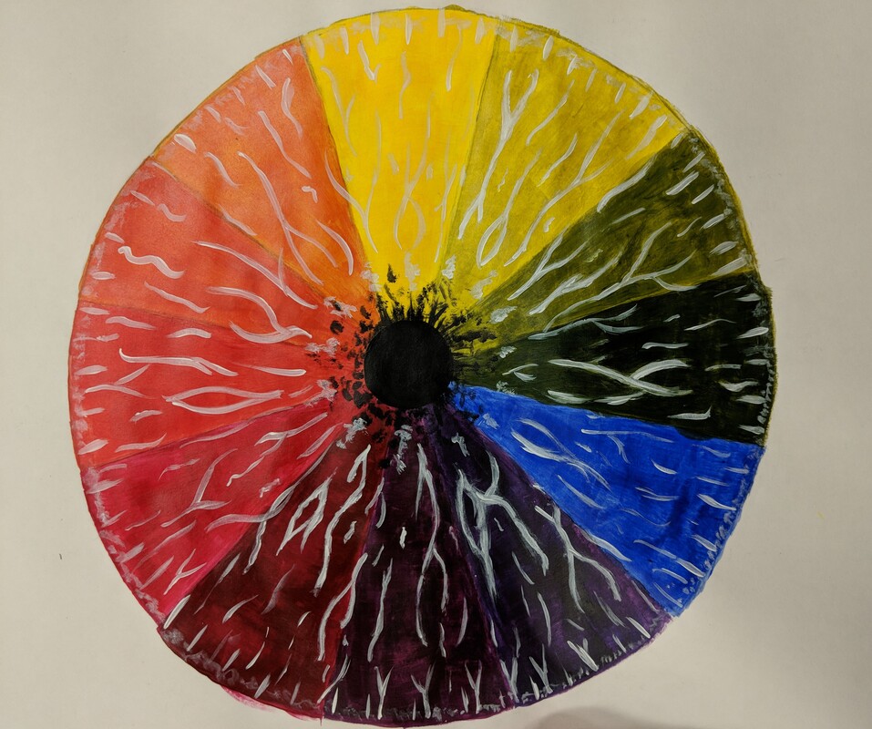
The first photo above shows value charts for each of the three primary colors. To create these, I first had to place the normal paint color in the center box of the nine boxes. Then I created tints by adding the primary color to white to make the color lighter and lighter going to the left end of the value chart, and I created shades by adding black to make the color darker and darker going to the right end of the value chart. The second photo above is a color wheel consisting of the three primary colors, along with the secondary and tertiary colors. I created the three secondary colors by blending blending two primary colors together, then the six tertiary colors were created by blending secondary colors with primary colors. I painted my color wheel to look like the iris of the eye, with the black pupil of the eye in the center.
