Blind Contour Hand Drawings
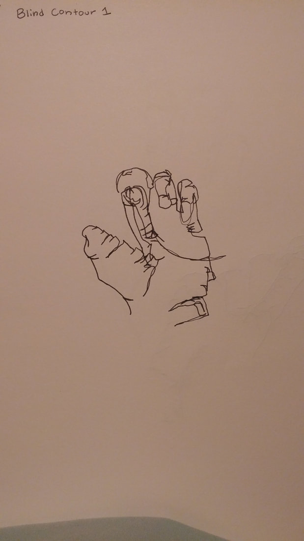
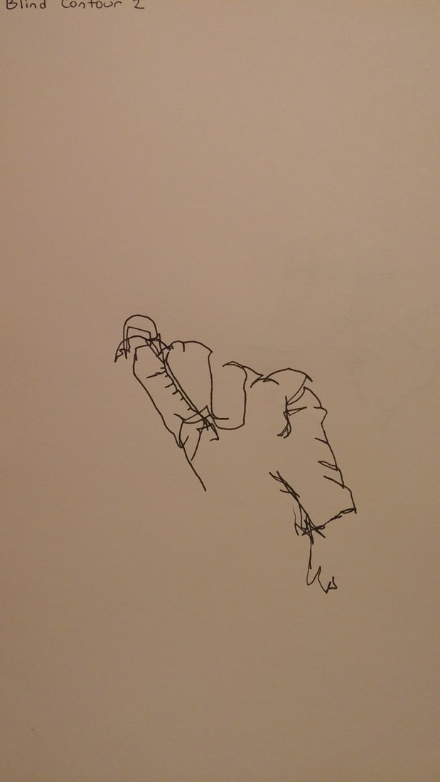
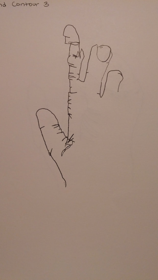
For these blind contour drawings, we had to draw our hand in different positions multiple times. In the contour line drawings, we could not lift our pens up and had to focus on drawing every detail without sketching out the drawing. The reason this was called a blind drawing was because we could not look at our paper at all while we were drawing. We could not look down at our paper because it helped us to try and take our time to draw exactly what we see. As our eyes moved, our pen had to move at the same pace in order to create a proportionate detailed drawing.
Modified Contour Hand Drawings
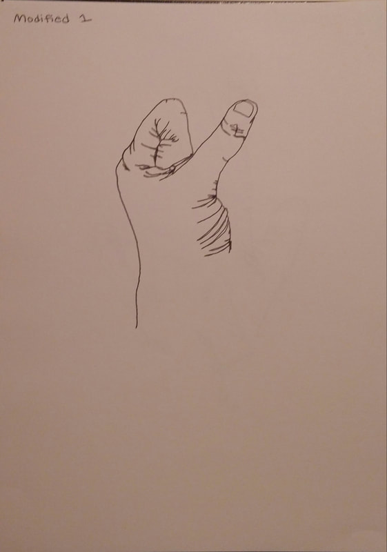
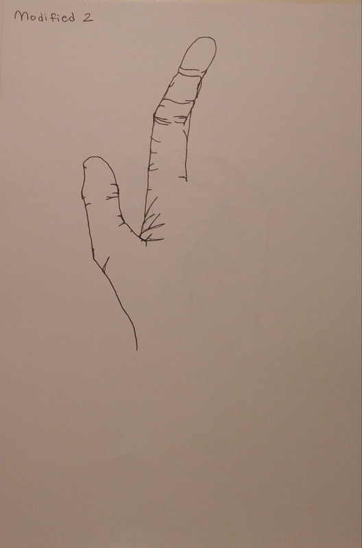
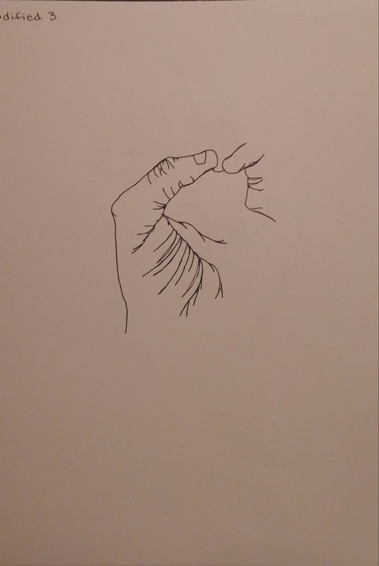
The Modified Contour Hand Drawings were different from the Blind Drawings because we were allowed to glance down at the paper in order to keep track of where we were, and make the drawing more accurate. We still could not lift our pen because creating the fluid, smooth lines helped train us to not rely on sketching and be more patient with our work. The smooth lines also forced us to pay closely attention to every detail in our hand because you must draw it as you see it, instead of editing your mistakes later on.
Contour Backpack
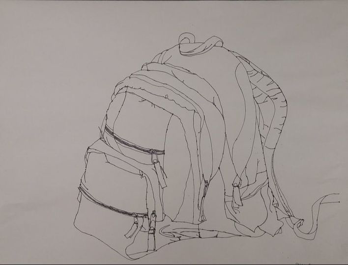
For this assignment, we were to do a contour line drawing of a backpack sitting in the middle of our table. We were allowed to look at the drawing as we did it, just like in the Modified Contour Drawings. This helped us create better proportions and more realistic qualities within the drawing. We didn't lift up our pens because we had to try and use our patience and observation skills to keep the drawing it in proportion while drawing in whatever area your pen leads you to.
Contour Room Drawing
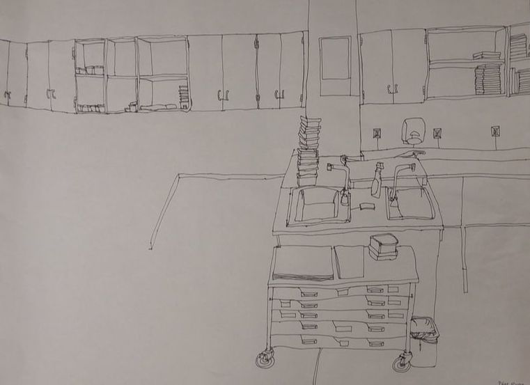
Practice
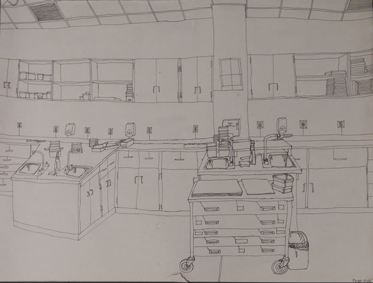
Final
Questions:
1) Did you use a fluid line? Explain how this is evident.
I used fluid lines throughout my drawing. This is very important because a contour line drawing is should put a lot of focus towards never picking up your pen to create smooth lines. Smooth lines enhance the final outcome of the piece because they show the neatness, focus and patience put into the work to create the structured, realistic drawing.
2) Explain how your knowledge and creating practice studies with contour line contributed to the success of your piece.
My knowledge and creating practice studies with contour line contributed to the success of my piece in a few different ways. As you can see from the comparison of my practice work with my final drawing, my final has much more accurate proportions. The final has better proportions because I learned to be more patient and observant from doing the practice drawing first and taking notice of its flaws. Practicing the contour drawing first also helped me take further notice of the detail in the room. In my practice drawing, I skipped over some details in the room, but I learned from the mistake and focused on including every detail in my final drawing.
3) Describe the difference in your contour line drawing to an outline drawing.
My contour line drawing is different from an outline drawing because contour drawings have a distinct trait that outline drawings don't have. My contour drawing doesn't just outline everything, I have used lines from the outline to create the details within the objects still. Outline drawings don't include the inside detail at all, they only outline whatever they are drawing with empty space within the outline.
4) Explain how your interpretation of line is essential in capturing the look of the room.
My interpretation of line is essential in capturing the look of the room for various reasons. One, if I don't understand how to create a proportional drawing by maintaining an equal pace of my eyes movement and my pen, I would not have created a realistic looking piece. Also, if I did not remember to draw the details as I went, the room would look quite blank and boring which would throw off the overall look of the room.
5) What did you learn from completing this drawing? If you could recreate your piece what would you do differently to enhance the final outcome?
By completing this drawing, I learned that drawing with patience and detail is very important in creating an accurate and realistic art piece. I also learned that drawing using smooth lines instead of sketching out a rough line helps develop better observation and patience skills. If I could recreate my piece, I would point my focus more towards creating perfect proportions in order to enhance the final outcome. I would also try to work at a slower pace in order to increase my own depth and detail in the drawing.
Value Drawings
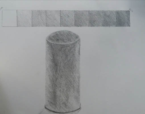
Practice Graphite Value chart and Form drawings
We practiced a value chart with graphite pencils. Then, I used a graphite pencil to practice a cylinder form, to enhance our skills in drawing shadows.
We used our practice from the value chart drawing and the practice form drawing to help us create a better form drawing with the graphite drawing. We used different shades of the pencils to slowly darken certain parts of the forms and create a three-dimensional effect with the shadows.
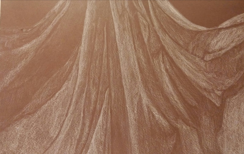
Fabric Preparation Value Charts and Form Drawings
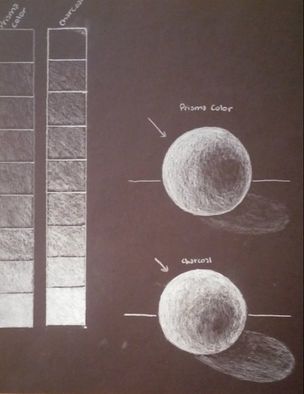
In these drawings, we created a value chart for the white Prisma colored pencils and the white charcoal pencils. We also practiced using these different values by creating a sphere drawing for each.
This Drawing is a white Prisma color pencil drawing on a black paper. Here we used what we learned when creating the white value chart and sphere drawing to create a realistic three-dimensional piece by shading in the lighter parts of the ribbon. We also left the dark parts of the ribbon unshaded in order to show the shadows of it.
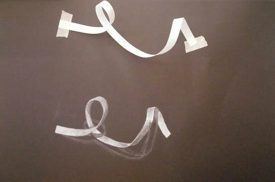
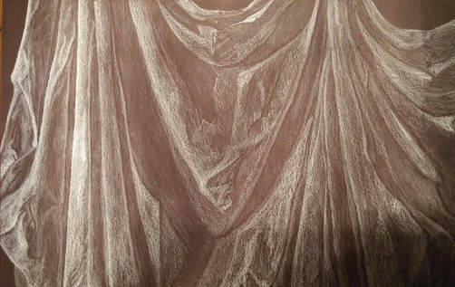
Practice Fabric Drawings with Different Mediums
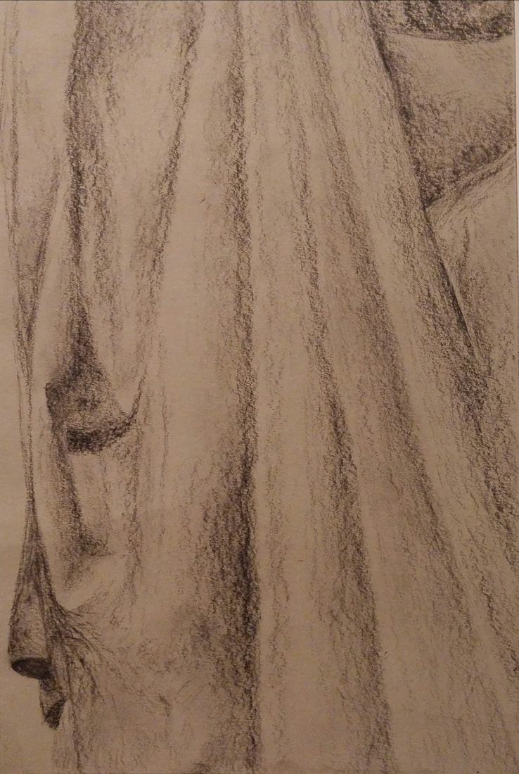
In these three drawings, we practiced drawing fabric using White Prisma Color Pencil, black charcoal, and white charcoal, on different colors of paper. This was a useful activity because it helped prepare us for our final piece by developing our skills in smooth shading and realistic shadows for a three-dimensional effect.
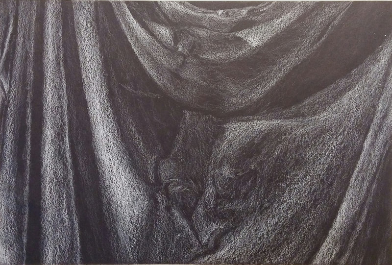
Final Fabric Drawing: White Prisma Color Pencil on Black Paper
- Did you use a wide range of values? (A range from white to black with at least 9 values). Explain how is this evident? I used a wide range of values within this final fabric drawing. This is evident because the more contrast between values and shadowing, the more three-dimensional and realistic it is.
- Explain how your knowledge and creating practice studies with value contributed to your piece. Creating practice drawings with value helped contribute to my piece because it improved my smooth shading skills and helped me practice how to create realistic and accurate proportions for the drawing.
- Describe the blending and transitions in your fabric (discuss your use of pressure with pencil/colored pencil/charcoal pencil and other techniques to achieve this). The use of blending and transitions in my fabric helped demonstrate the slow fading of shadows to give it the realistic effect. I was able to keep a steady amount of pressure on my pencils in order to blend smoothly as well.
- Explain how your interpretation of texture is essential in capturing the look of the object. My interpretation of texture is essential in capturing the look of the object because if I didn't take notice of the texture, the drawing would seem fake and unrealistic but since I took notice of the fabric's texture, I would not have been able to recreate those textures in the drawing to create a more in depth final piece.
- If you could recreate your pieces what would you do differently to enhance the final outcome? If I were to recreate my pieces, I would go at a slower pace and practice smooth shading more before hand in order to pay more attention to detail in my final piece.
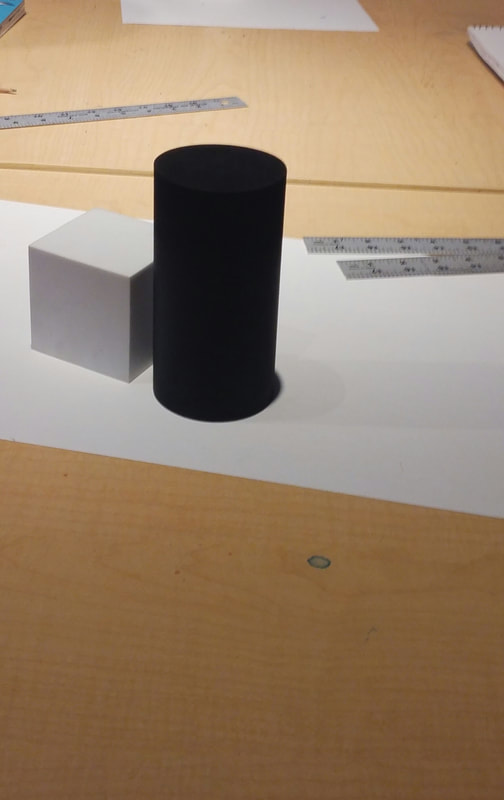
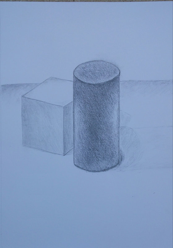
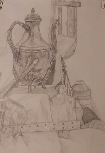
Value Still Life Drawings
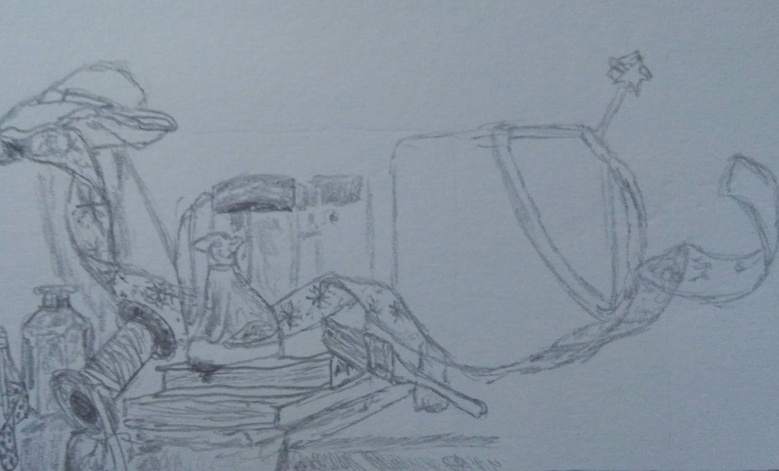
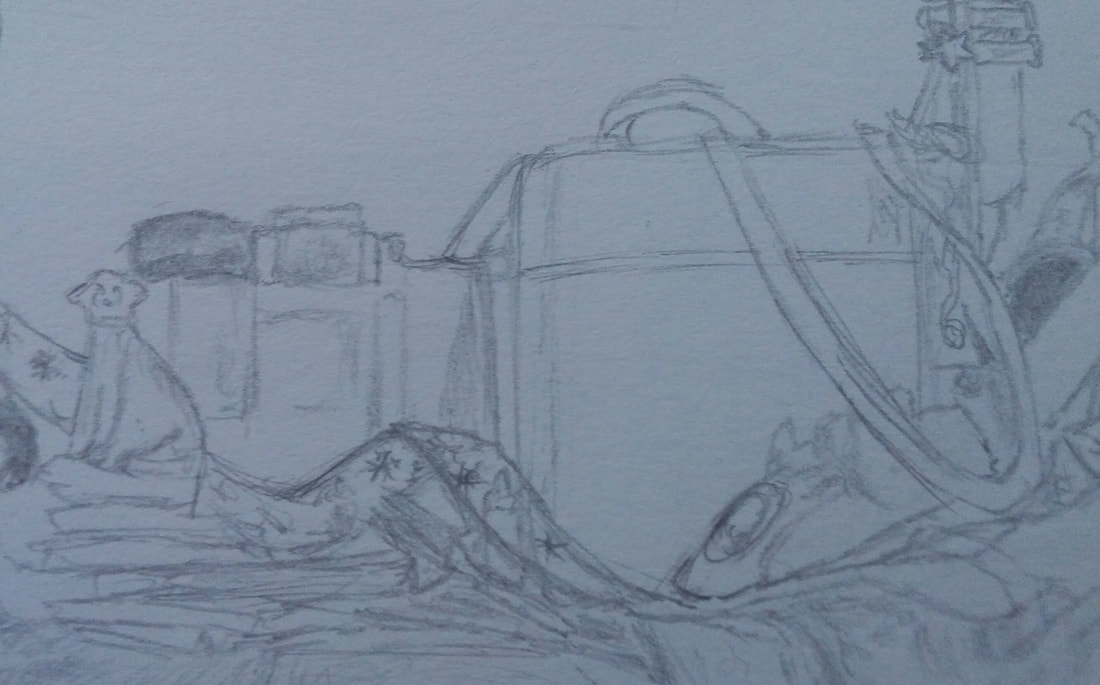
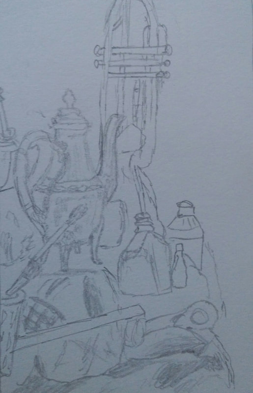
In these drawings, we were practicing our still life skills by choosing three different locations on the table to draw. Then, once we had completed the practice drawings, we could use them to decide which option would produce the best final piece.
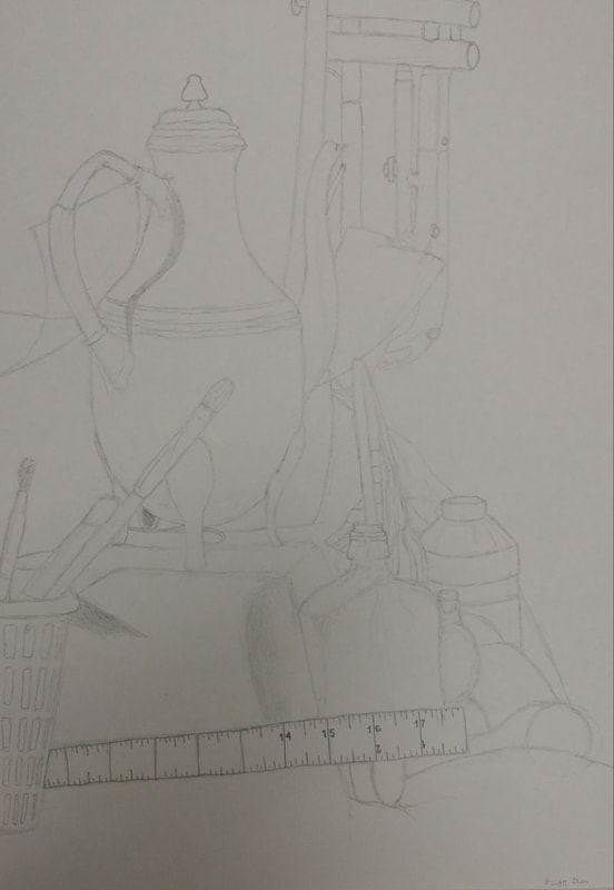
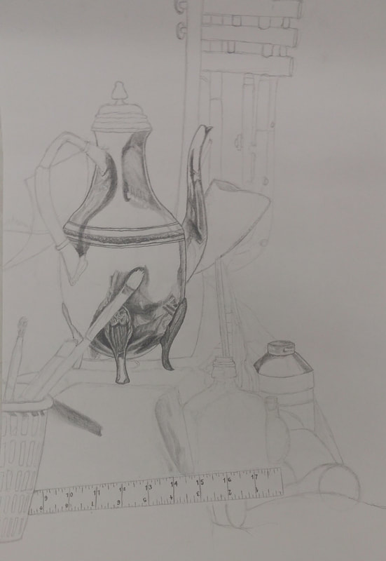
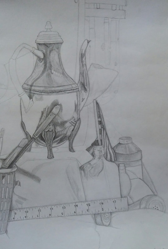
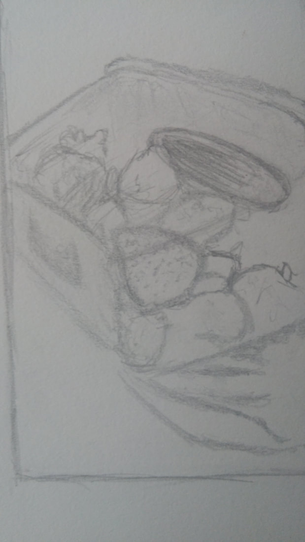
These three photos are showing the step by step process that I used while creating this piece. I started off by outlining everything on the table in order to get the proportions accurate, and then I started to shade things in from there. I slowly shaded certain objects until the whole project was finished.
1.) Describe the craftsmanship of your drawing. (Is it clear, clean edges, blended well, smudges, defined space, etc.)
I made sure that the craftsmanship of my drawing was very carefully planned out and intricately designed to create a realistic effect. I made the objects have very bold and clean edges, to emphasize where objects were overlapping each other. I also made sure that I blended everything well so that the objects seem more realistic and three-dimensional.
2.) Are your values and shadows realistic? How many values did you include? How and why are values important?
My values and shadows are very realistic because I used very dark shadows and value on the edges of objects to show where an object is overlapping another object. I used many different values from very light to very dark, to represent the light and dark colors and shadows of different items on the table. The values are very important because without them, everything in a drawing would just mold together, and you wouldn't be able to distinguish where different objects overlap.
3.) Is there a clear source of lighting?
There are different sources of light surrounding the objects, but you can tell that they all are coming from above and from various sides because all the objects have dark shadows beneath them, and they have shadows overlapping each other from the spotlights coming from opposite directions.
4.) How important were the compositional sketches? Explain.
The compositional sketches were very important because they help us plan out our proportions for our final drawing by allowing us to quickly practice laying out the drawing without being overwhelmed by the combination of so many different objects. These sketches also give us an idea on how the drawing would look from different angles, so that we might decide on which one will produce the best final piece.
5.) How is your final drawing successful?
My final drawing is successful because I was very careful to create accurate proportions and shading throughout the entire piece. I also paid attention to the very intricate details of all the objects. These aspects of the drawing were what made it seem much more realistic.
6.) Are the proportions, structure and perspective of the subject correct?
The proportions in my drawing are very accurate and precise because I worked very carefully in order to make them as realistic as possible. The structure and perspective of the objects in the drawing are also correct because I focused on each object in particular while I was working, in order to create an overall accurate piece.
7.) Does the placement & grouping of objects create a pleasing arrangement (composition)?
The placement and grouping of objects created a pleasing arrangement because of specific objects overlapping other items. Even though the exact placement of each object was seemingly random and chaotic, the emphasized edges and shadows of each object made the final composition seem very put together and realistic when finished.
8.) Is there a center of interest and is it well located?
I believe the drawings' center of interest was the tea pot. This object was the center of interest because it is the first thing your eyes get drawn towards when looking at the piece. This item was located in a very good position because, even though it was not in the very center of the drawing, it was toward the middle vertically and was a very good place to work from to create the rest of the drawing because it rested up higher with fabric falling off the surfaces' edge right next to it.
9.) How well did you manage your time and resources throughout the process of creating this drawing? Do you see where you could improve in this area?
I believe that I managed my time and resources well throughout the process of creating this drawing because I was able to lay out my plan of how to draw so many objects and come out with a successful final piece because of it. I could have improved in this area, however, because I could not finish it in time during our class periods. I had to take my drawing home to finish. I do not believe I wasted any time in class to have caused this, but I think that I spend to long worrying about one small part of the drawing and then I don't leave myself enough time to do the rest of it.
10.) What challenges did you encounter during this project and how did you overcome them?
Some challenges I encountered during this project were that I started off not being able to create distinct edges on objects to show them overlapping to create the three-dimensional effect. I overcame this obstacle by using a darker value to create prominent shadows that made the objects pop out more.
11.) What have you learned drawing a still life?
I have learned that when drawing a still life, I must exaggerate the shadows and edges to create a more realistic piece. I also discovered that I can create a big piece like this by focusing on one object at a time, in order to stop overwhelming myself by looking at everything at once.
Colored Pencil
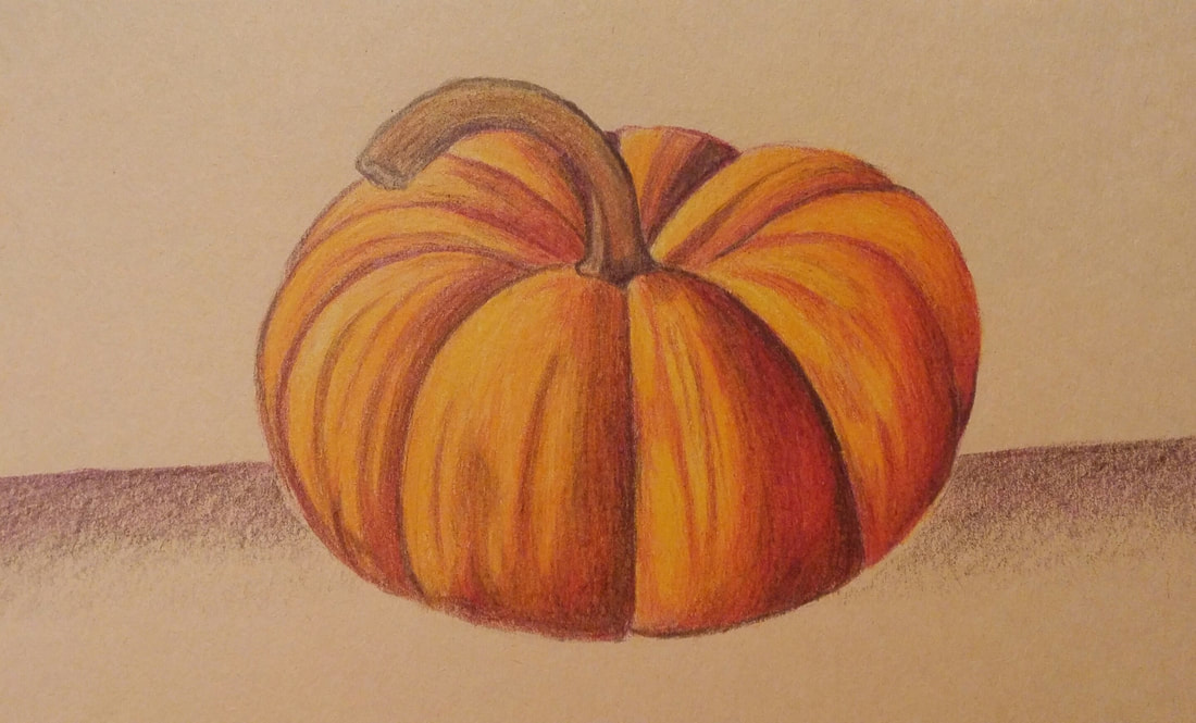
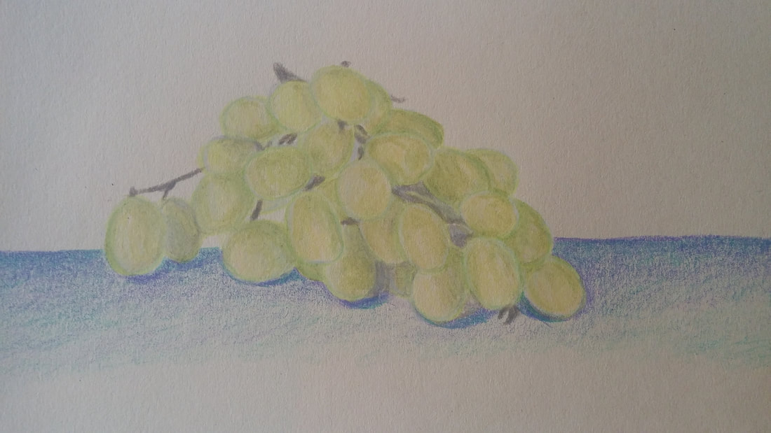
In the pumpkin and grape drawings, we practiced blending colored pencil shades together and using contrasting colors to emphasize shadows and highlights.
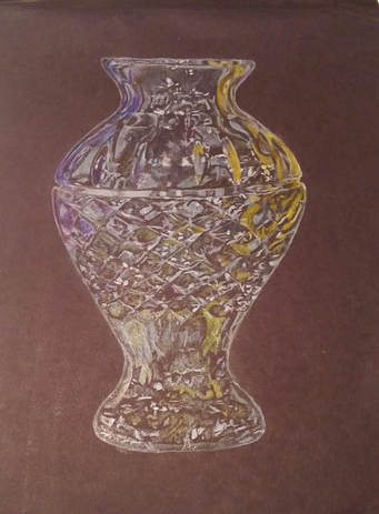
This is a practice for drawing glass with colored pencils. The vase had to have a large variety of colors and shades of white in order to emphasize the 3- dimensional shape of it with the background color showing through it and the spotlight's reflections in the glass.
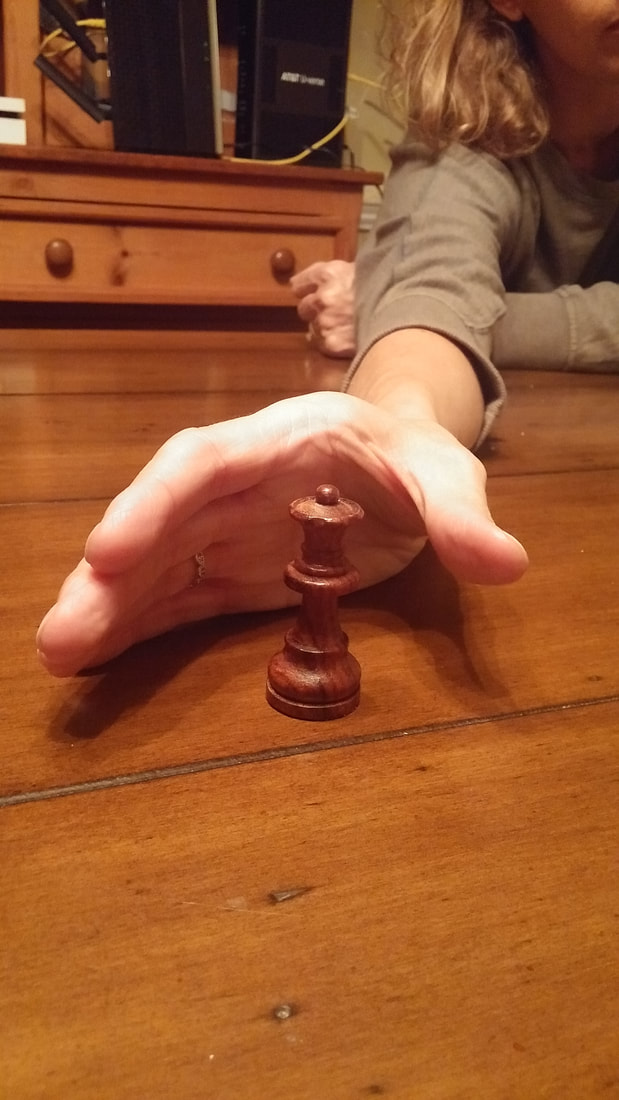
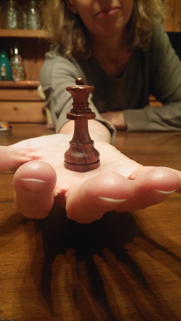
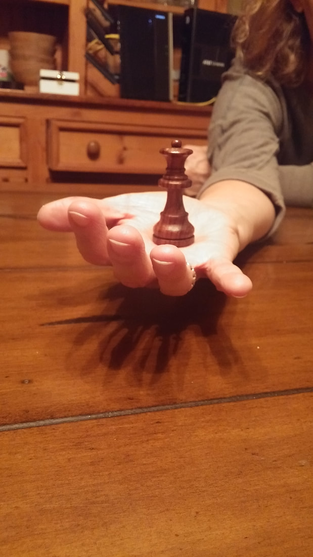
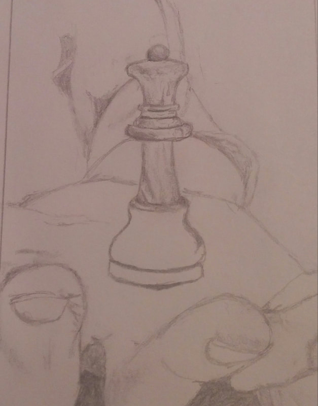
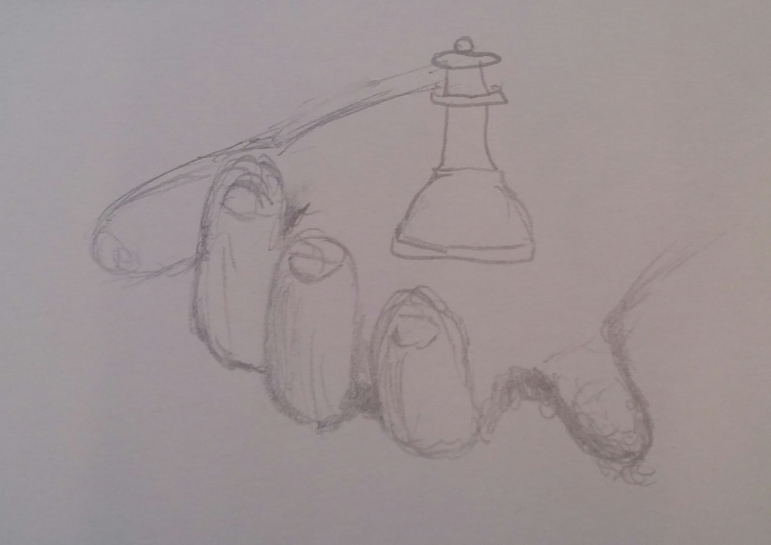
These pictures show my compositional sketches for my forshortening project.
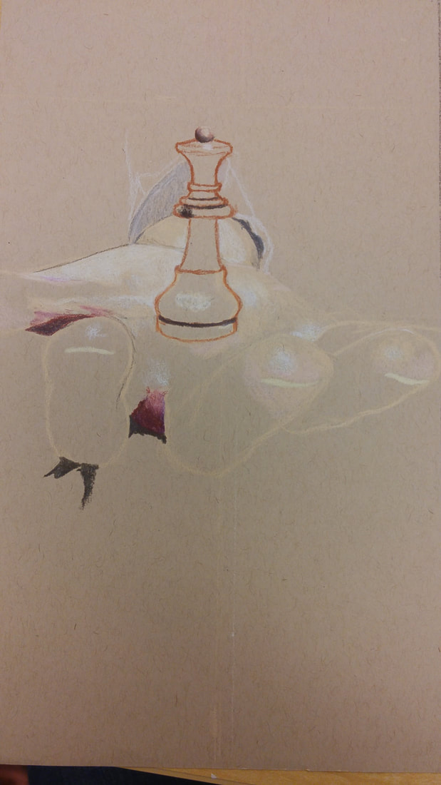
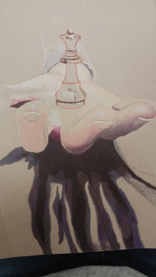
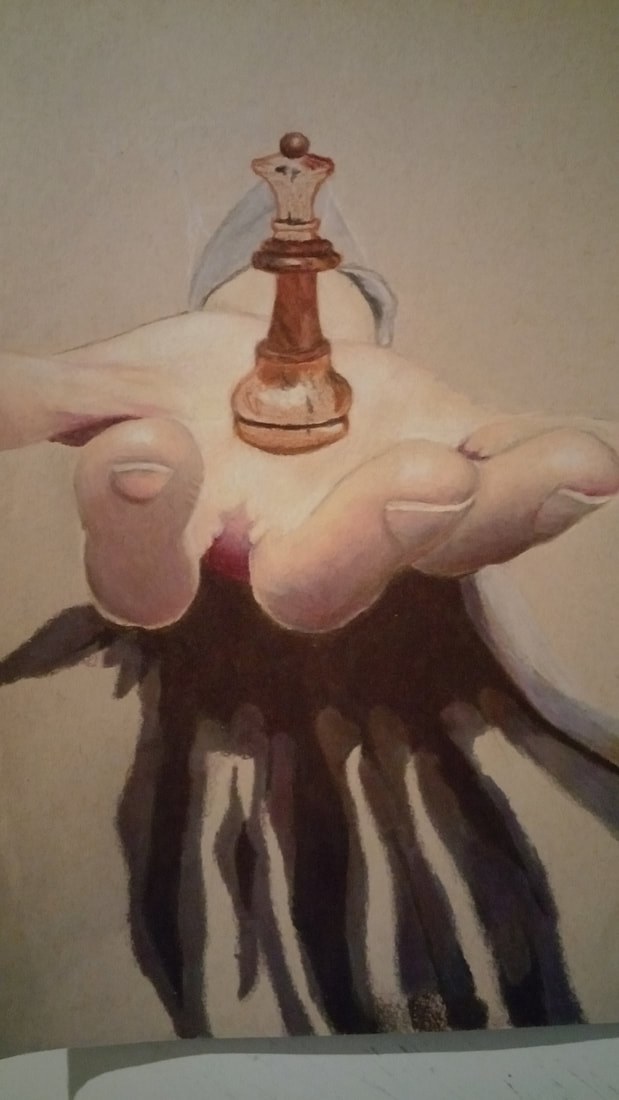
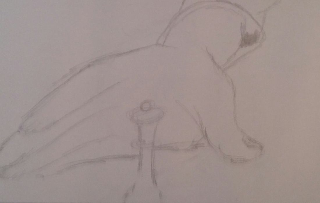
These 3 photos show the my drawing as I progressed while working on it. They show how I laid out the drawing before shading and experimented with base colors as I went along.
- Describe how you created an interesting point of view? Was it successful? Why or why not? I created an interesting point of view in this foreshortening project because I had an arm reaching out toward you, holding a chess piece. Since the hand is so much closer up in the picture, it ends of being drawn at a bigger size than the head of the person to show the three-dimensional aspect of the image. I believe that this point of view was successful because it really looks like a the arm is stretched out and the hand is farther forward in the picture.
- Why is it important to understand perspective and how to draw it? It is important to understand perspective and how to draw it because perspective is required in all realistic pieces of art to make them look real. If you don't master perspective first, your drawings will continuously come out unproportional and seem like something is off about it. However, once you have understood perspective, then you should be able to produce very accurate and realistic drawings.
- How were the colored pencil exercises important in the success of your piece? The colored pencil exercises were important in the success of my piece because they helped me practice and improve my blending skills and my precision while working with them before I started on my final piece. I applied the skills I learned in my drawing in order to blend my colors to create solid realistic colors to match the photo and create shadows that would enhance the three-dimensional appearance of the hand.
- Describe the craftsmanship of your colored pencil. What techniques were used? (How well the project is technically crafted). I used blending techniques to create distinct colors. I also used a technique to create accurate proportions, by drawing measurement lines on the photo and light lines on the paper I was drawing on. This way I could increase the dimensions of the drawing from the photo without creating inaccurate proportions.
- Were you able to achieve depth by showing a foreground, middle ground and back- ground? Explain. I was able to achieve depth by showing a foreground, middle ground and back-ground because I created shadows and proportions that emphasized the depth and dimensions of the picture.
- Explain your experience with colored pencil and the project in general. What were the obstacles and advantages? The obstacles of working with colored pencils and this drawing were that the skin tone with shadows were very hard to get the color right. It was also very hard to create the back-ground. The advantages include that these pencils are very easily blended which helped create accurate coloring.
- Looking back on the progression of this project what skills, techniques or other information would you like to have been taught? Do you feel you were prepared for this project? Looking back on the progression of this project, I would have liked it if I had learned a technique to create the partially blurred background in the photo to make the drawing look realistic. I still feel I was prepared for this project because I have had experience with colored pencil drawing before, and we practiced the techniques and skills that we would need before we started the final.
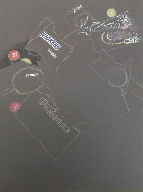
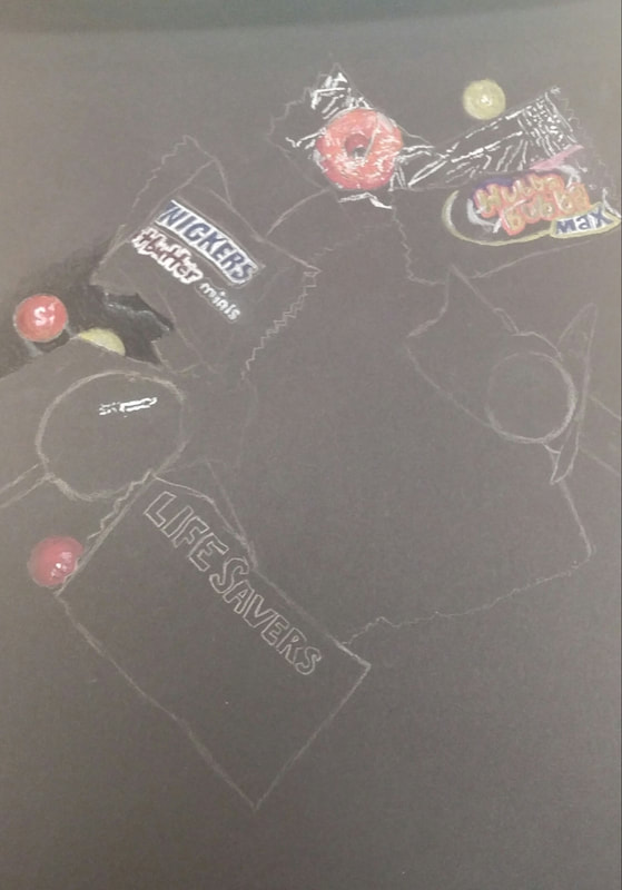
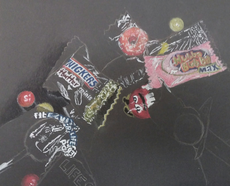
These picture show how I progressed as I created a pastel pencil drawing of candies. This practice was useful because it helped me gain more experience using this medium and I learned more about how to make this medium turn out good and what techniques might help or hurt the final outcome, even if that technique had the opposite effect while using Prisma Color pencils.
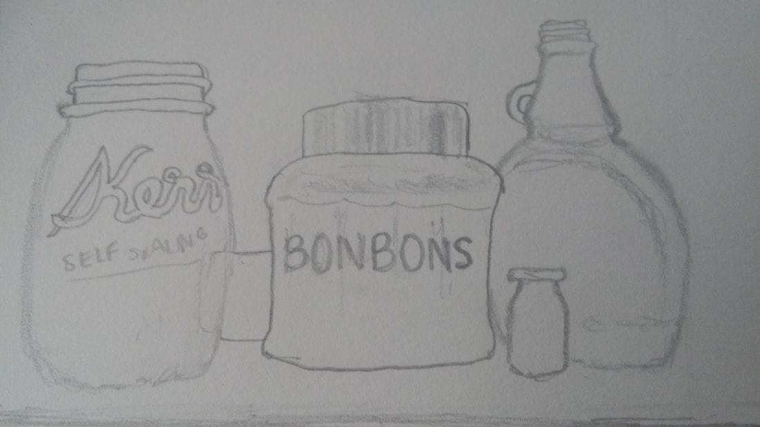
These sketches, were the opacity practice sketches. The purpose of these was to practice overlapping things that are transparent and showing where highlights would be added in a final product in order to choose which one shows the most opacity and reflections.
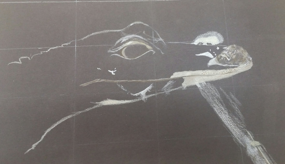
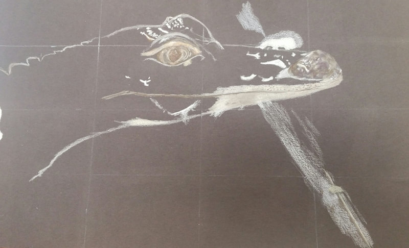
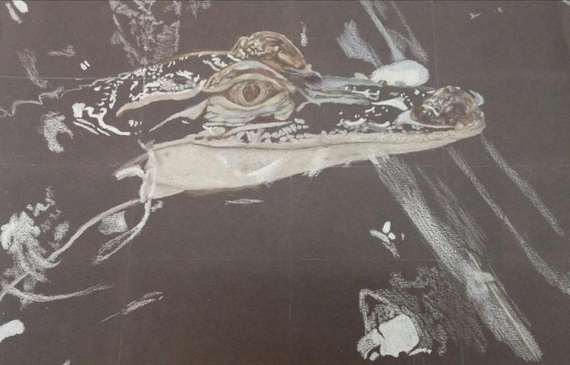
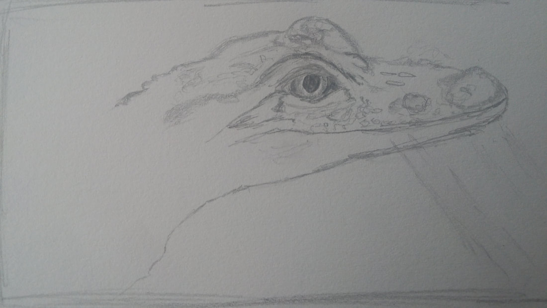
These in progress photos demonstrate the lay out and techniques I used in my drawing. I first outlined the primary features of the alligator and then I placed white highlights throughout the drawing in order to show the opacity of the drawing. The highlights enhanced the visual appearance of the water and glass reflections.
1. Describe the craftsmanship of the drawing. (Is it neat and well executed?)
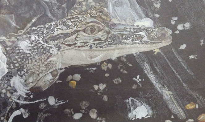
I think the craftsmanship of my drawing was done very well. I think this because throughout the drawing, I had a layout of how I wanted it to look and I had lines marked in order for me to keep my proportions accurate. I believe my plan was executed well because I paid very close attention to detail, and I slowly added the white highlights and built up the composition from there.
3. Describe your choice of colors/color harmonies and how you used them throughout the artwork.
I followed the color scheme of the photo of the alligator I used. In some of the darker shades on the alligator scales however, I added some tiny hints of dark purple. I used the colors throughout the artwork to emphasize the intricacy and beauty of the alligators scales and to help create the reflections in the glass and water. All the shades of brown and gray were molded together to create the accurate real life colors of the alligator.
4. How did you create contrast in your drawing?
I created contrast in the drawing in a few different ways. I made sure to have distinct but not too bold lines that marked the edges of lighter areas to make the bright highlights pop more. I also added the white highlights first so that I could make sure that none of the other colors made the highlights fade out.
5. How did you use textures, highlights, and shadows to enhance your artwork?
I used textures in the drawing the create the smooth scales of the alligator, while still showing the ridges on his back. Highlights and shadows were essential in enhancing my artwork because they were exaggerated so that they made the alligator stand out and to really show the reflections of light in the water and through the glass.
6. Why did you choose a particular background color to mount your artwork?
I chose to do the same background that is in the photo of the alligator. I decided to mount my artwork on this background because with all the key highlights throughout the image, the pebbles and glass reflections in the background seemed very important in pulling the whole piece together.
7. Discuss the importance of understanding the media (prisma or pastels) and acquiring the skills necessary to create a successful project.
It is very important when creating a successful project to understand the media. In my piece, I had to understand the media of prisma colored pencils, and I had to use the skills that I have developed over time using them, to create my final artwork. For me, what I had to learn about working with prisma is that if I work slowly and don't let my eyes ignore any slight detail, then the artwork comes out much better than it would if I rush.
8. Describe any difficulties you had creating your drawing and what you could do to improve your drawing.
In creating my drawing, I had difficulties starting the background because there is so much detail just in the background it is hard to know where you should begin. To improve my drawing I think I should have spent a little more time working of the detail of the alligator scales, but overall I think I put in enough work to make the alligator look as realistic as I can make it.
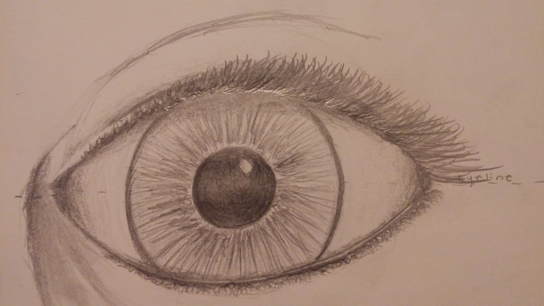
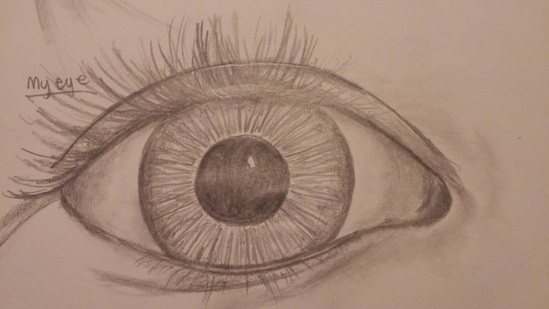
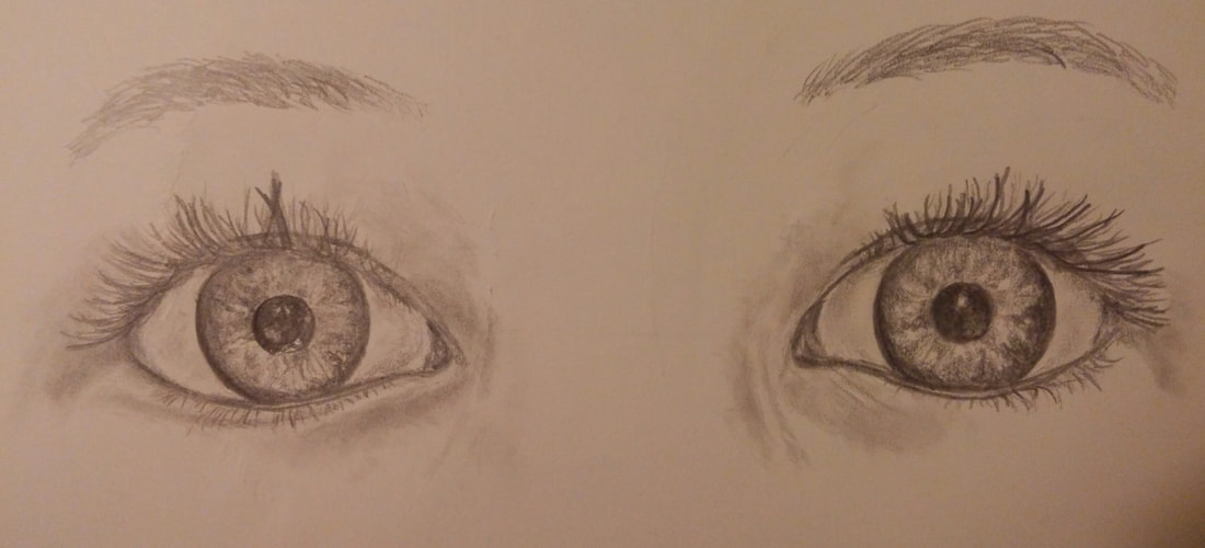
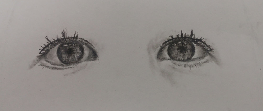
In the pictures above, we practiced drawing eyes. We first did a practice drawing of a generic eye. Then, we tried to draw our own eye in order to practice making it look like a specific person instead of just the most basic layout. Finally we did a drawing of both of our eyes together in order to have one last practice in spacing and creating a realistic view of the eyes.
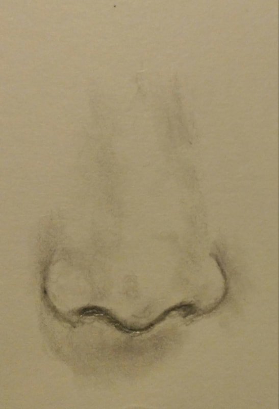
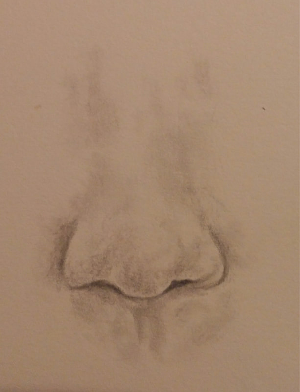
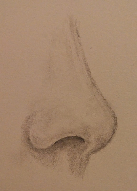
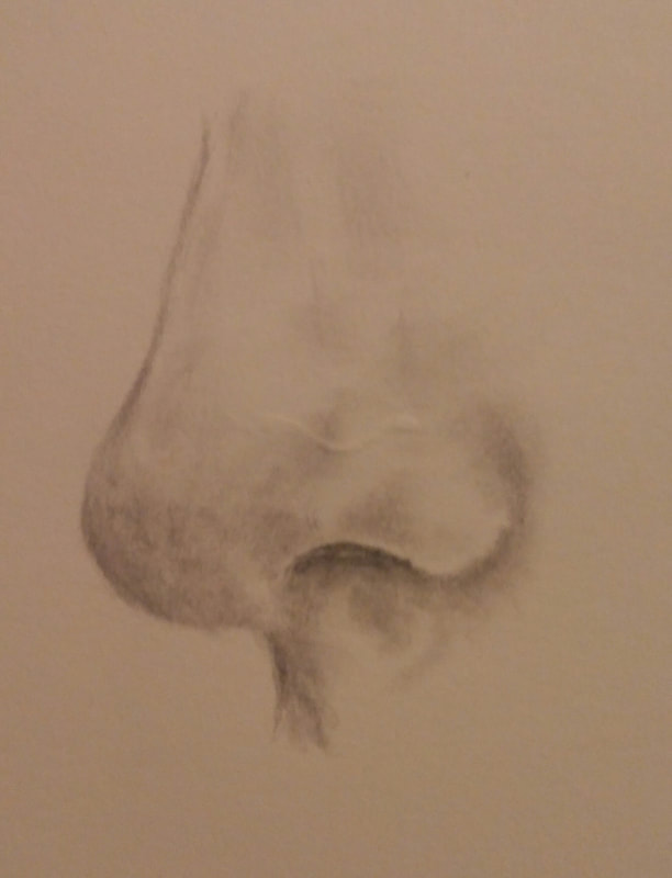
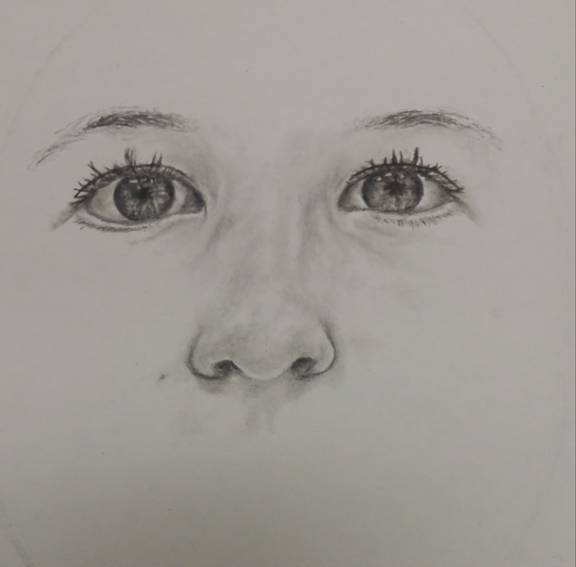
We practiced drawing noses in the above photos. We focused on making sure that the lines weren't too distinct and dark where they shouldn't be, and we practiced drawing the angles of the nostrils exactly how they look in real life because the nose is another facial feature that helps give an individual a more distinct, recognizable look.
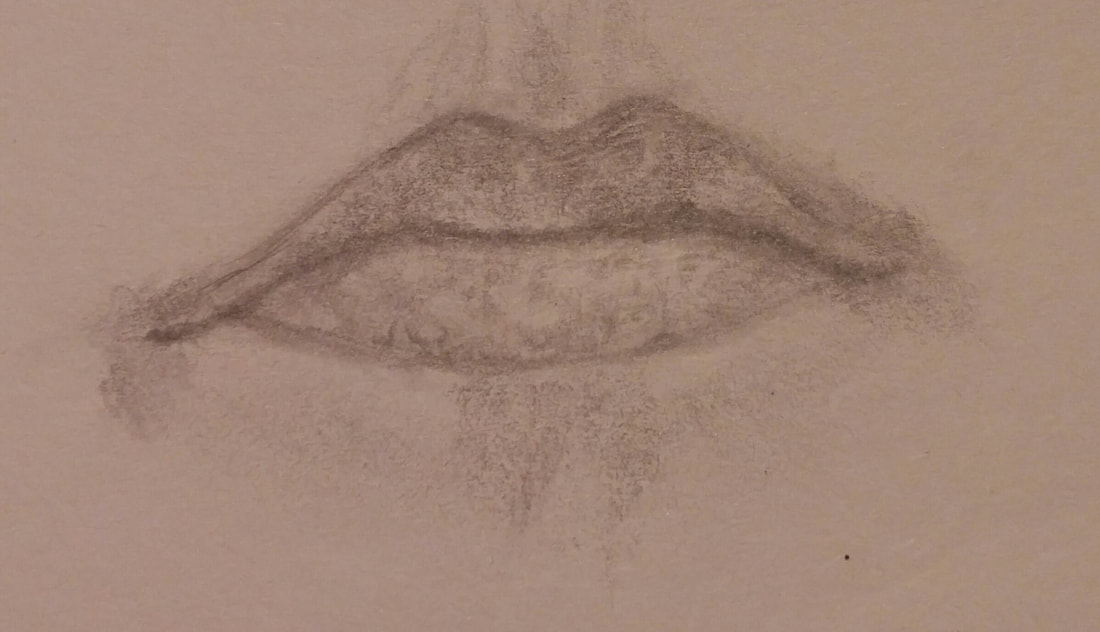
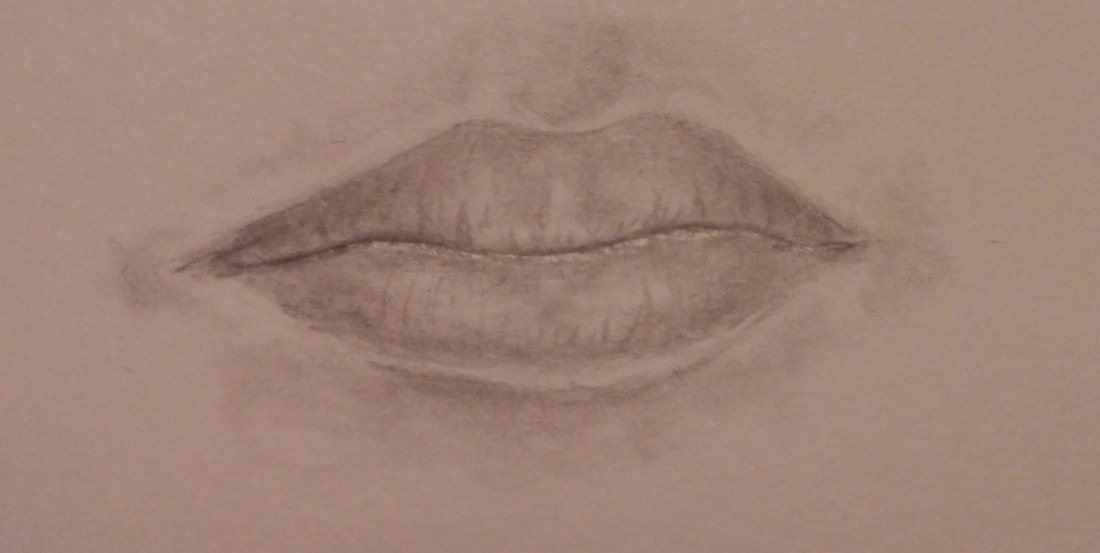
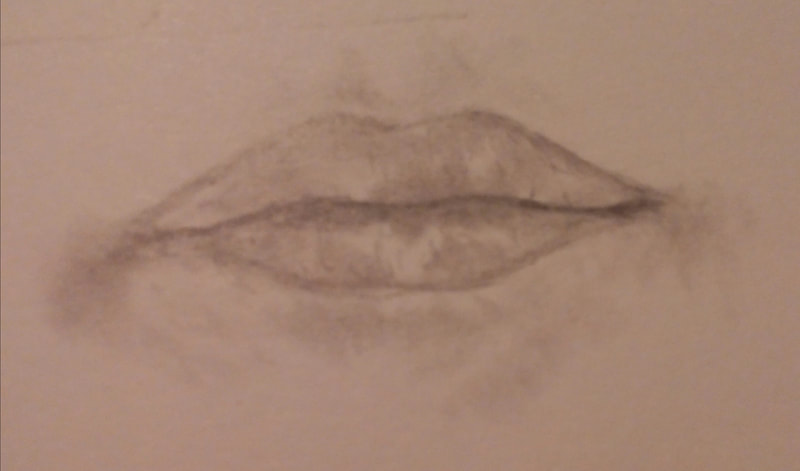
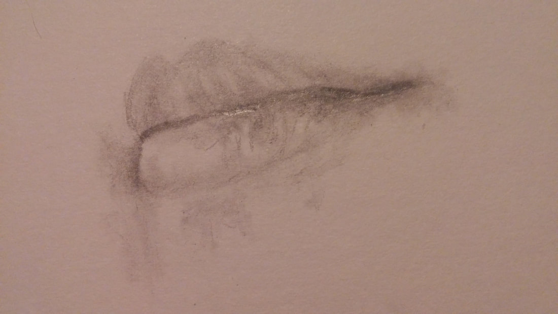
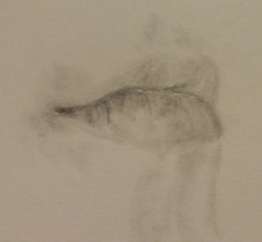
When practicing drawing lips, we first followed along with a video to help us understand the step by step process that drawing lips requires. We specifically spent a little more time trying to create realistic shadows, and making sure that the lines of the lips are visible but not too exaggerated.
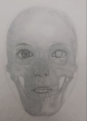
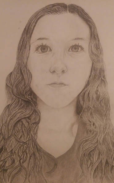
For this drawing, we used a large piece of tracing paper to draw ourselves over a basic human skull picture. This method was useful in our practicing self portraits because it helped us to understand the general layout and dimensions of a persons face. I found it especially useful when trying to create the head shape because the edge of the skull was a very helpful guideline for a persons facial shape.
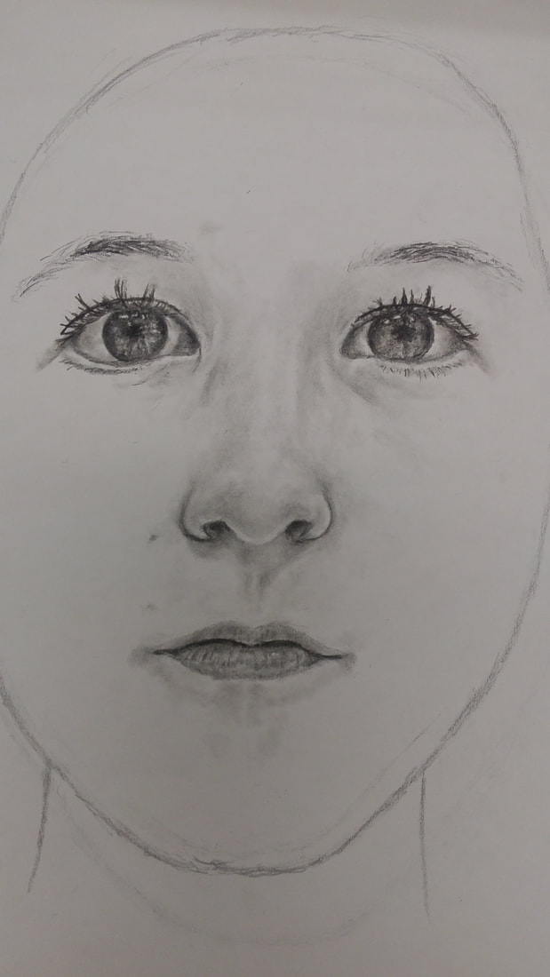
These pictures show my self portrait drawing as I progressed. It shows how I started off by creating the eyes and then used the eyes to create accurate proportions for the other features of my face.
1. Explain the process you went through to develop your drawing.
When developing my drawing, I used a slow and careful process. I focused on the main features of the face first, starting with the eyes. Then, from there I shaded darker and darker and erased parts to create the highlights. I worked outward from there and then once I had my eyes, nose, and mouth, I created an outline for my face. Once I did that, I lightly sketched out the hair and added darker and darker values until the hair looked realistic and then I smoothed out the graphite to finish it off.
2. Explain how you found the different values in the portrait?
In the portrait, I had to really analyze my photo to find all the different values that make up my face. The way I created the values in the portrait were that I chose a base value. My base value was the main shade that I used for the most generic skin tone. Then when I created highlights I used my original face shade to judge how light they needed to be, and used that same idea to determine how dark I needed to make the shadows.
3. Did you achieve a full range of the different values within your portrait? How?
I achieved a full range of different values within my portrait. I obtained this goal by making the highlights really stand out as lighter shades in the bright part of my nose and the whites of my eyes. I also obtained the darkest values by adding some charcoal to my portrait in the eyebrows, pupils, and around my neck where my hair blocks the light.
4. Describe your craftsmanship. Is the artwork executed and crafted neatly?
I believe that my artwork was executed and crafted neatly. I think my craftsmanship was well done because I worked very slowly and created many different values to create the realistic shading of the face. I also think I executed it neatly because I was very careful to create accurate proportions and dimensions when it came to the layout of my face.
5. How were you able to capture your look?
I was able to capture my look by creating a slow and analytical process. I carefully created very accurate dimensions which is a primary part of making a portrait of someone capture their unique physical features and make them recognizable. Besides that I worked very slowly on each main feature of my face to incorporate every tiny detail.
6. Explain how you made sure you had correct facial feature placement.
I made sure I had correct facial feature placement by using a couple different methods. First, I estimated the distance between features just by guessing, then I used the measurement system of how many eye lengths to adjust it to make the placement even more accurate. Finally, I used the photo to create certain proportions and made some final calculations and adjustments to get the most accurate and realistic feature placement possible.
7. Explain the importance of learning how to draw all the features individually.
I believe that learning how to draw all the features individually first was very important for a few different reasons. One, it takes a few tries when drawing a portrait, especially a self portrait, to grasp the concept of individuality by not overlooking one's imperfections or unique traits. Two, eyes are, in my opinion, the most important part of determining an individual's uniqueness. This is because your eyes show your spirit and emotions that define a person more than any other thing. Finally, when creating the nose and mouth, it really helped to have practice creating the shading that shows the edges of your features.
8. What part of this unit was the most beneficial and why?
I think a really beneficial part of this unit was incorporating the charcoal pencil into our drawings. This is my opinion because as artists, I think we all fear making mistakes and sometimes that prevents us from creating an even greater masterpiece. Everyone was nervous about using charcoal in the drawing because it seems to be much more permanent than the graphite pencil when we see how dark it is, but in truth once we became comfortable with it, it really helped create contrast and make our portraits seem much more realistic.
9. List any obstacles you had to overcome and how you dealt with them.
My primary obstacle was working on the eyes because of our unique eye shapes. I know that the shape of a persons' eye is a very defining quality and I didn't want to make a single mistake, but I overcame this obstacle by working very carefully in order to create a realistic resemblance to my own eye. My other main obstacle was getting the head shape right. I found this challenging because the slightest angle could make a great difference when trying to get an accurate bone structure. I overcame this challenge though, by using the features of my face as reference points to create accurate dimensions.
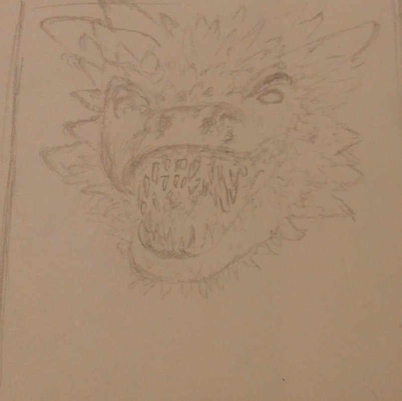
In these pictures above, we practiced how we were planning on drawing our scratch board projects on black paper.
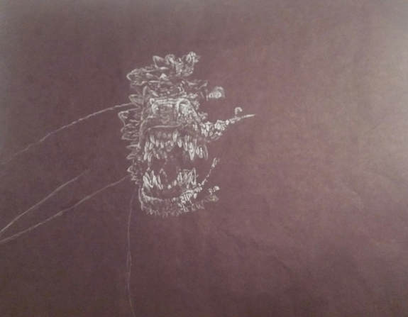
This picture shows the drawing of the dragon that I did on black paper with a white prisma color pencil. We did this so that we could know how it would look before we started on the scratch board so that we wouldn't make as many mistakes.
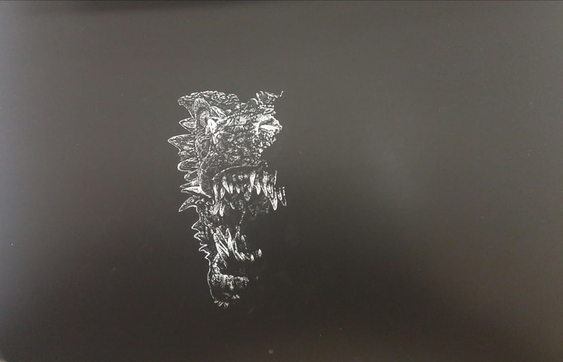
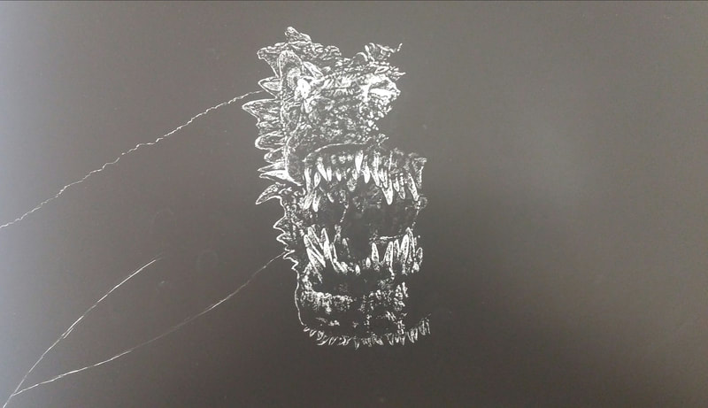
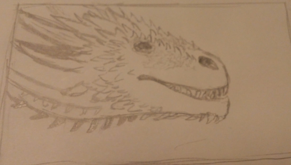
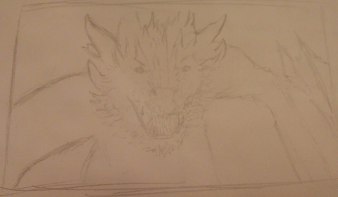
These photos show my final scratch board project as I progressed. It shows how I slowly started with the nose of the dragon and carefully added detail and texture until I had the final project completed.
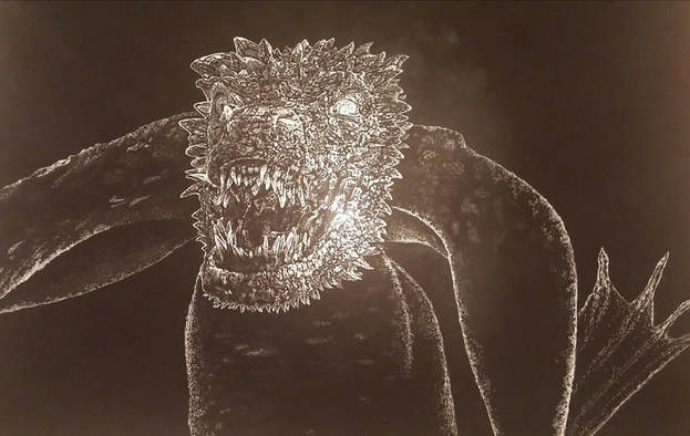
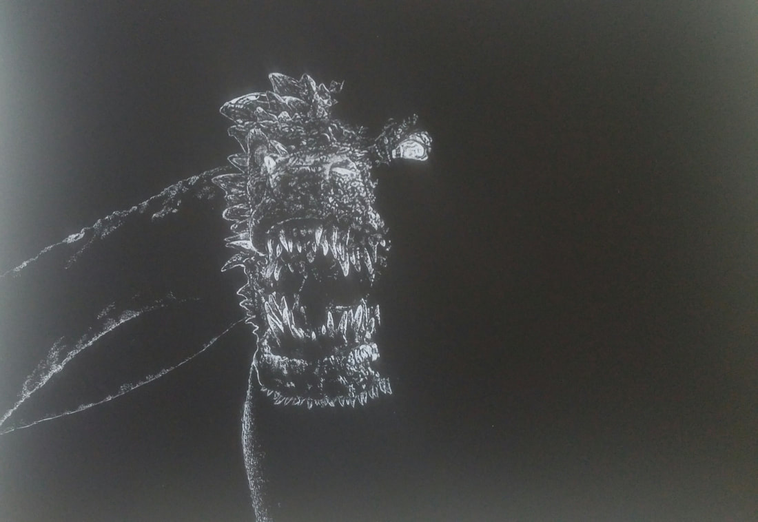
1. Describe the subject matter and meaning of your artwork.
For my scratch board project, I decided to do a mythical creature. I chose to do the dragon because I think dragon's in different stories and legends are very interesting beings. I think I am drawn towards dragons because of the many different perceptions of them that people describe. Dragons can be evil or just wild animals, they could be loyal to a certain person or decide that they should answer to no one. I think this is very interesting because they are super powerful, but can still be graceful or misunderstood. I chose to do an up close picture of a dragon to show texture instead of motion because in my opinion, the texture and shape of the face makes the whole visual seem more alive.
2. How did you use textures to enhance your picture?
I used textures to enhance my picture the entire time I was creating the piece. The texture of the dragon scales is what pulls it together and makes the creature recognizable. The different textures I used, along with the amount of pressure I applied, brought the drawing together. The brighter and smoother textures were more distinct and they made certain characteristics of the dragon stand out more.
3. How did you balance your artwork and create a well-organized composition?
I was able to balance my artwork and create a well-organized composition by using a few different methods. To balance my work, I made sure that anyone who was looking at it would be drawn towards the head. I accomplished this by brightening the outline and slightly brightening the scales of the dragon's face so that it's head stood out compared to the slightly darker and more faded wings and body. My composition was well-organized because I was very slow and careful to make sure that every detail was in the correct place.
4. How did you imply movement in your drawing?
In my drawing, I mainly focused on texture instead of implied movement, but it partially shows the implied movement in a couple of ways. For one, the dragon's mouth is slightly open, which demonstrates implied movement because it is about to roar. Another aspect of the drawing that shows implied movement is the wings in the background. The wings demonstrate implied movement because it shows that the dragon isn't resting or in a sitting stance, it is moving forward and using it's wings to do so.
5. How could you improve your artwork?
I believe I could improve my artwork by using some other tools to create the texture. I think that at some points of the drawing, I created too bright of scratches with the xacto knife, but if I had used another type of tool, I might have been able to accomplish a softer and more delicate touch on the scratch board.
6. How did you demonstrate a wide range of shading values?
I demonstrated a wide range of shading values in my piece using a couple different techniques. First, in order to show the darkest values, I left the scratch board black without or barely scratching it. If I wanted a bright highlight then I would scratch of the black completely to give way to the bright white underneath. I was also able to adjust the blade of the xacto knife to different angles in order to scratch off more or less of the black surface.
